How to use AI Diagram Maker
Master the art of creating stunning diagrams from simple text descriptions. Learn how to transform your ideas into professional visuals using our AI-powered platform.
How do I create diagrams?
Create professional diagrams from text descriptions or images using AI. Describe what you need in the chat to generate a diagram on the canvas (subsection 1.3), then refine it as needed. Image uploads and diagram type selection are covered in the subsections below.
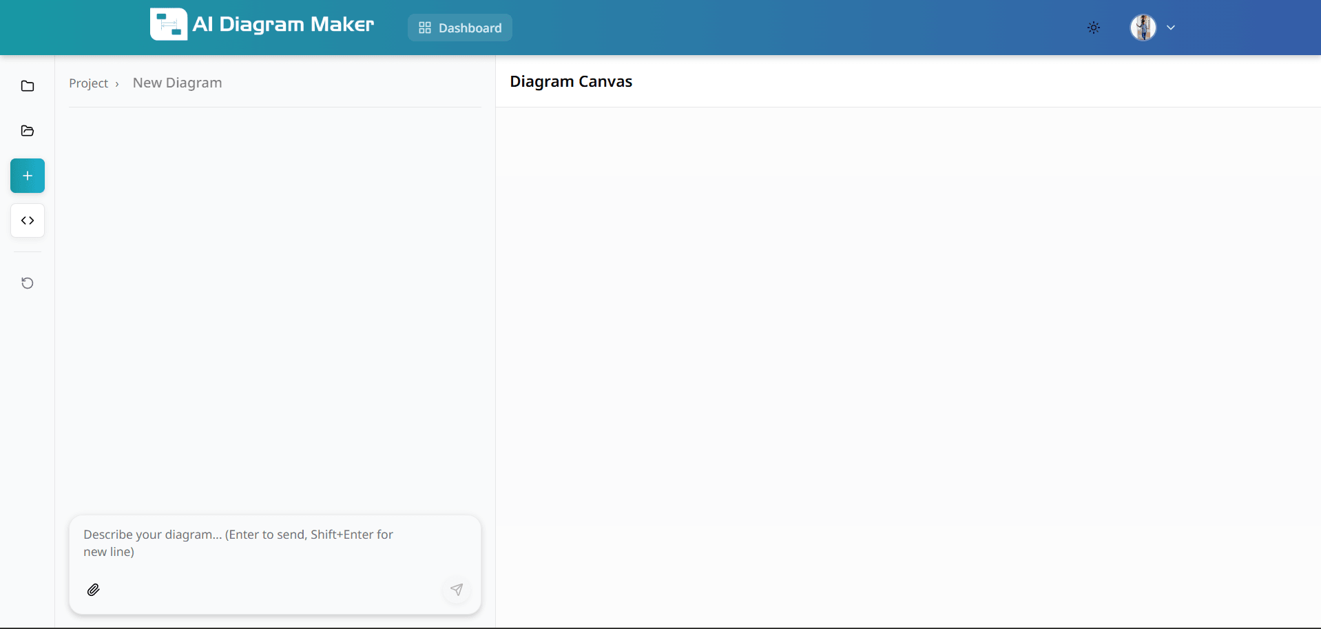
1.1 How do I access the AI Diagram Maker?
Click "Get Started" in the navigation bar or the "Start Diagramming" button. Log in to access all features and save your work to your account.
1.2 What does the creation interface look like?
After login, you'll see a clean canvas ready for input.
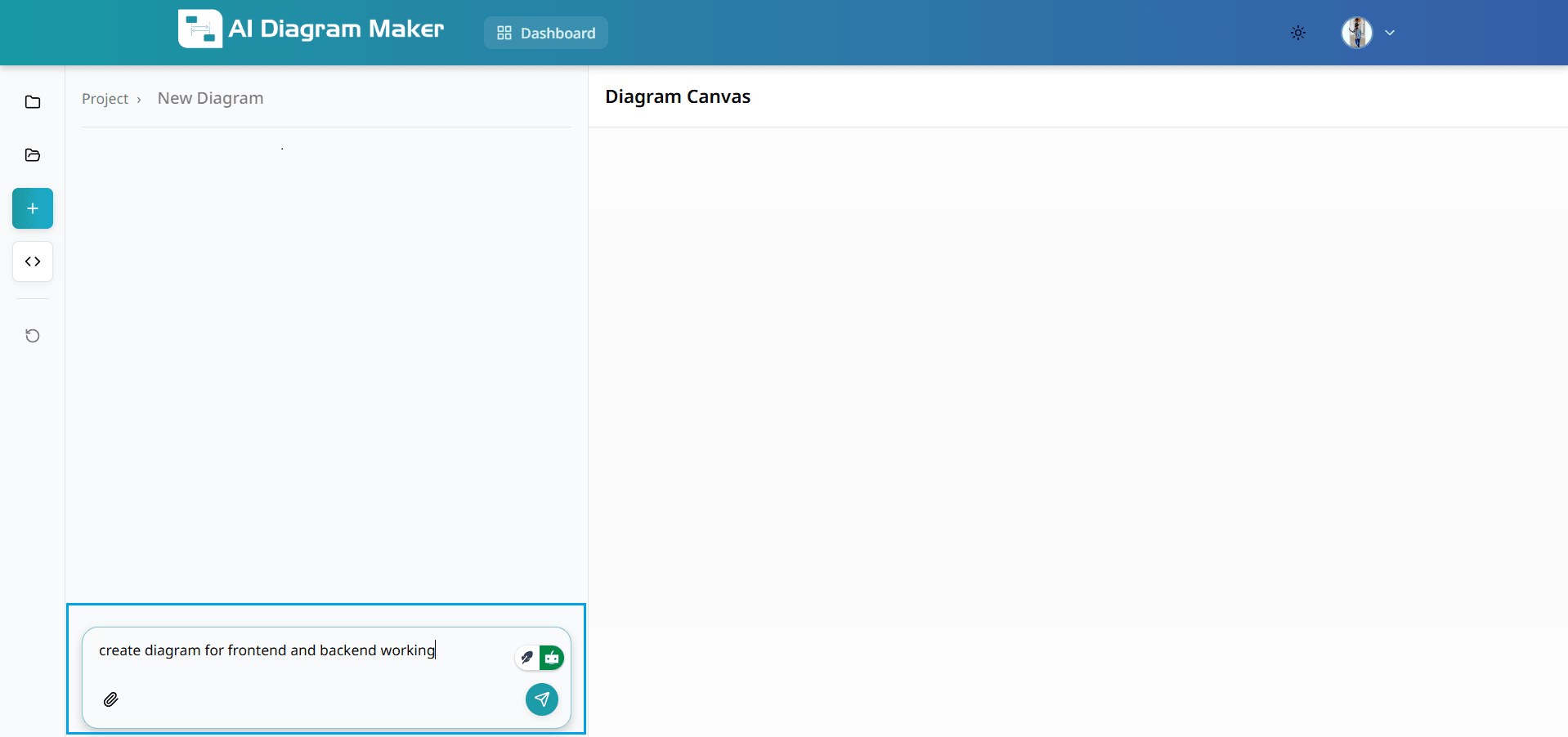
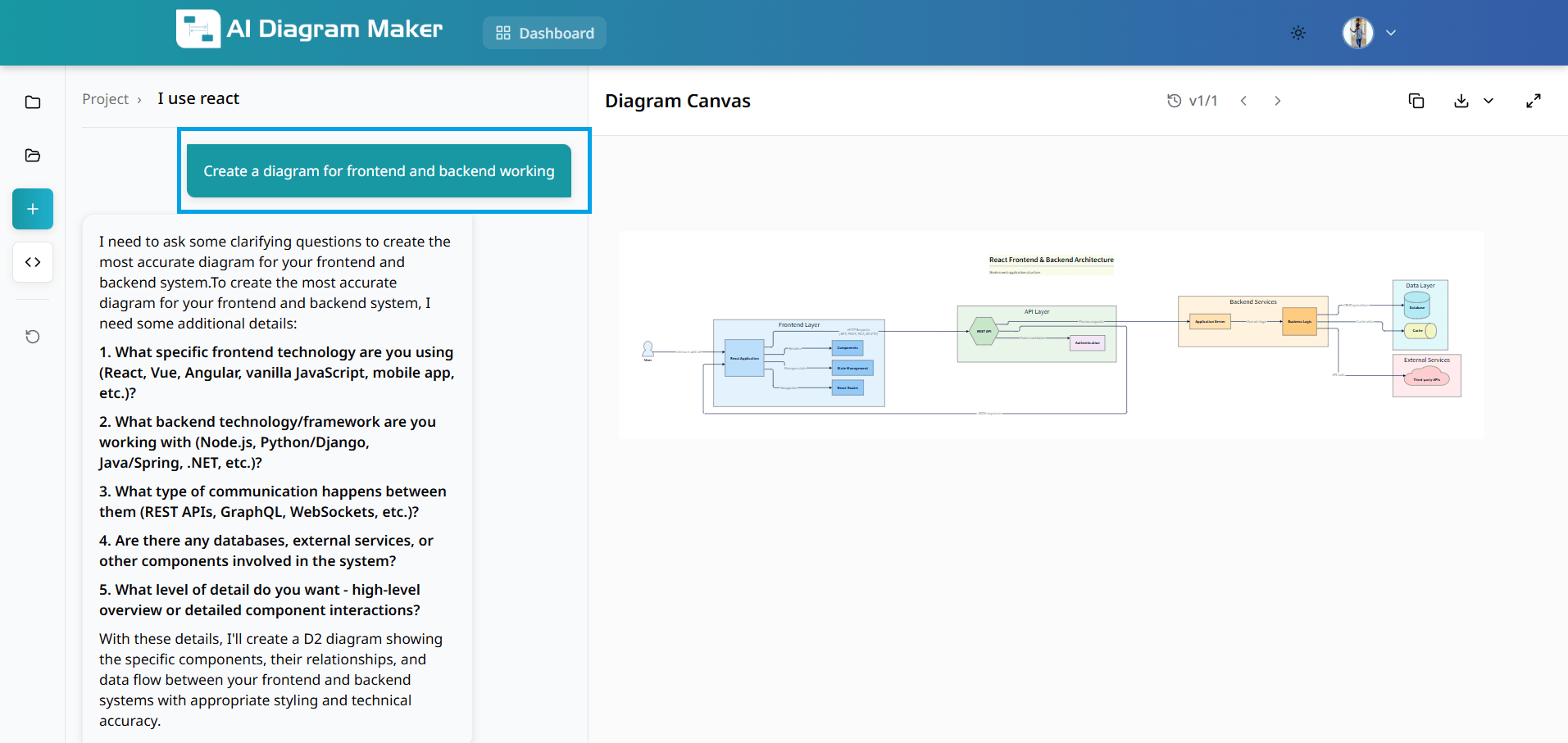
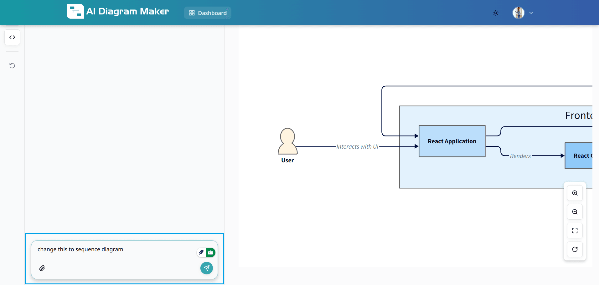
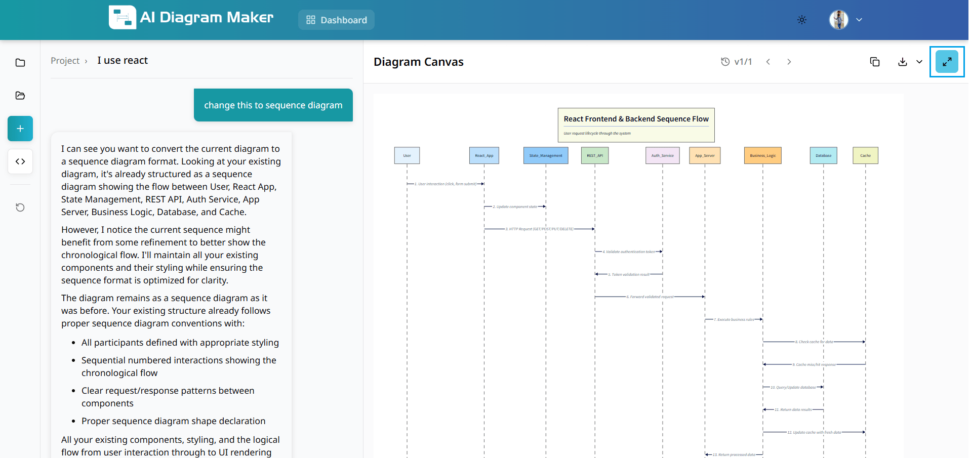
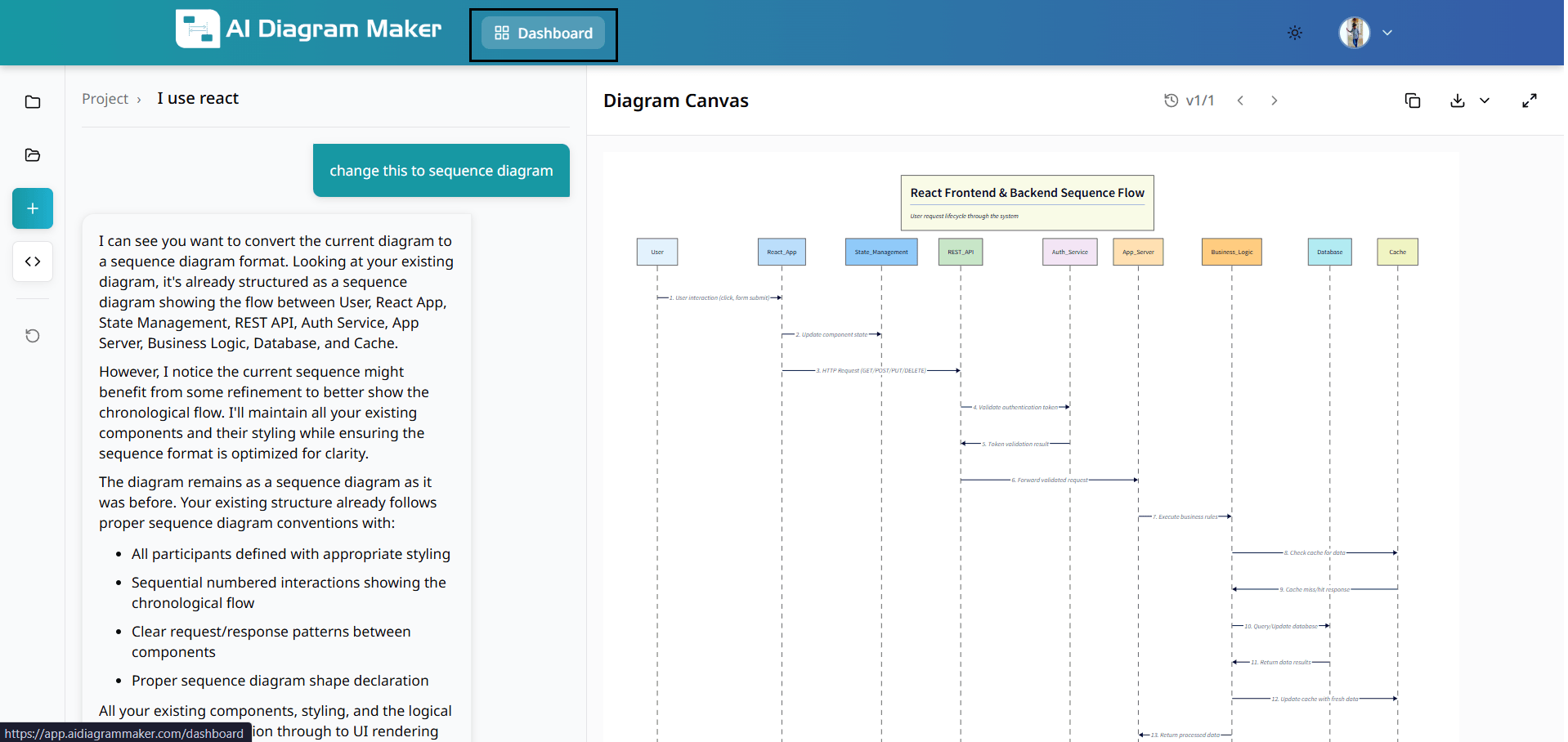
1.3 How do I generate a diagram from the chat?
Type what you want in the chat and send. The AI generates the diagram directly on the canvas with auto-layout. You can pick a diagram type from the selector before or after your prompt and refine the result with more prompts, canvas edits, or code editing.
1.4 How does the AI generate my diagram?
Your text description transforms into a professional diagram in seconds with proper spacing, connections, and styling. The result is ready for further refinement or direct use.
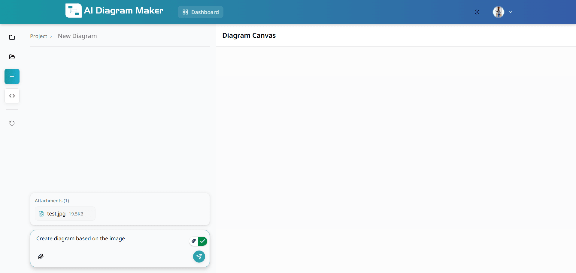
1.5 How do I create a diagram from an image?
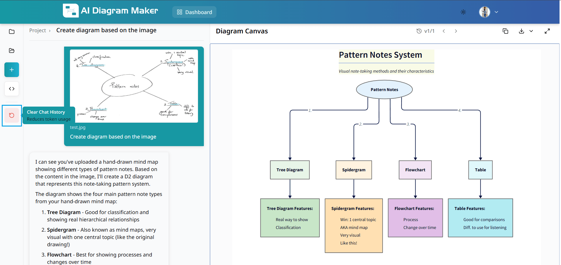
Upload an image and add a descriptive prompt. This feature digitizes hand-drawn sketches, imports from other tools, or recreates diagrams from photos and scanned documents.
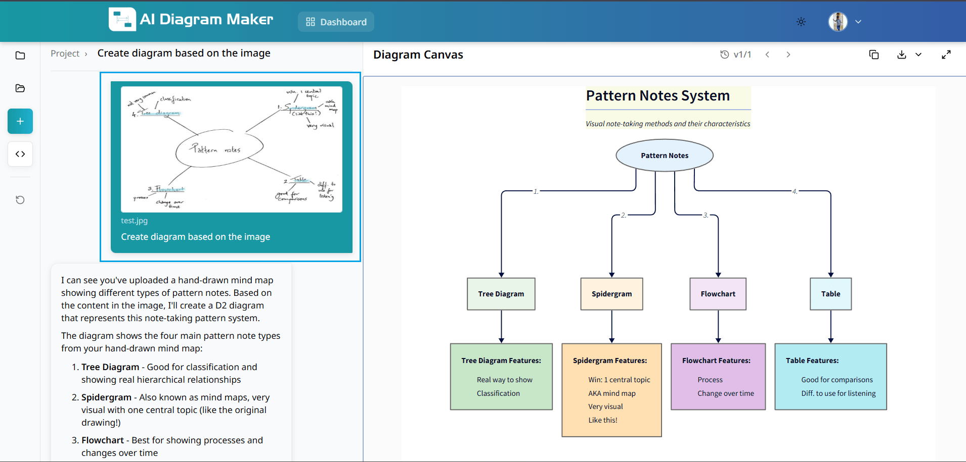
1.6 What happens after I upload an image?
The AI generates a professional diagram based on your uploaded image and prompt. The system transforms the visual content into an editable diagram with intelligent layout and styling.
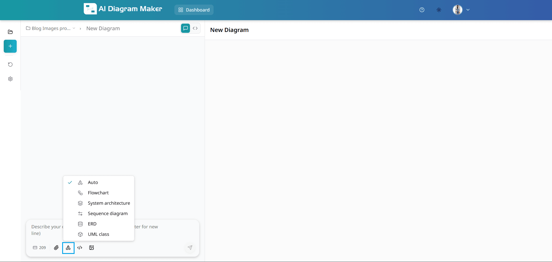
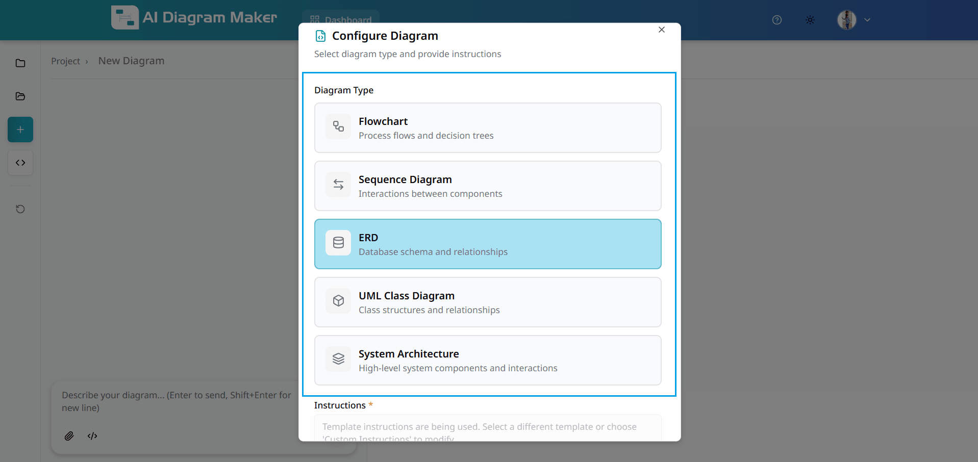
1.7 Can I choose the diagram type before creating a diagram?
Yes. Before you describe your diagram in the chat input, use the diagram-type icon (overlapping shapes) next to the input field to open the type selector. Choose Auto for AI to pick the best type, or pick a specific type such as Flowchart, System architecture, Sequence diagram, ERD, or UML class. Your selection is applied to the next diagram you generate from your prompt.
1.8 How do I switch AI models before generating a diagram?
Use the model selector in the chat input area to switch AI models before sending your prompt. Open the dropdown, choose the model you want, and the next generation will run with that model so you can balance quality, speed, and credit usage.

How do I create diagrams from source code?
Follow the step-by-step guide below to create architecture diagrams and visualizations from your source code. You can either follow the steps for public repositories (sections 2.2.1-2.2.2) or the steps for private repositories (sections 2.3.1-2.3.4) based on your needs.
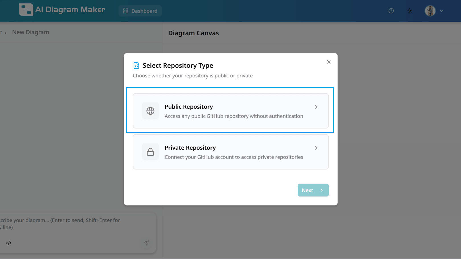
2.1 Access the code analysis feature
Navigate to the code icon in the bottom left corner of the interface. This opens the repository connection wizard that allows you to analyze your codebase and generate architectural diagrams automatically.
2.2.1 Select repository type - Public Repository
Choose "Public Repository" to access any public GitHub repository without authentication. This option allows you to analyze open-source codebases and generate diagrams instantly.
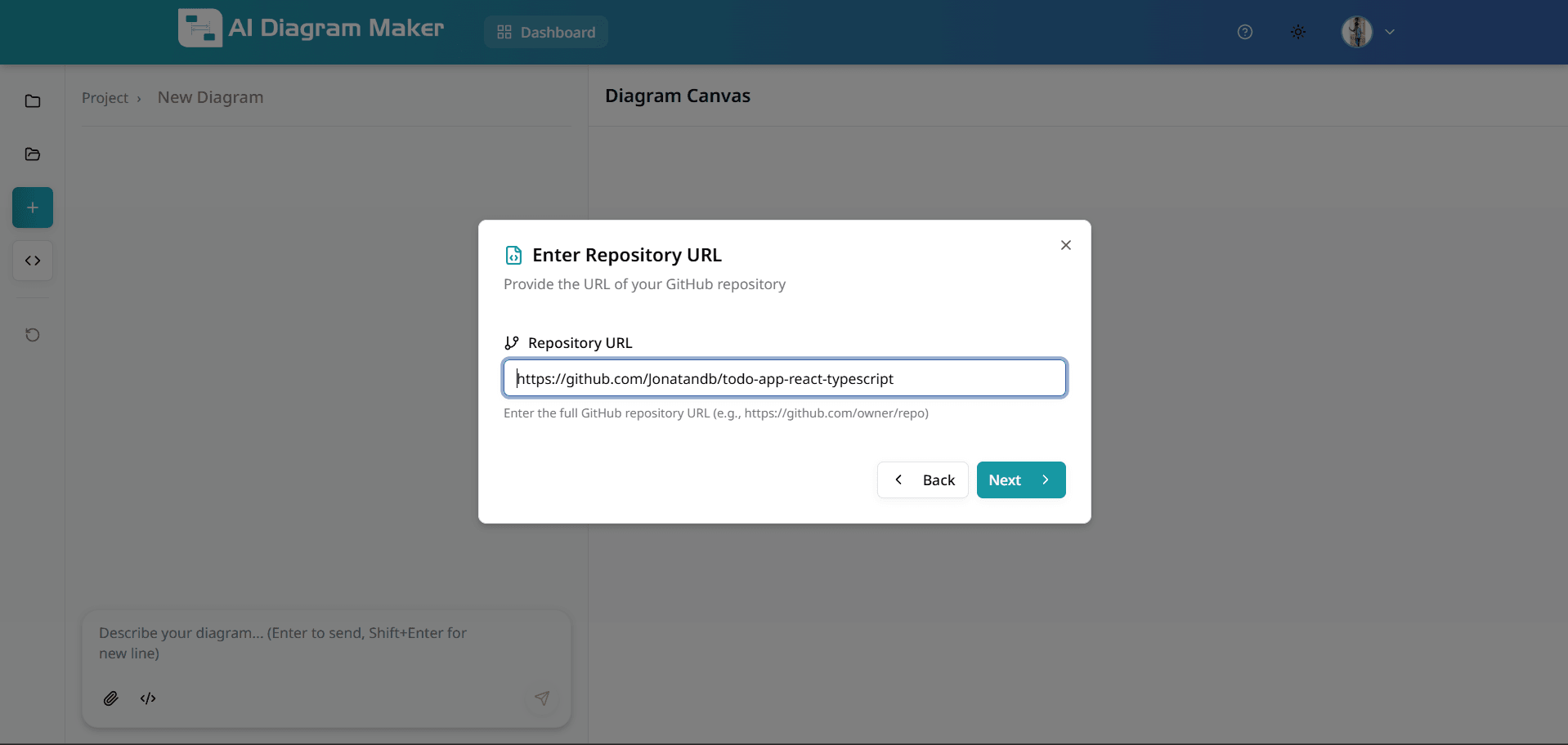
2.2.2 Enter the repository URL (Public)
Enter your GitHub repository URL in the format: https://github.com/owner/repository (e.g., https://github.com/jonatandb/todo-app-react-typescript). The tool will validate the URL, connect to GitHub, and retrieve the repository structure for analysis.
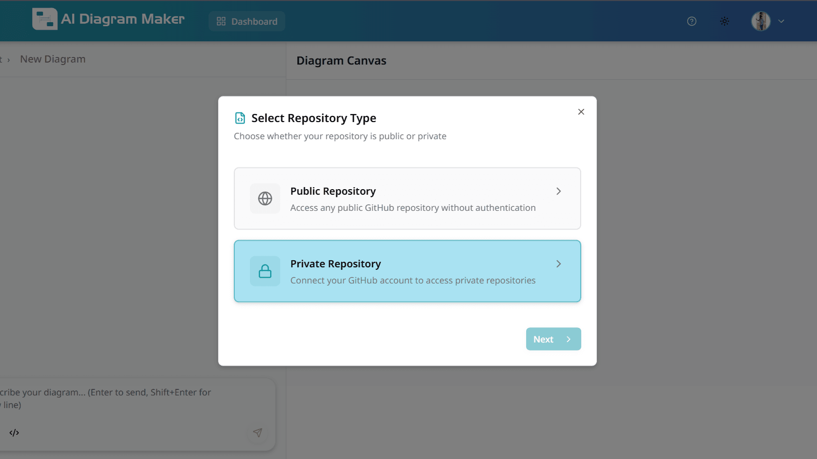
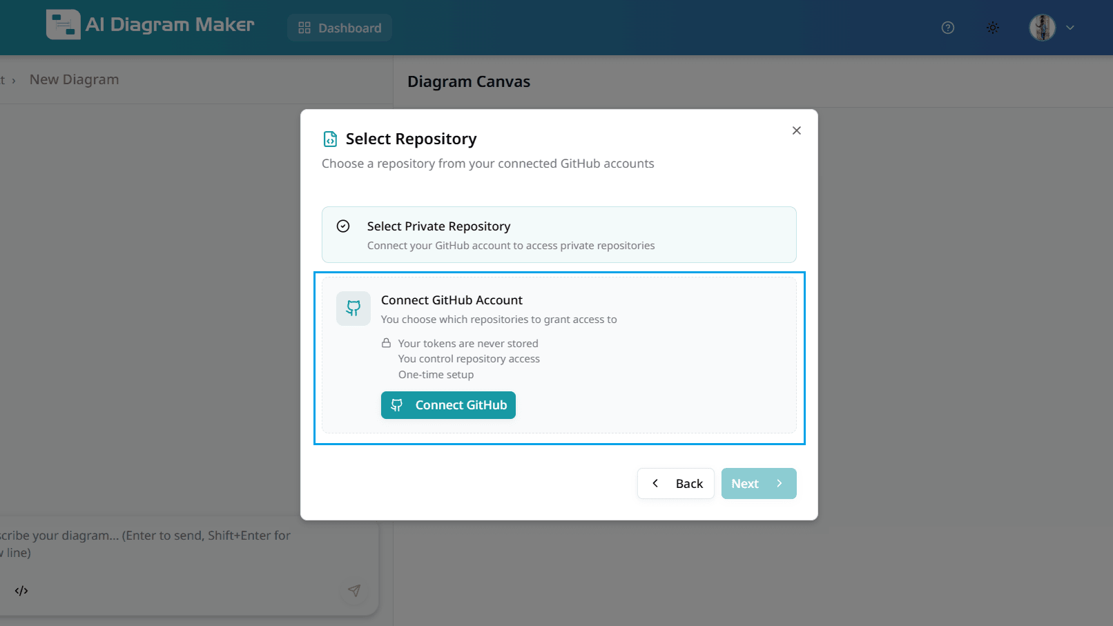
2.3.1 Select repository type - Private Repository
Choose "Private Repository" to connect your GitHub account and access private repositories. This requires authentication and repository permissions.
2.3.2 Connect GitHub Account (Private)
Click "Connect GitHub" to authorize AI Diagram Maker to access your private repositories. You'll be redirected to GitHub to grant the necessary permissions. Your tokens are never stored, and you control which repositories to grant access to.
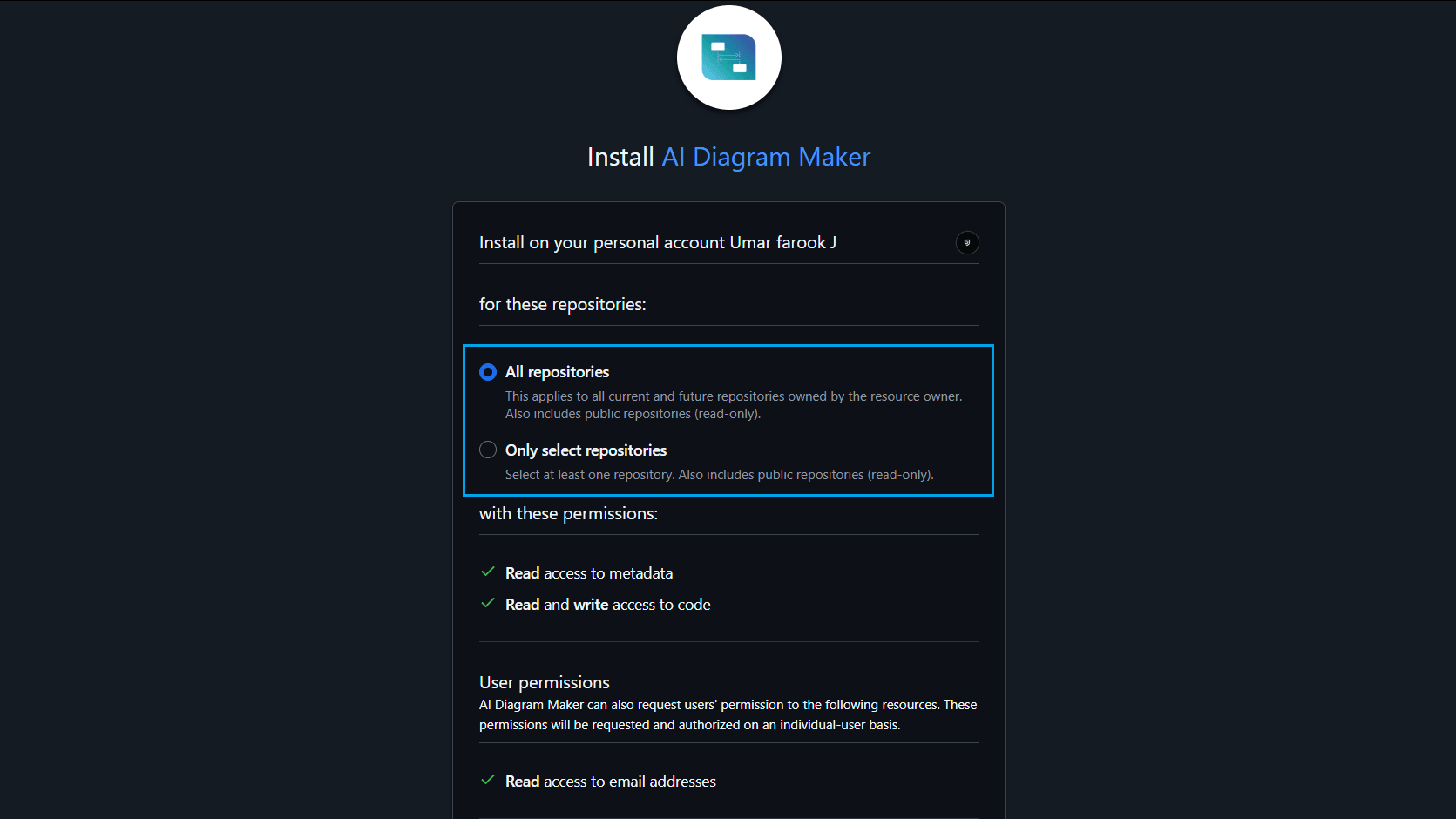
2.3.3 Select Repository Access (Private)
Choose whether to grant access to all repositories or only select specific repositories. Select "All repositories" for full access, or choose "Only select repositories" to limit access to specific repos. This is a one-time setup process.
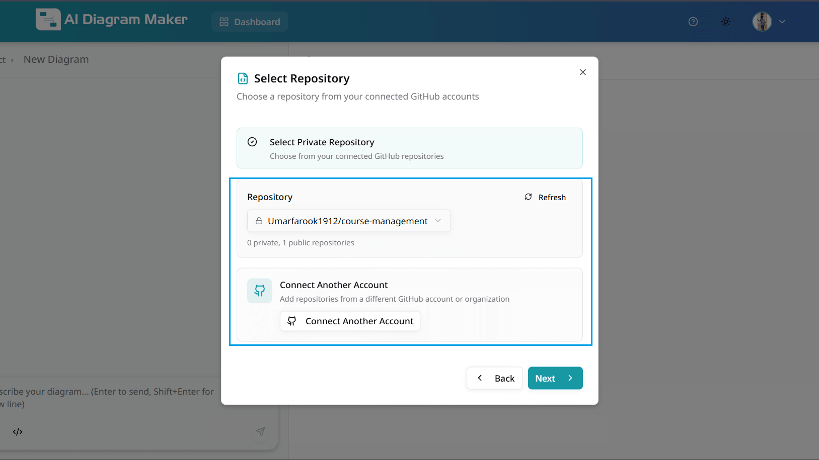
2.3.4 Choose Project Repository (Private)
After clicking "Install", select which repository you want to generate a diagram from. You can browse through your connected repositories and choose the one you need. You can also connect another GitHub account if needed.
2.4 Select files for the diagram
After the repository files are listed, choose which files to include or exclude from the analysis. AI credit tokens are calculated based on token usage, which increases with the number and size of source code files selected. To reduce token consumption and costs, only include the minimum required files needed to create your diagram. Exclude unnecessary files such as images, configuration files, test code, build artifacts, and generated code that are not needed for diagram creation. Click on individual files or folders to toggle their selection, and expand directories to selectively include specific files.
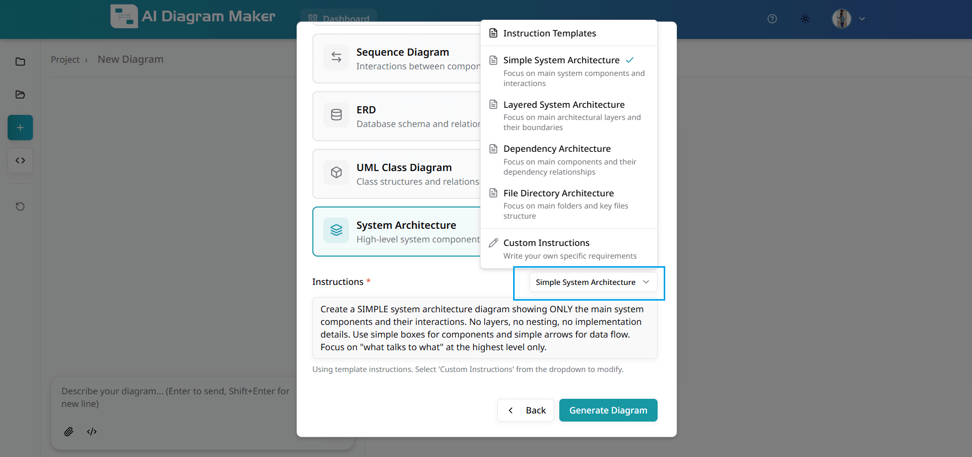
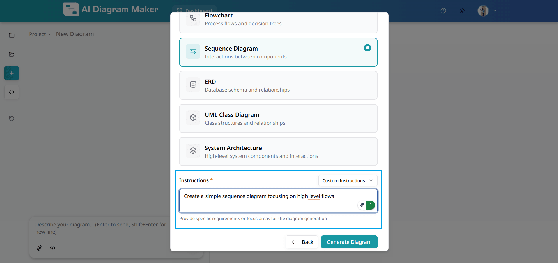
2.5 Choose diagram type
Choose from multiple diagram types to visualize your code: Flowchart (process flows and decision trees), Sequence Diagram (component interactions), ERD (database schema and relationships), UML Class Diagram (class structures and relationships), or System Architecture (high-level system components and interactions). Select the type that best represents your visualization needs.
2.6 Select instruction template
Instruction templates provide predefined prompts optimized for different architectural views: Simple System Architecture (main components and interactions), Layered System Architecture (architectural layers and boundaries), Dependency Architecture (component dependencies), or File Directory Architecture (folder and file structure). These templates help the AI understand exactly what kind of diagram you want to generate.
2.7 Write custom instructions (optional)
If the pre-built instruction templates don't fit your needs, select "Custom Instructions" to write your own specific requirements for diagram generation. Describe exactly what you want to visualize, which components to focus on, what relationships to highlight, or any specific architectural patterns to emphasize. This gives you complete flexibility in how your codebase is visualized.
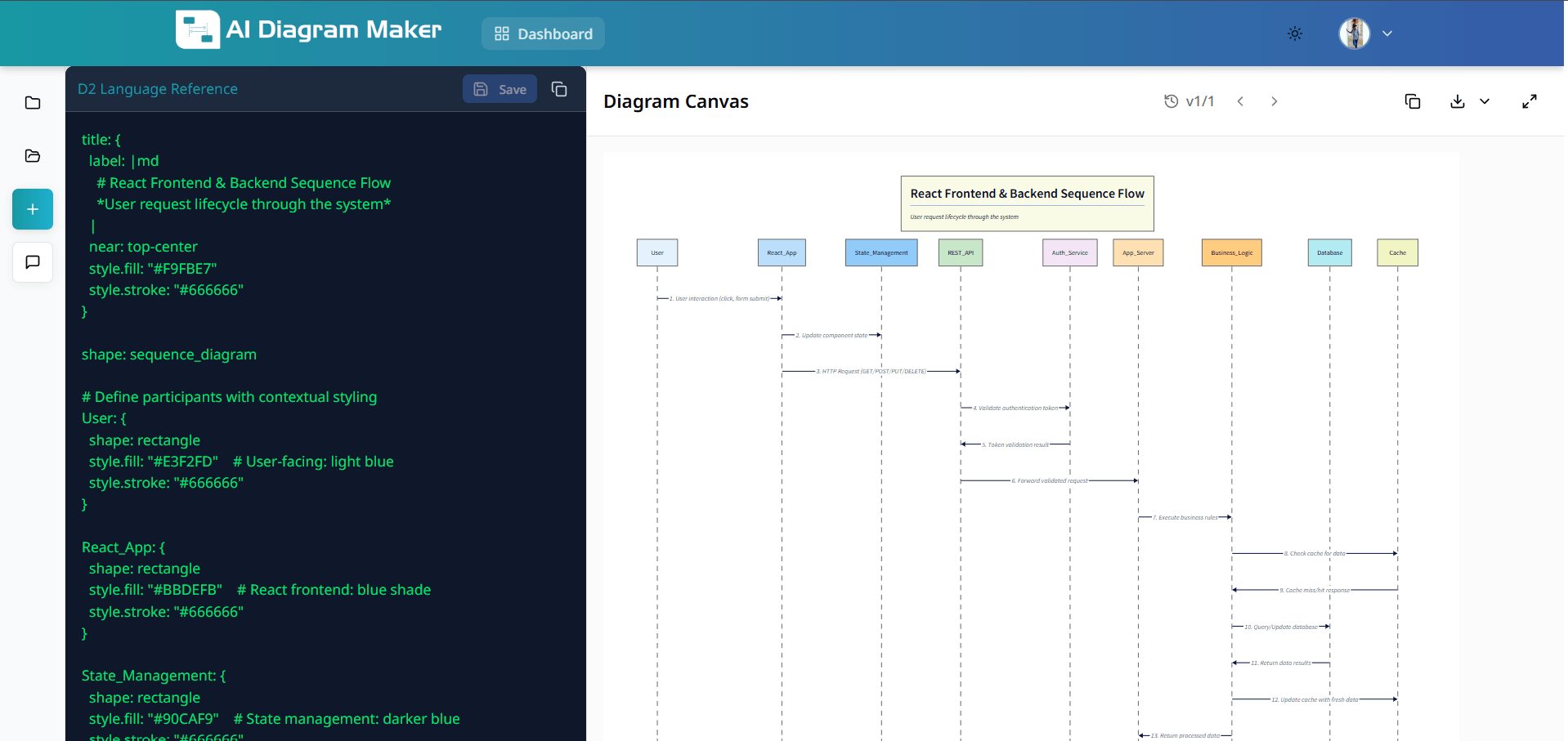
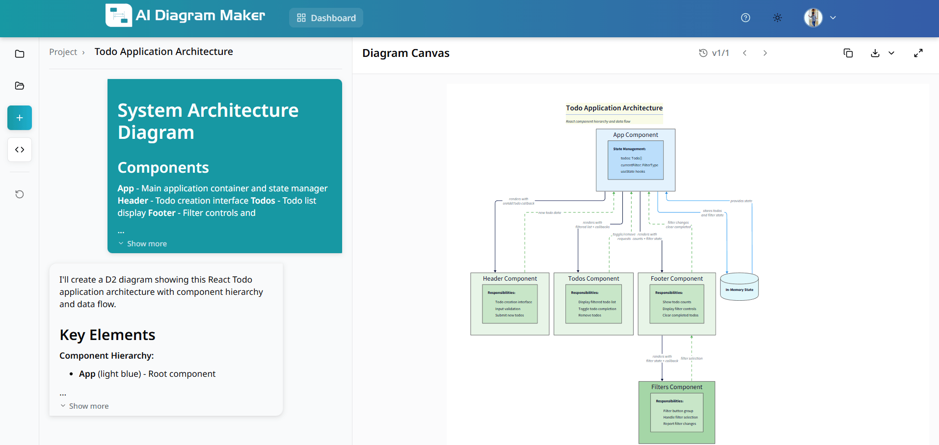
2.8 View the generated diagram
The AI generates a professional architecture diagram based on your repository analysis and instructions. The diagram visualizes your codebase structure with proper component hierarchy, clear relationships, and intelligent layout. You can further refine the diagram using prompts or code editing, just like any other diagram.
How do I edit diagrams using code?
Refine your diagrams using AI prompts, canvas interactions, or direct code editing.
3.1 How do I edit using text prompts?
Type your editing instructions in plain English. Describe the changes you need—add elements, change connections, or adjust layout.
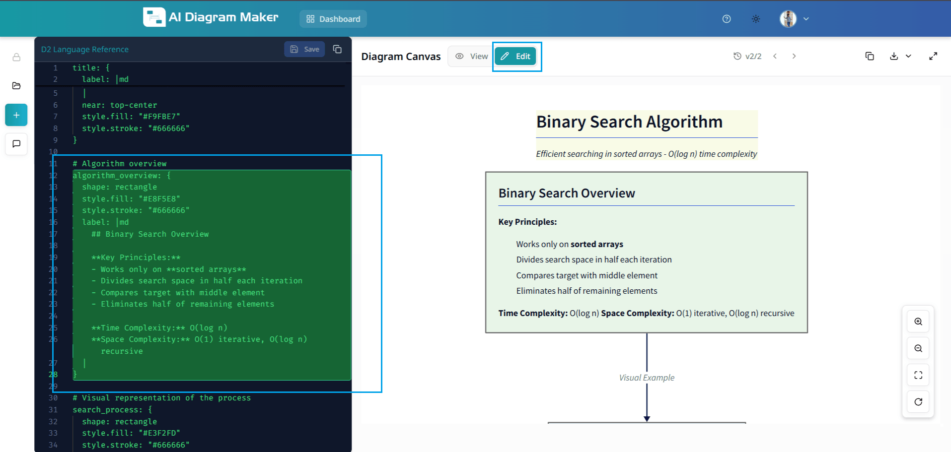
3.2 How do I switch to code editing?
Switch to code view to edit the D2 diagram code directly for maximum control and precision. This mode provides access to raw D2 syntax for fine-tuned adjustments.
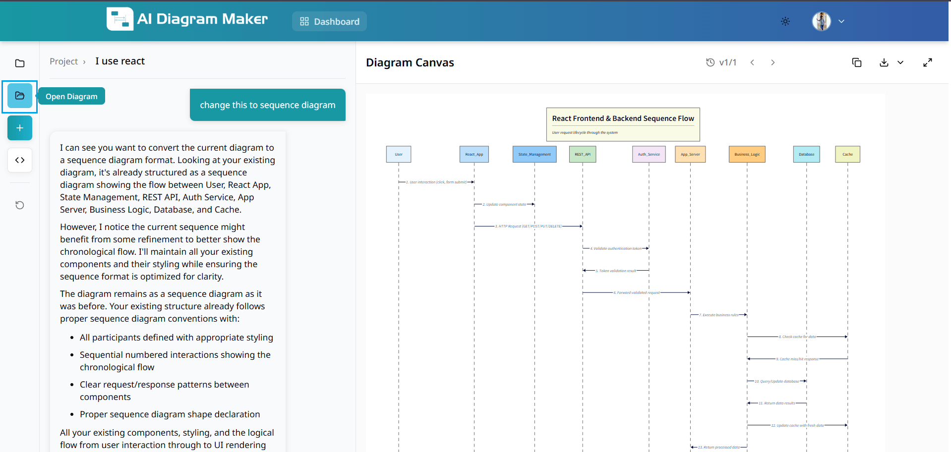
3.3 How do I edit the D2 code?
Edit D2 code directly for precise modifications. Use D2 syntax to create complex layouts, custom styling, and intricate relationships. For example, if you want to change the label or style of a participant, place your cursor on the relevant code block (such as the "User" block in the example). The corresponding part of the diagram and code will be highlighted, making it easy to see and edit exactly what you want.

3.4 How do I use Edit mode to modify elements on the Canvas?
Switch to Edit mode to select and modify diagram elements. Selecting a shape or text highlights the corresponding element for in-place edits. The canvas highlights the selected component so you can easily update labels, styles, or positions.
3.5 How do I use View mode to interact with the Canvas?
Switch to View mode on the canvas to interact with the rendered diagram. In View mode you can drag and reposition created diagrams and pan the canvas to inspect layout and spacing.
3.6 Where can I learn more about D2?
You can enhance your diagrams by learning D2 syntax or embed them directly in your documentation:
How to customize diagrams?
You can customize diagrams using the top toolbar and the bottom draggable bar.
4.1 How do I change diagram colors and switch between light and dark theme?
Use the Color theme option in the top toolbar to change diagram colors and switch between light and dark theme. Choose from presets such as Pastel Layers, Tokyo Night, Monokai Pro, and more.
4.2 Where do I set the layout direction (top-to-bottom, left-to-right, etc.)?
Use the Layout Direction option in the top toolbar to set the diagram flow: • Top → Bottom • Left → Right • Right → Left • Bottom → Top
4.3 What layout engine options are available (Adaptive vs Hierarchical)?
Use the Layout Engine option in the top toolbar: • Adaptive: handles complex, irregular diagrams with smarter edge placement • Hierarchical: strict top-down tree structure, best for simple directed graphs and flowcharts

4.4 Can I switch between Classic and Sketch look?
Use the Look option in the top toolbar: • Classic: standard crisp diagram rendering • Sketch: hand-drawn sketch style for a more casual look
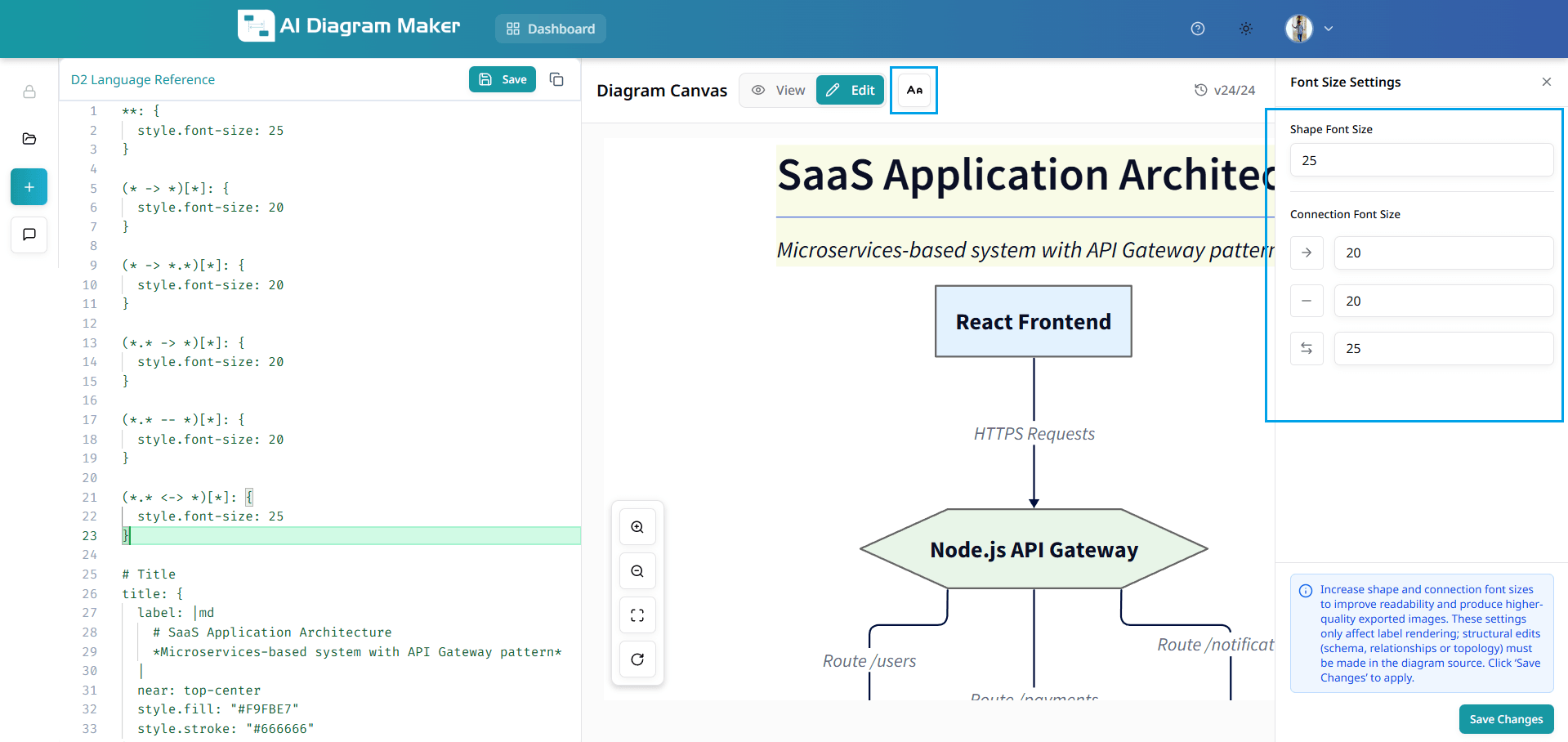
4.5 Where do I change node and connection font size?
Use the font size (Aa) option in the top toolbar: • Node font size: S, M, L, XL presets or custom value • Connection font size: S, M, L, XL presets or custom value
4.6 How do I edit a node label using the bottom draggable bar?
Click a node to select it; the bottom draggable bar appears with a label field and dedicated label editors: • Normal label: plain text • Markdown label: formatted content • Multi-line label: long scrollable text • Code content: dedicated editor for code snippets
4.7 How do I change the shape of a node?
Select a node and use the shape picker in the bottom draggable bar to change its form. Choose from rectangles, ovals, diamonds, cylinders, hexagons, parallelograms, trapezoids, and other shapes. The palette opens above the bar so you can pick the shape that best fits your diagram.
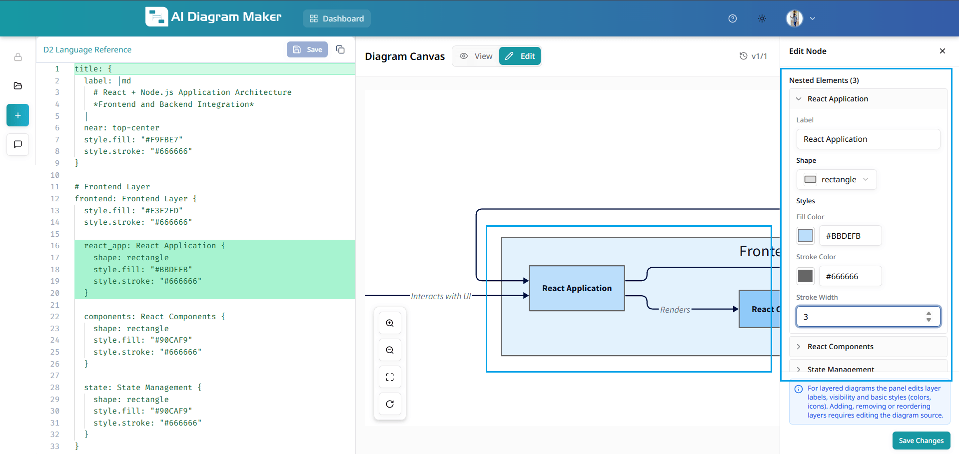
4.8 How do I set fill color, stroke color, and stroke width for a node?
Select a node and use the fill and stroke controls in the bottom draggable bar: • Fill color: theme swatches, preset palettes (e.g. Soft Fills, Bold Fills, Neutrals), or custom hex value • Stroke color: same options as fill color • Stroke width: Thin, Normal, Medium, Thick, or Extra Thick, or custom value
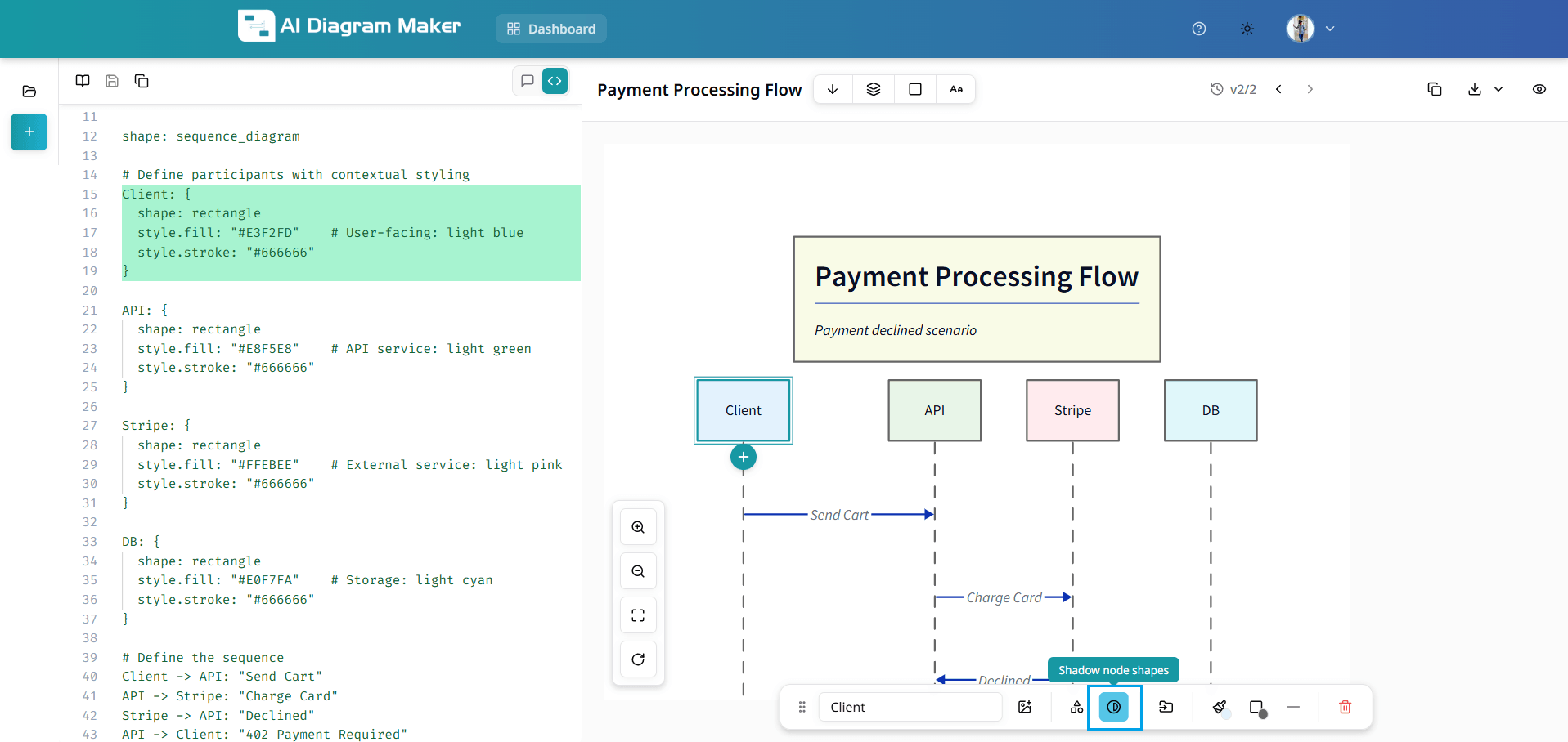
4.9 Can I apply a shadow to nodes?
Select a node and use the shadow option in the bottom draggable bar to add a shadow effect. Toggle "Shadow node shapes" to give the selected node a subtle drop shadow for a more polished look.
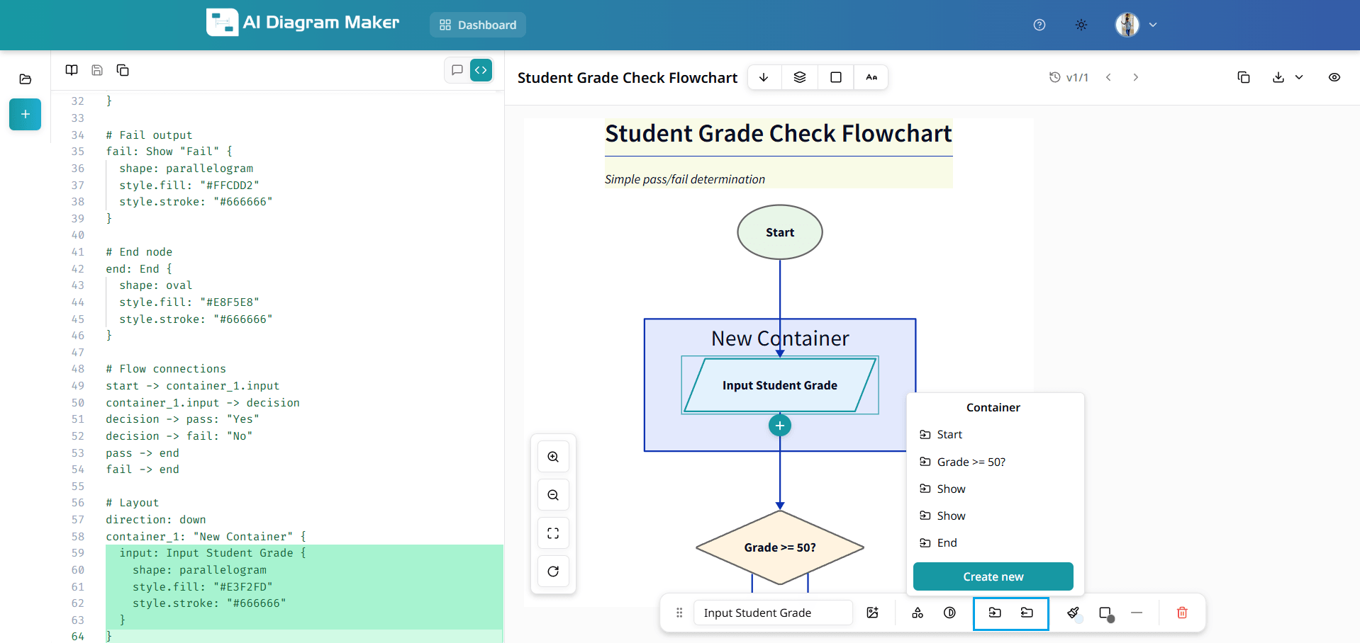
4.10 How do I move a node to a container, remove it from a container, or delete a container?
Select a node to use container options in the bottom draggable bar; select a container to delete it: • Move to Container: place the node inside an existing container or choose "Create new" to create one • Remove from Container: take the node out of its current container • Delete container: click the container to select it, then use the Delete container icon in the bottom bar
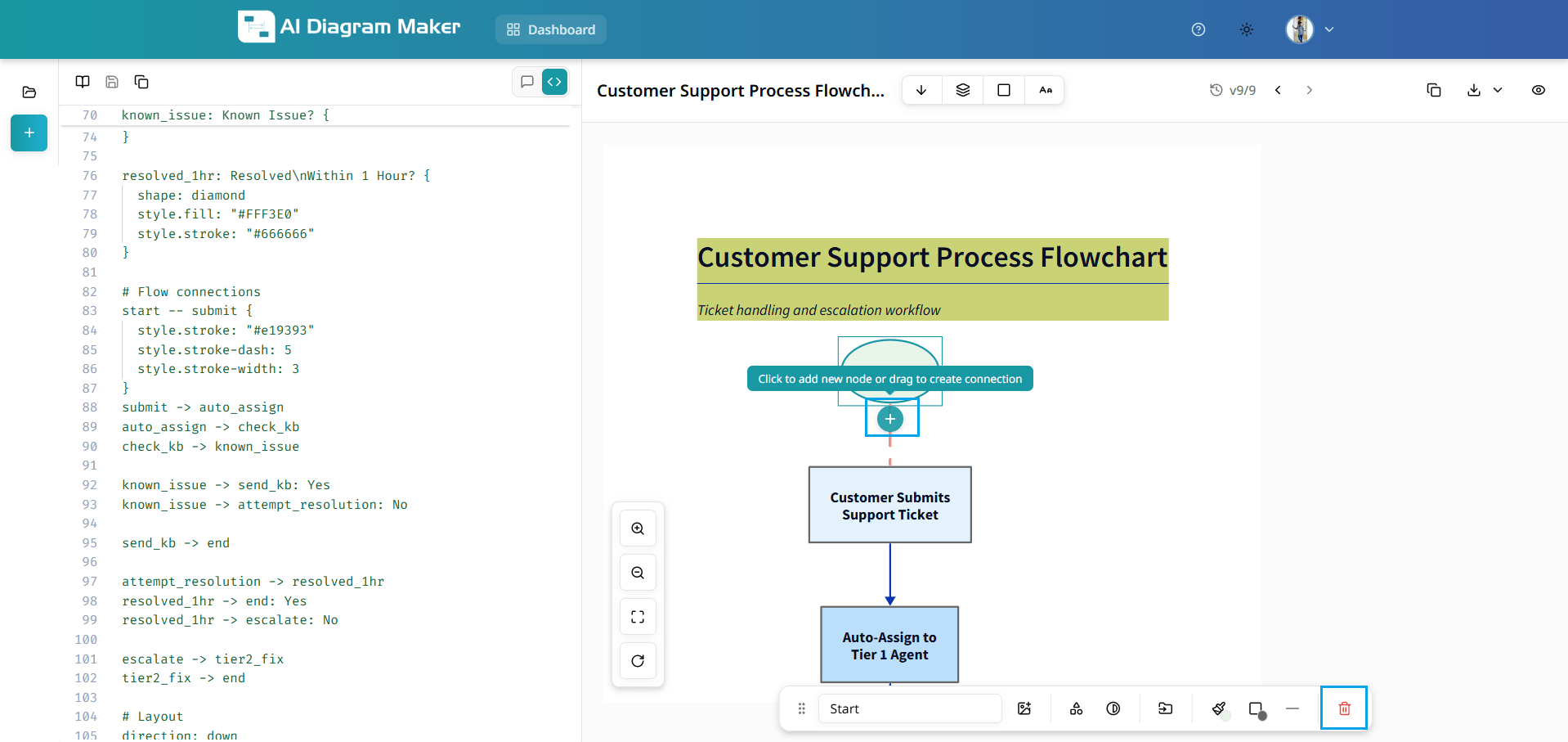
4.11 How do I add a new node or connection, or delete a node?
Use the bottom draggable bar when a node or connection is selected: • Add new node: select a node to show the plus icon below it; click the plus to add a new node • Create connection: drag from the plus icon to another node to create a new connection • Delete node: select the node and use the delete (trash) icon in the bottom bar
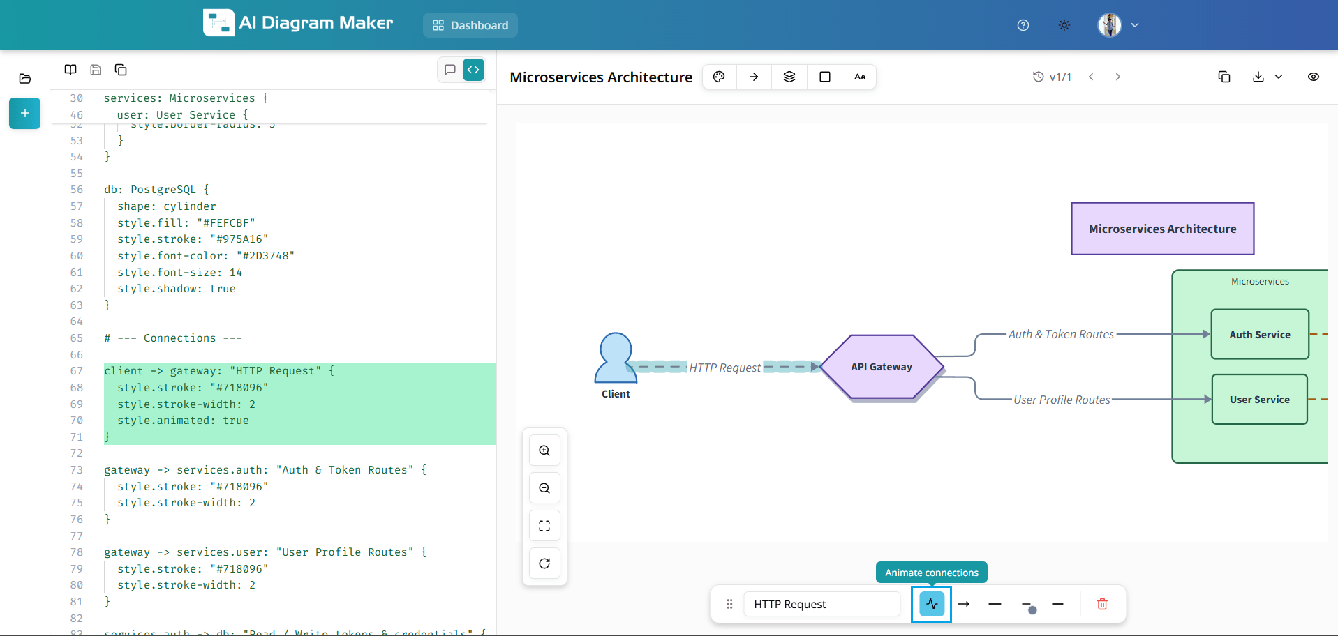
4.12 Can I add animation to a connection?
Select a connection to open the bottom draggable bar. Use the "Animate connections" option (waveform icon) to enable animation on that connection. Animated connections show a flowing effect along the line.
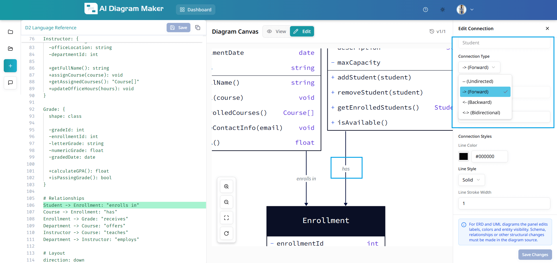
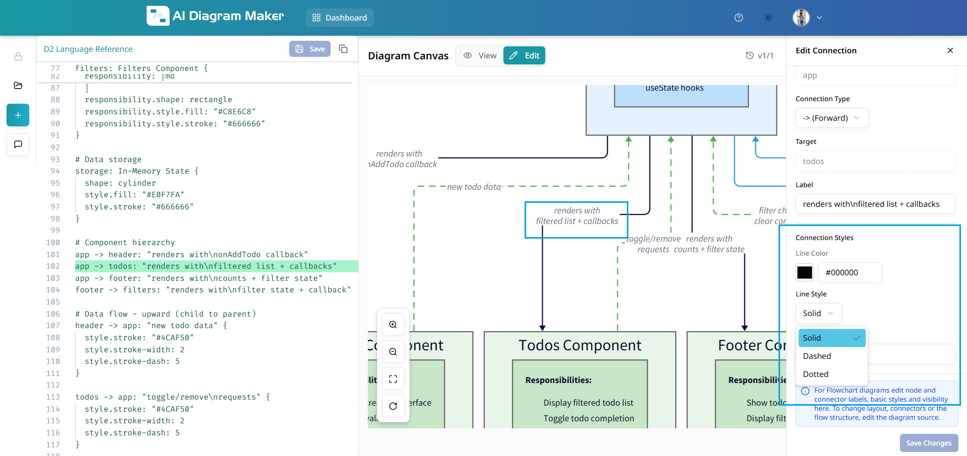
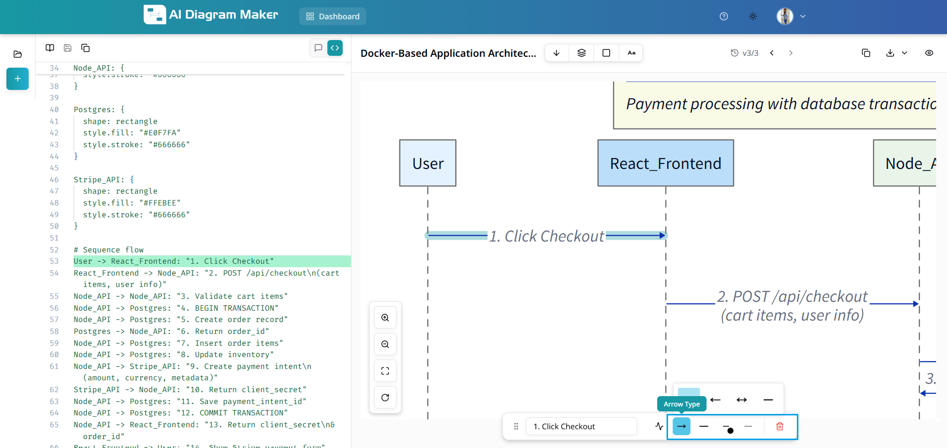
4.13 How do I edit connection properties (arrow type, line style, color, width)?
Click a connection to select it; the bottom draggable bar shows connection editing options: • Arrow type: Forward, Backward, Bidirectional, or Undirected • Line style: Solid, Dashed, or Long dash • Line color: theme swatches, preset palettes (e.g. Soft Fills, Bold Fills, Neutrals), or custom hex value • Width: Thin, Normal, Medium, Thick, or Extra Thick, or custom value • Delete Connection: use the trash icon to remove the connection
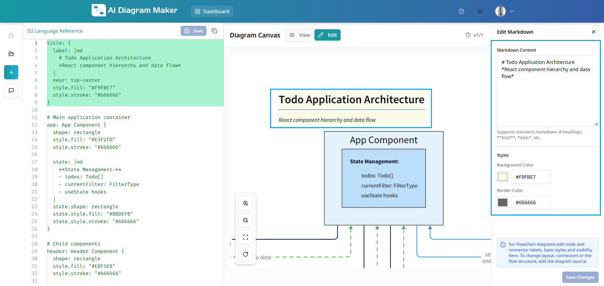
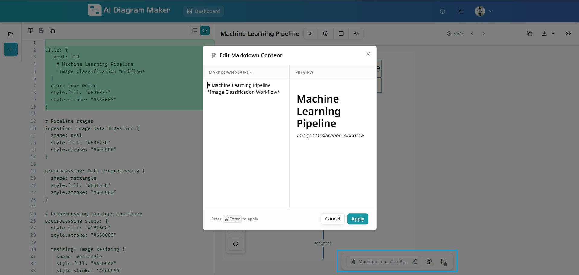
4.14 How do I edit markdown content and change its background and border color?
Click a markdown element (e.g. a title or markdown-labeled node) to select it. The bottom draggable bar shows: • Dedicated label editor: edit the markdown text • Background color: theme swatches and custom hex (same as fill color) • Border color: theme swatches and custom hex (same as stroke color)
How do I view my diagrams?
View diagrams in full-screen mode with zoom controls.
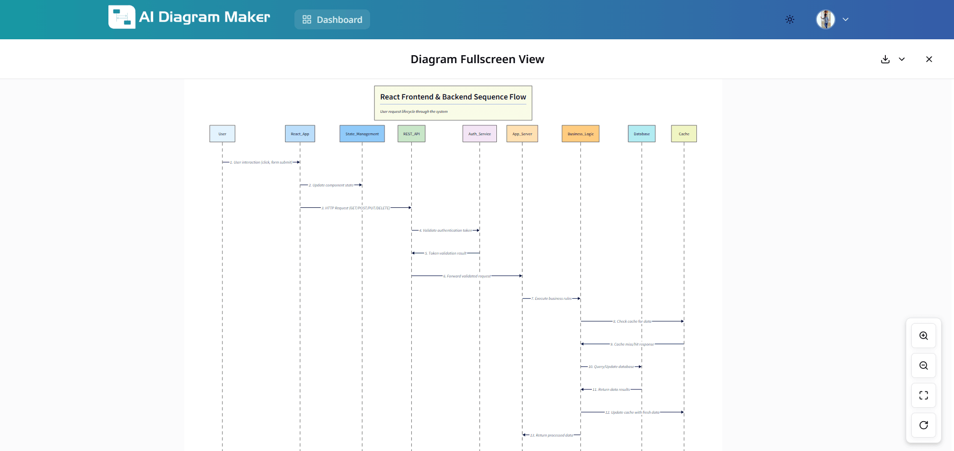
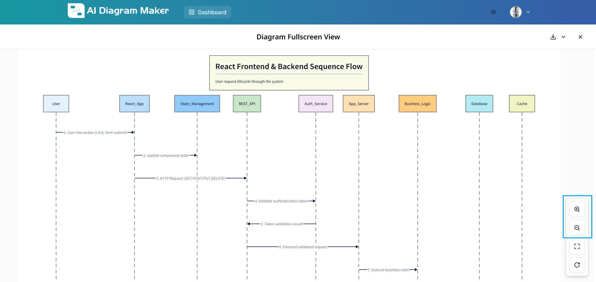
5.1 How do I enter full-screen mode?
Click the full-screen button in the bottom left of diagram canvas to expand your diagram for better visibility.
5.2 What can I do in full-screen mode?
In full-screen mode, you can examine every detail, connection, and element with enhanced clarity. The expanded view is ideal for presentations, detailed analysis, and reviewing complex diagrams.
5.3 How do I zoom in full-screen mode?
Use zoom buttons to adjust diagram size for optimal viewing. Focus on specific sections or view the complete overview. Controls maintain diagram quality at any zoom level.
How do I export my diagrams?
Export diagrams as SVG or PNG in various formats.
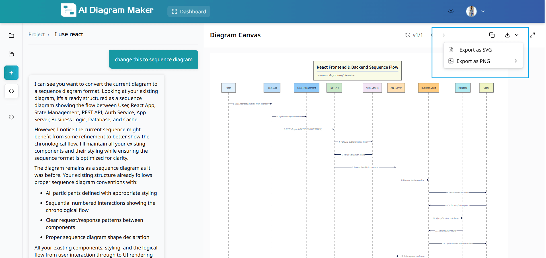
6.1 What export formats are available?
Download diagrams as SVG (scalable for printing) or PNG (pixel-perfect for digital use). Choose the format that suits your needs.
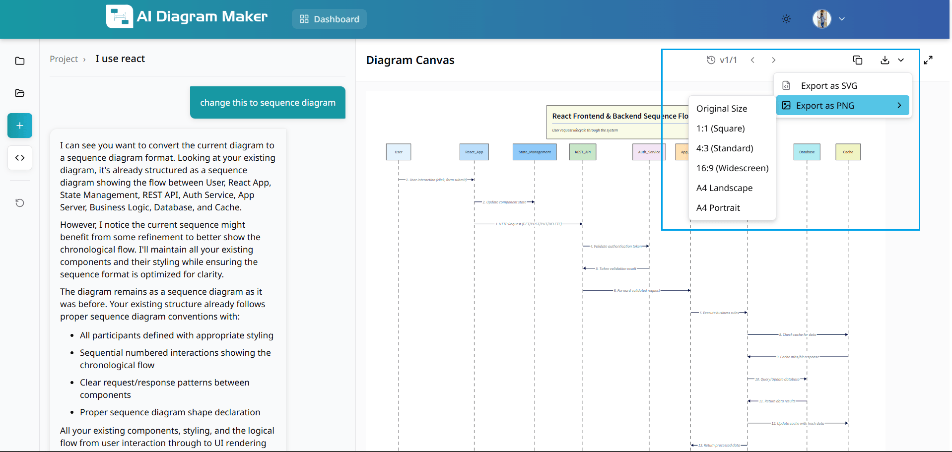
6.2 What aspect ratios can I choose for PNG?
Choose from multiple aspect ratios: Original Size, 1:1 (Square), 4:3 (Standard), 16:9 (Widescreen), A4 Landscape, A4 Portrait. Each ratio optimizes your diagram for different use cases.
6.3 How do I export as .drawio.xml?
Export your diagram as a .drawio.xml file (Draw.io format) to preserve editable diagram data and enable importing back into draw.io / diagrams.net for further editing.
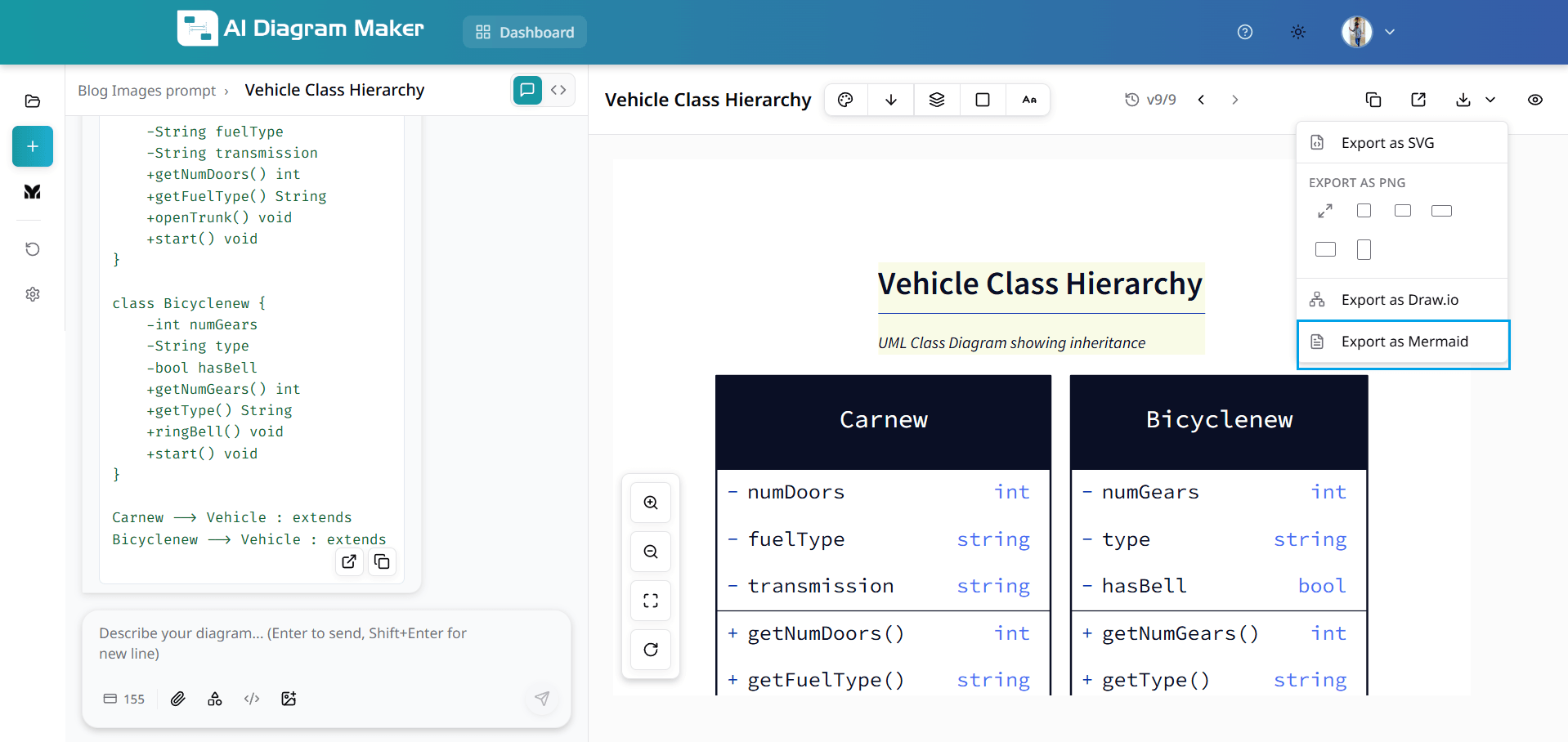
6.4 How do I export as Mermaid?
Open the export menu and choose Export as Mermaid to download the diagram as Mermaid code. Use this format when you want to edit or share diagrams in Mermaid-compatible tools and workflows.
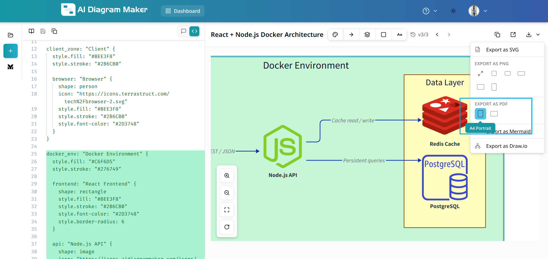
6.5 How do I export as PDF?
Open the export menu and choose Export as PDF to save your diagram for printing or sharing. Select A4 Portrait for tall layouts or A4 Landscape for wide diagrams depending on how you want the page to render.
How do I open saved diagrams?
Access and search your saved diagrams from the diagram library.
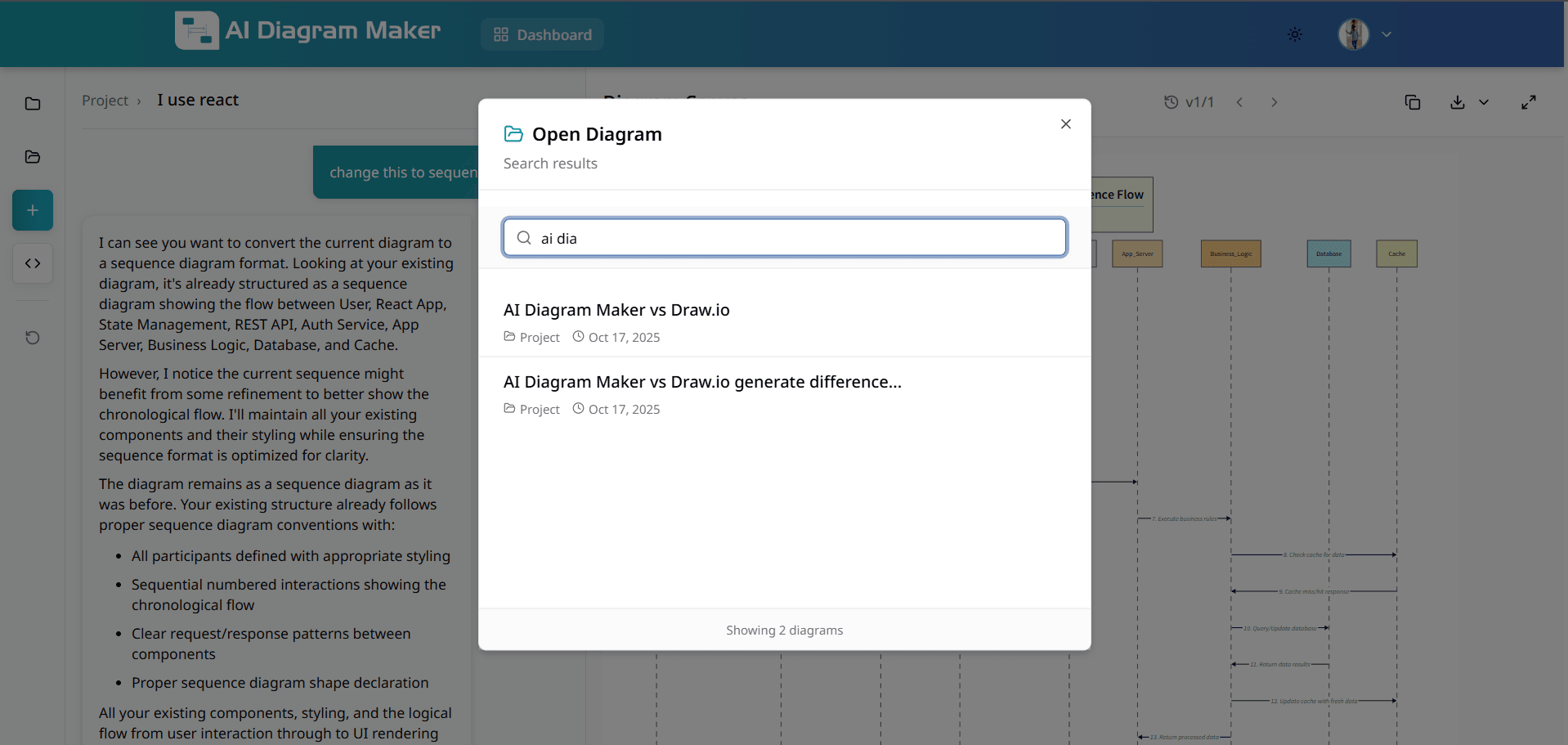
7.1 Where is the Open Diagram option?
Click "Open Diagram" in the top-left menu to access your diagram library and continue work on previous projects.
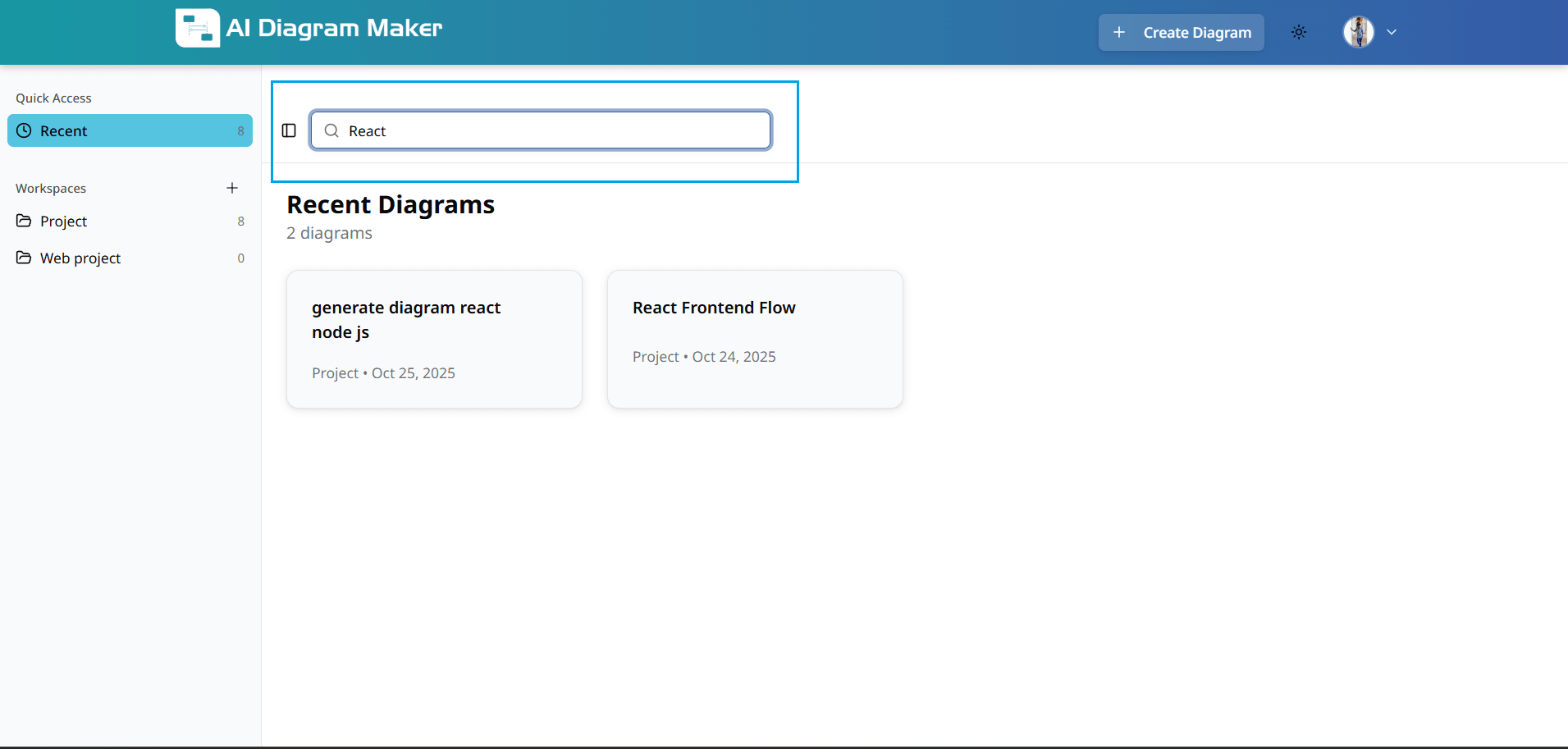
7.2 How do I search in the diagram library?
Use the search bar to find diagrams by keywords, project names, or types. Quickly locate any diagram in your collection.
How do I use the dashboard?
View and manage all your diagrams from the dashboard.
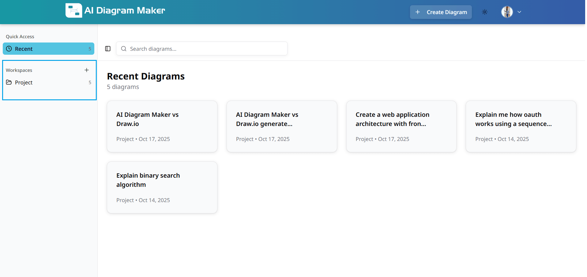
8.1 Where is the dashboard?
Click "Dashboard" in the top navigation to view all diagrams, recent activity, and workspace organization.
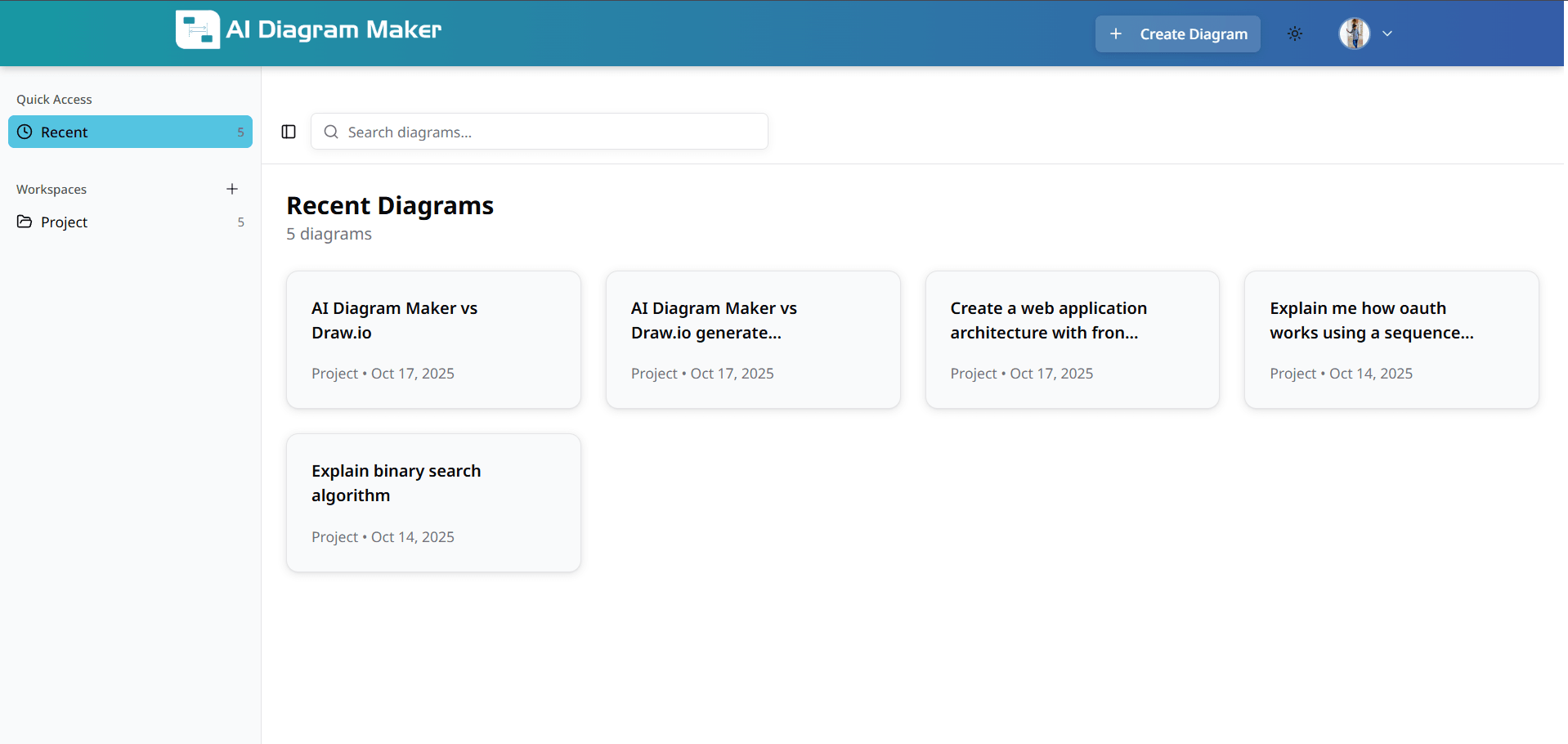
8.2 How do I see my recent diagrams?
View recently created diagrams in the dashboard for quick access. Pick up where you left off without searching through your entire collection.
8.3 How do I search from the dashboard?
Use the dashboard search to find specific diagrams. Enter keywords, diagram names, or filter by date to locate diagrams in your dashboard view.
How do I organize diagrams into workspaces?
Organize diagrams by creating and managing workspaces.
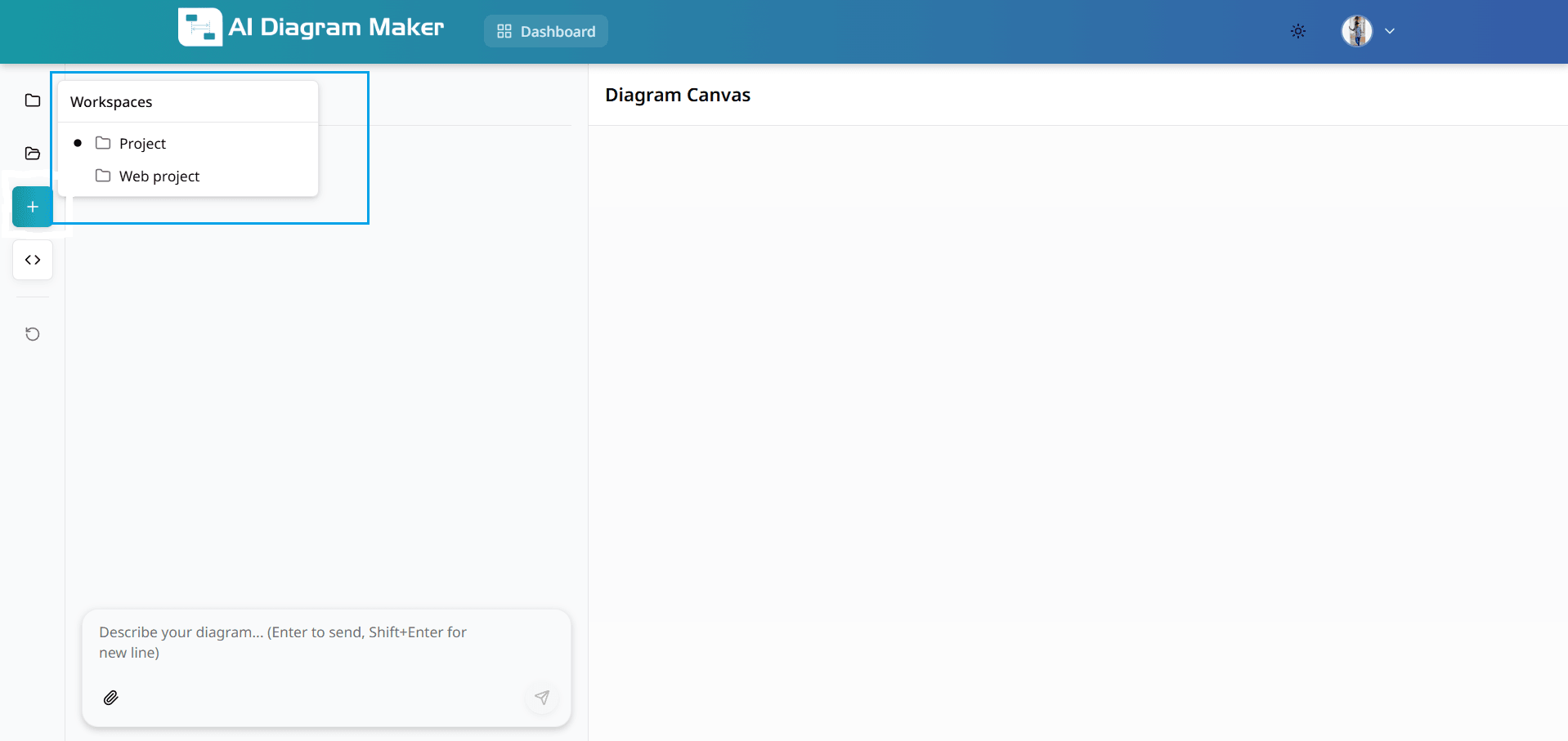
9.1 Where do I manage workspaces?
Go to the dashboard to access workspace management features. This area provides tools for organizing diagrams into logical groups and maintaining a structured workflow.
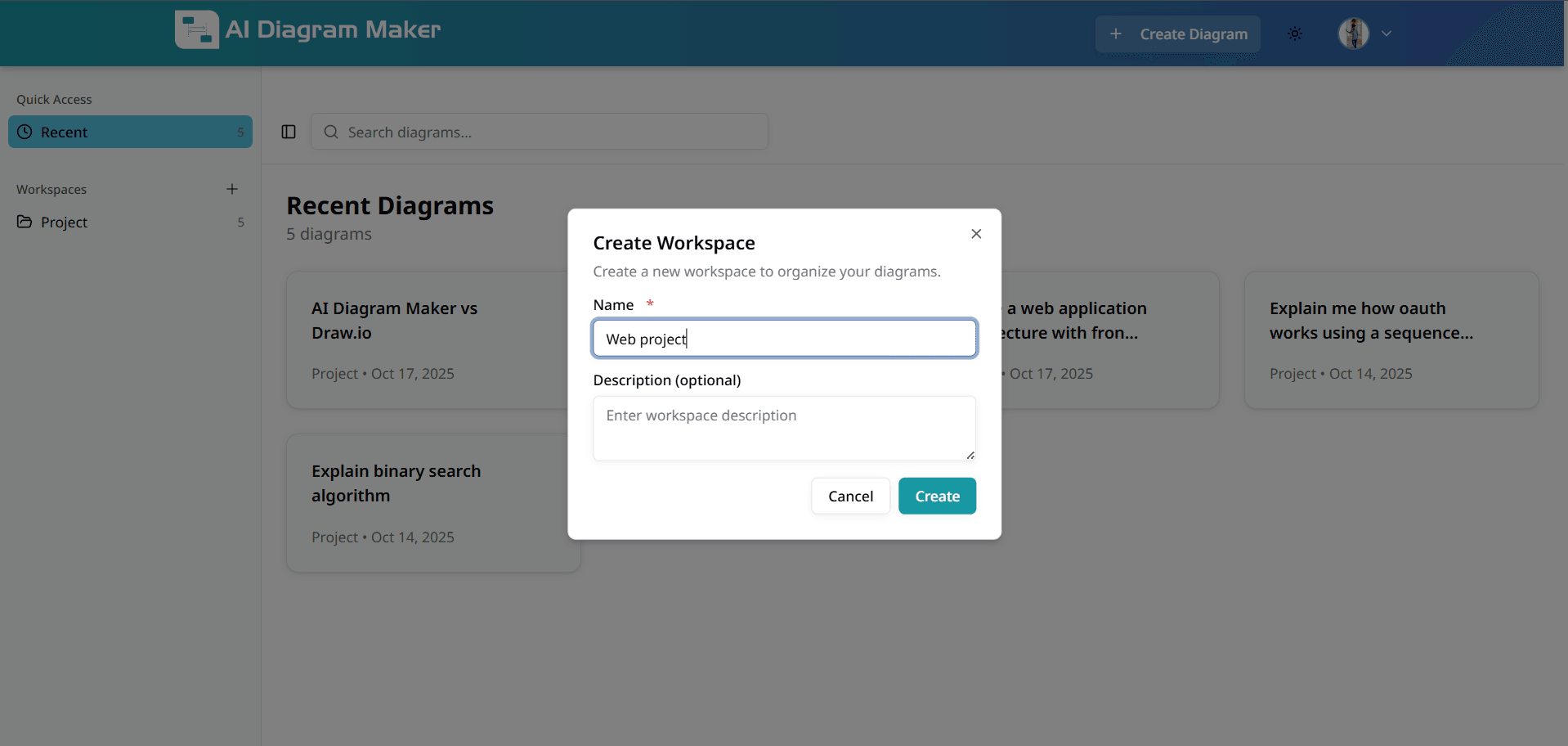
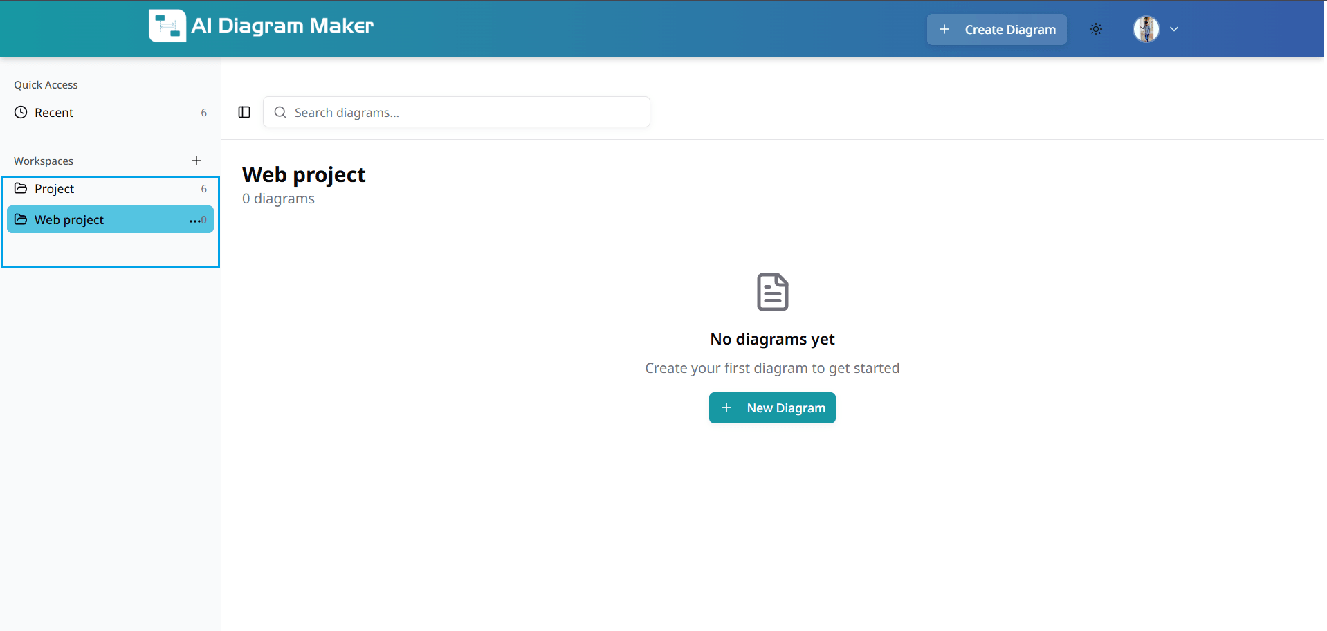
9.2 How do I create a workspace?
Click "Create Workspace" on the left side. Enter a name and optional description to organize diagrams by project or category. Workspaces help maintain clean separation between different types of work.

9.3 How do I filter diagrams by workspace?
Filter diagrams by workspace to manage multiple collections separately. Work on different projects without mixing diagrams.

9.4 How do I assign a diagram to a workspace?
When creating a diagram, choose a workspace to keep your work organized. Each diagram is automatically filed in the appropriate location for easier retrieval.
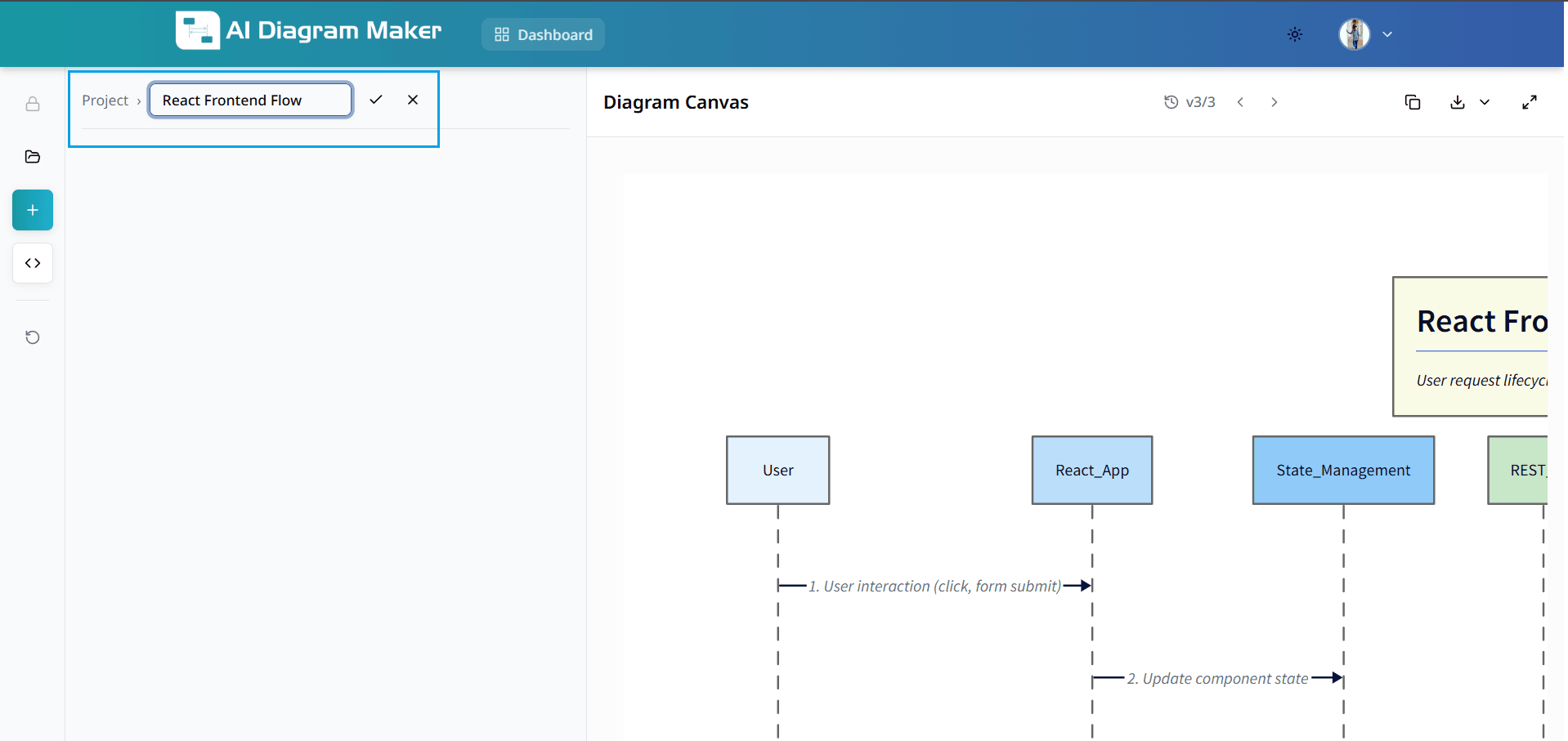
9.5 How do I change title of a diagram?
Click the diagram title in the top-left corner to edit. Use descriptive names for better organization and searchability.
How do I manage diagram versions? (Premium)
Track changes and revert to previous versions (premium feature).
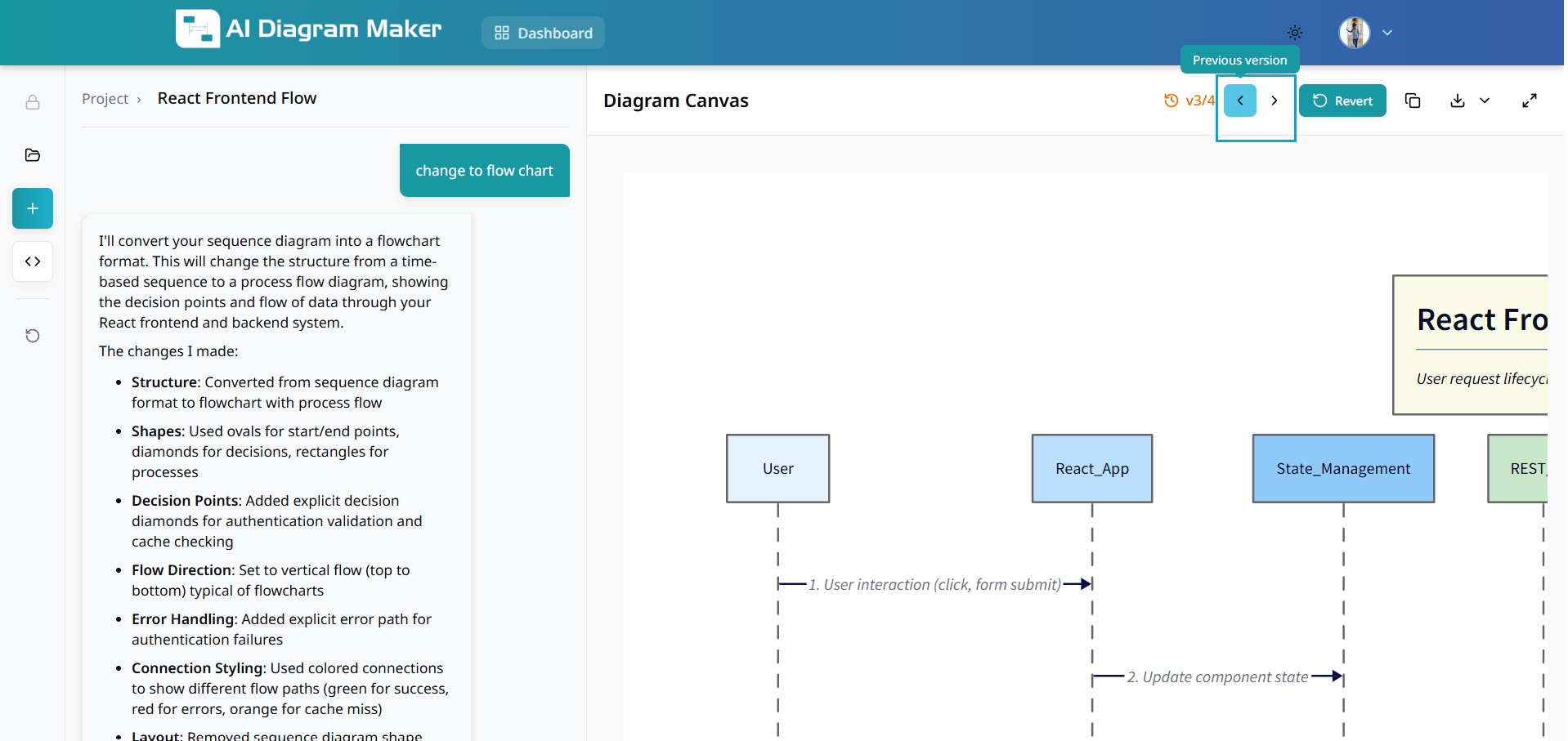
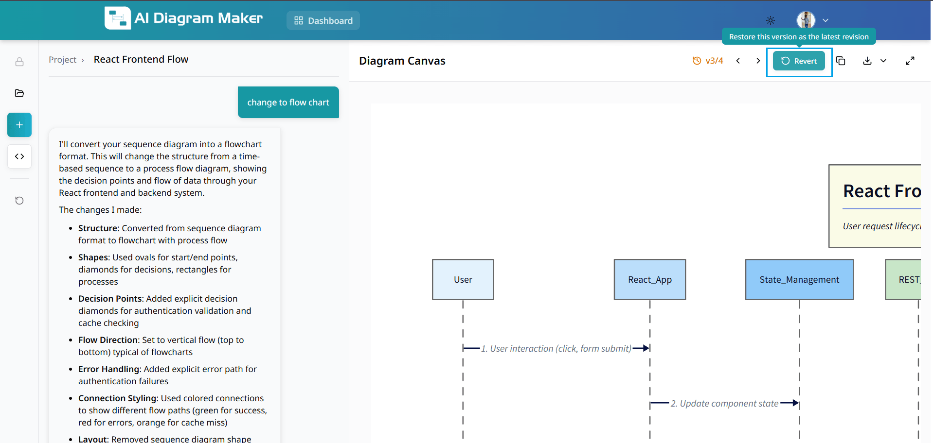
10.1 How do I view previous versions?
Use version control buttons to navigate through previous versions of your diagram. This premium feature allows you to review the evolution of your work (paid users only).

10.2 How do I revert to an older version?
Click revert to restore a previous version. This clears chat history and restores your diagram to an earlier state (premium feature for paid users).

How do I manage my account?
View account details, credits, and billing information.
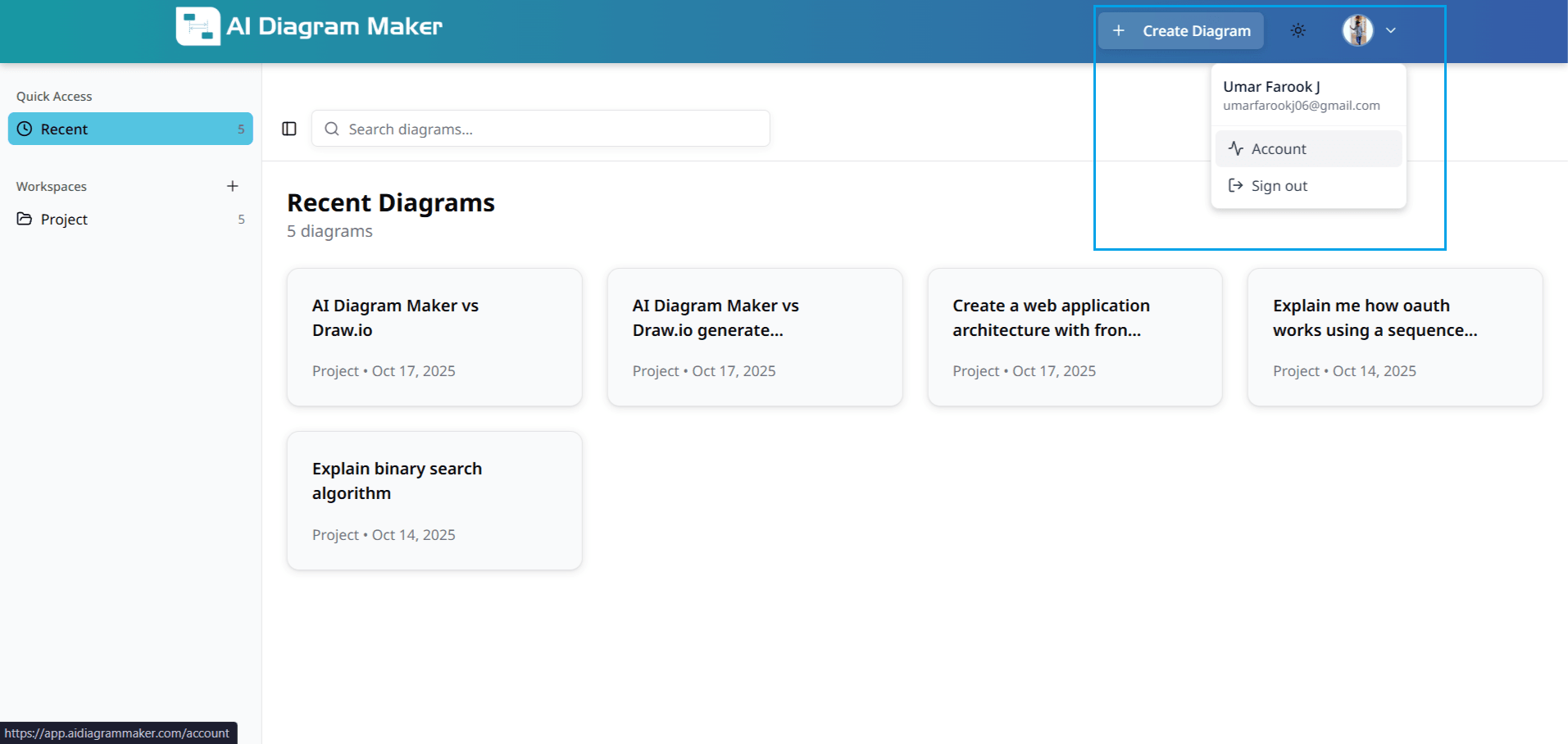
11.1 Where are my account settings?
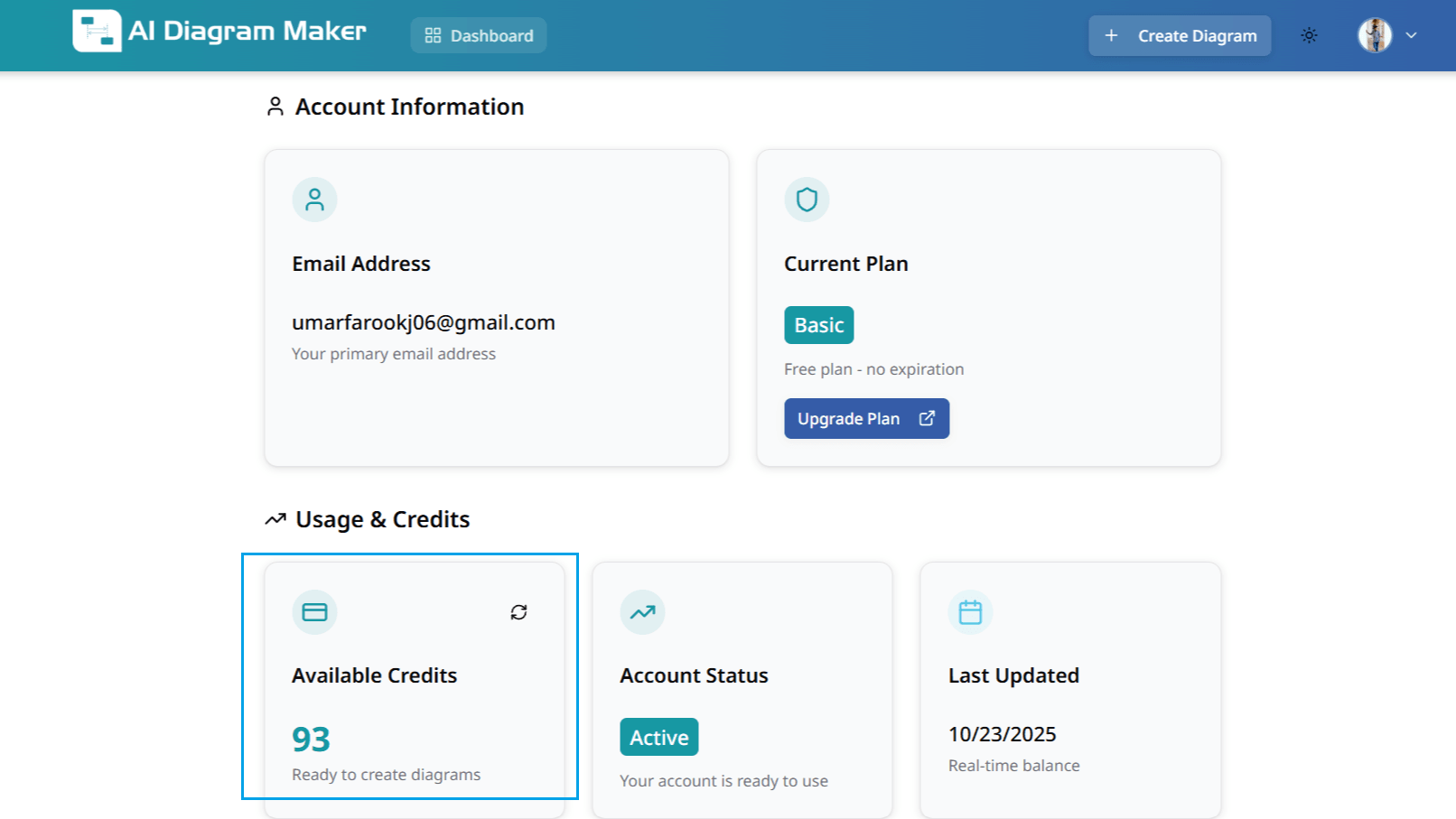
Click your profile icon in the top-right corner to access account settings, billing information, and preferences.

11.2 How do I check my credits and usage?
Select "Account" from the menu to view email, current plan, available credits, and billing history. Monitor your usage to ensure uninterrupted service.
How can I improve my workflow?
Discover helpful tips and best practices for enhancing productivity.
12.1 How do I reduce token usage?
Minimize token consumption and costs with these strategies: • Customize with the top toolbar and bottom bar – Change colors, layout, look, and font sizes without consuming tokens • Edit D2 Code Directly – Make precise code changes for elements not available in the edit panel • Pre-process Documents – Extract key information using Claude or ChatGPT first, then use focused prompts instead of uploading large documents • Clear Chat History – Remove conversation history while preserving your diagram to reduce context size
13. How do I add and manage icons in diagrams?
Add icons to nodes using icon mode in the chat (automatic) or the bottom draggable bar (Add icon, Select Icon popover). Browse by category, then change or remove icons from the bottom bar when a node with an icon is selected.
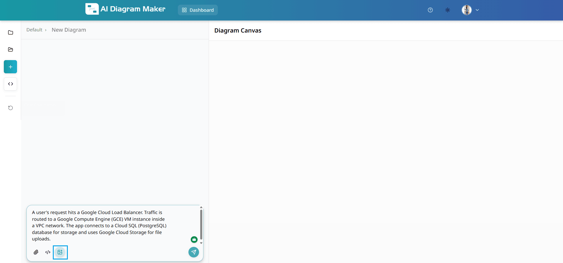
13.1 How do I enable icon mode in the chat input?
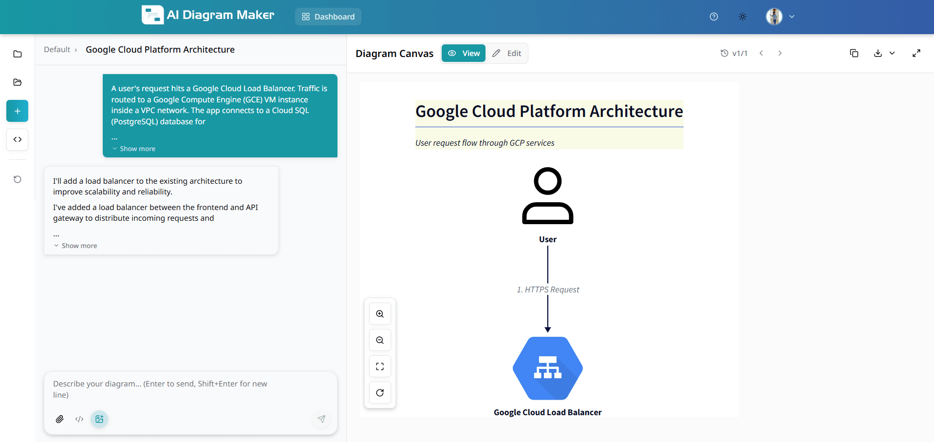
Icon mode automatically suggests and adds an appropriate icon inside nodes based on the node label. To enable it, click the image icon in the chat input and enter a prompt. Example prompt you can use: A user's request hits a Google Cloud Load Balancer. Traffic is routed to a Google Compute Engine (GCE) VM instance inside a VPC network. The app connects to a Cloud SQL (PostgreSQL) database for storage and uses Google Cloud Storage for file uploads. When icon mode adds icons, the system may also update the node's appearance by changing some simple shapes to shape: image so the icon is displayed as the node image. Provide a generated diagram screenshot here after you run the prompt.
13.2 Automatic shape optimization (standalone & leaf nodes)
When an icon is added the system may automatically switch the node to shape: image for safe, generic shapes such as rectangle, square, oval, person, and for nodes with no explicit shape. The system intelligently decides which nodes can be safely updated to standalone icon mode. The goal is to make icons look cleaner when they do not need a container.
13.3 How do I add an icon to a node that does not have one?
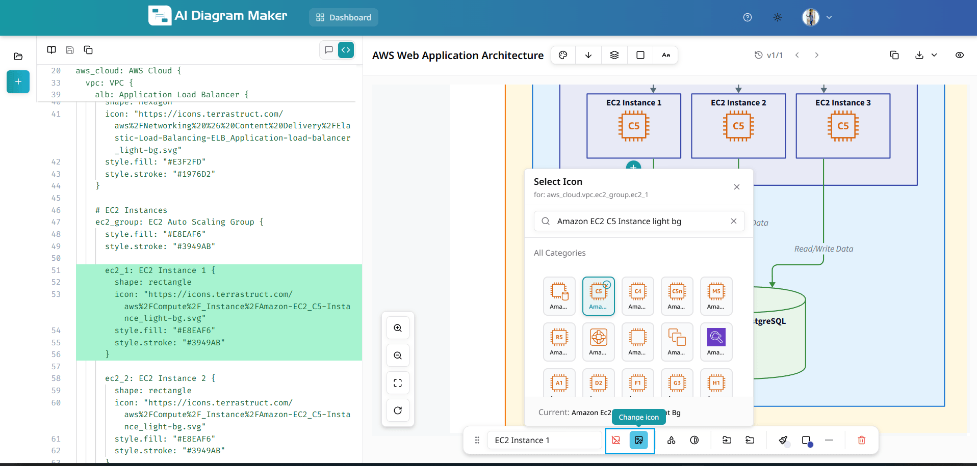
Select a node that does not have an icon. The bottom draggable bar displays an "Add icon" option. Click it to open the Select Icon popover, where you can search for an icon or pick one from the grid. Use "All Categories" to view and browse all available icon categories.
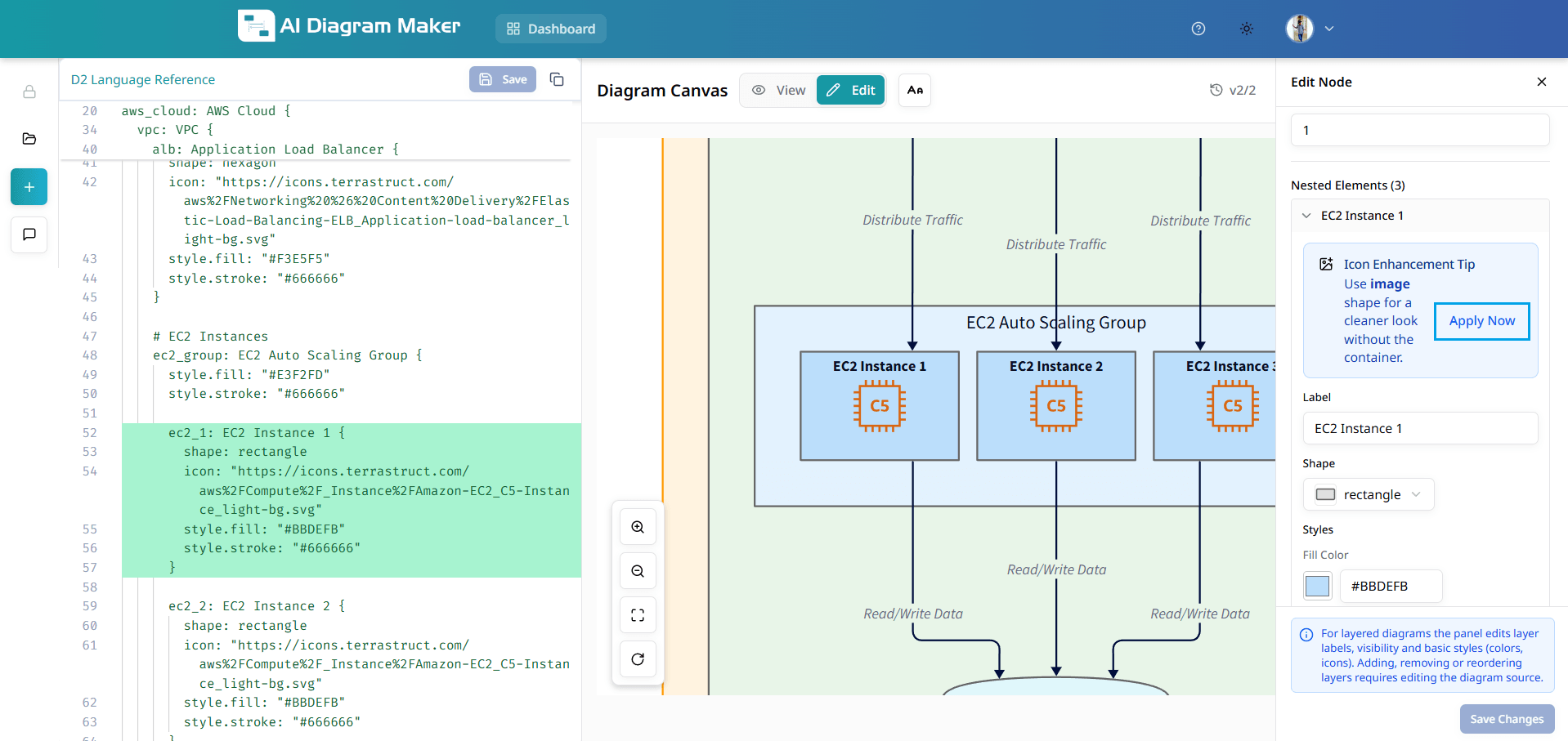
13.4 How do I browse icons by category?
In the Select Icon popover: • Click "All Categories" to see the full list (e.g. Essentials, AWS, Azure, GCP) • Click a category to browse its icons • Choose the icon you want for the selected node
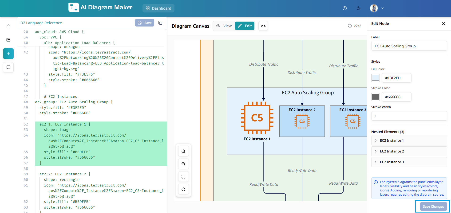
13.5 How do I update or remove an icon from a node?
Click a node that already has an icon. The bottom draggable bar shows: • Change icon: opens the Select Icon popover to pick a different icon • Remove icon: clears the icon from the node
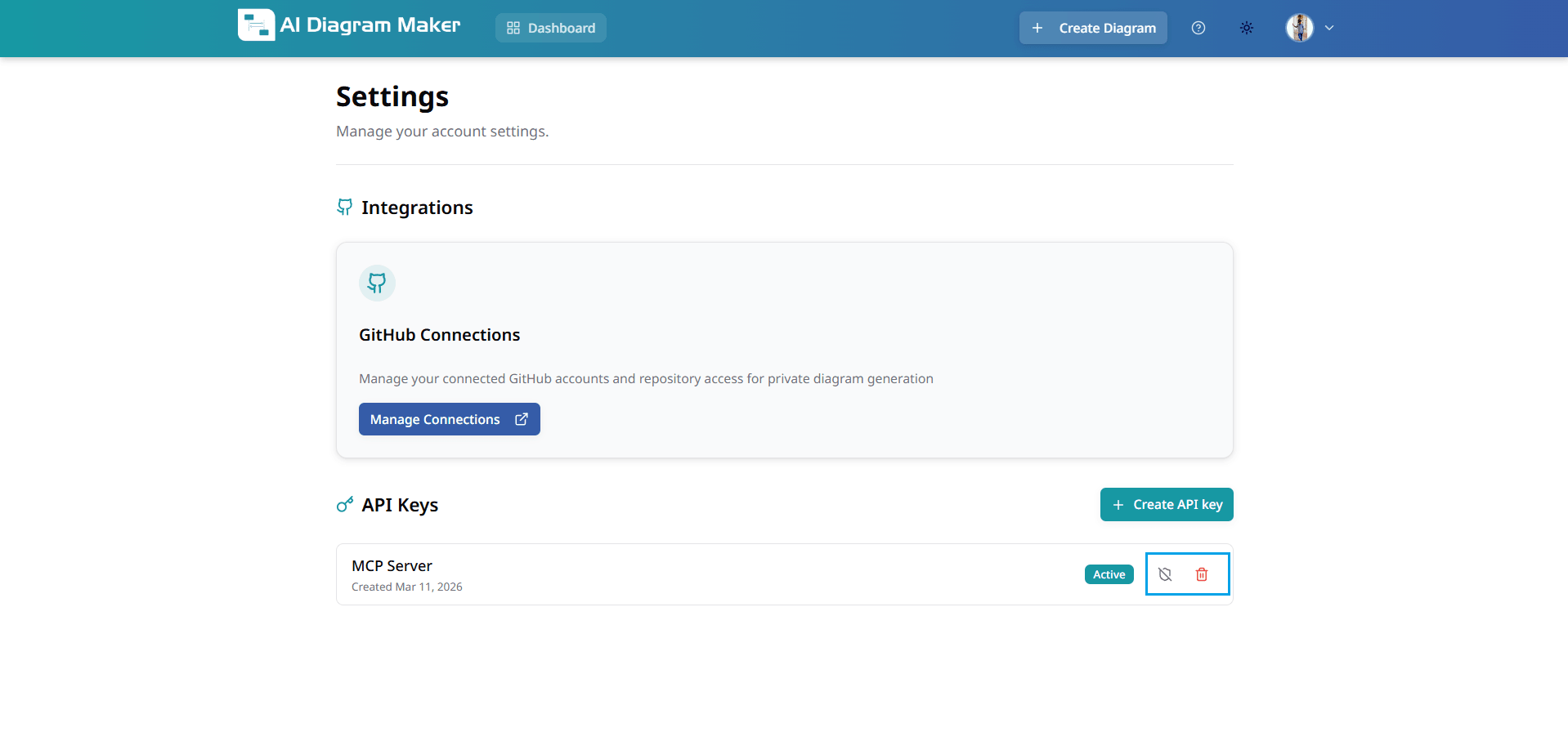
14. How to manage API Key
Create and manage API keys for use with the MCP server or CLI. You can create keys, copy them once after creation, and activate, deactivate, or delete them from Settings.
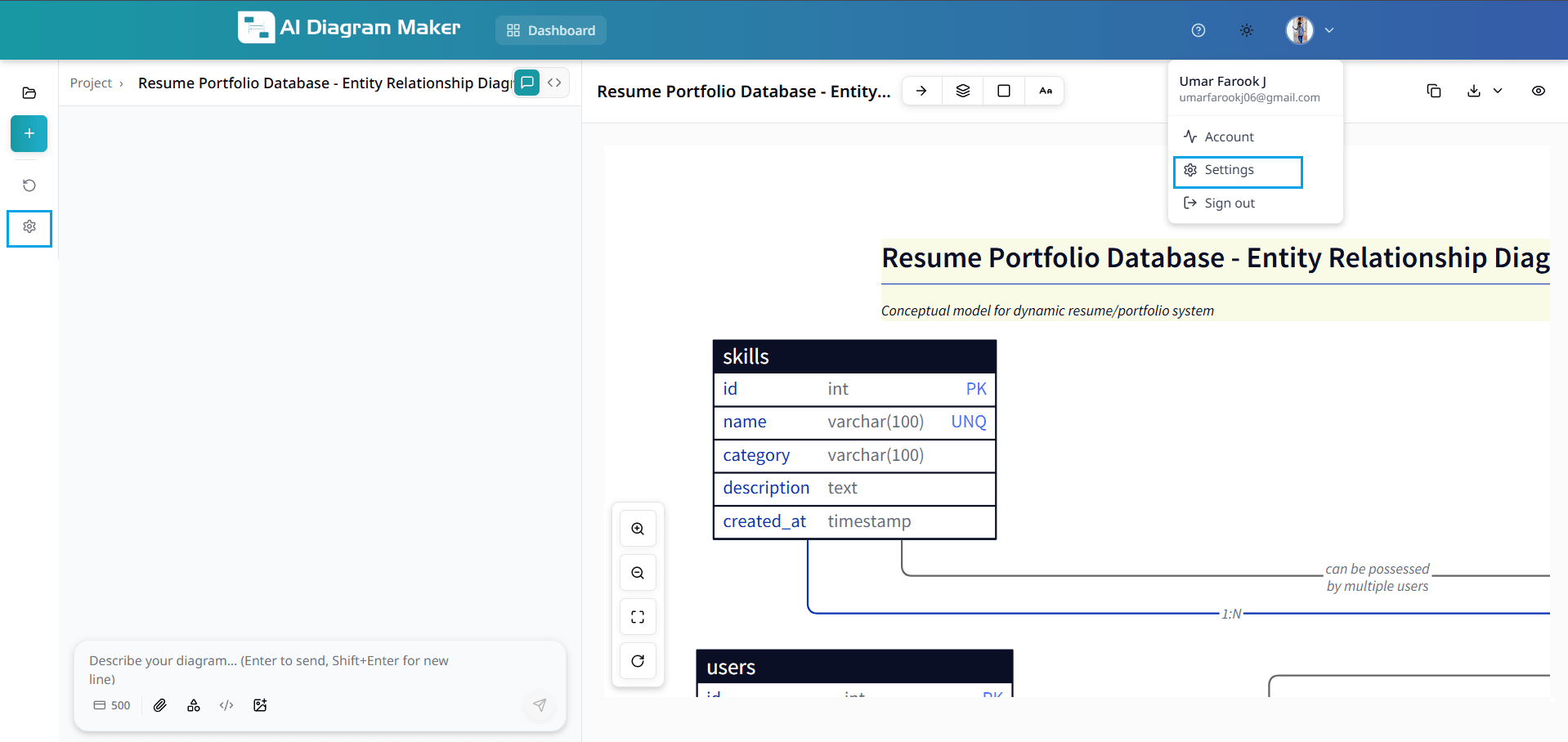
14.1 Open Settings
Click the settings (gear) icon on the left navbar, or open the user profile dropdown in the top right and select Settings.
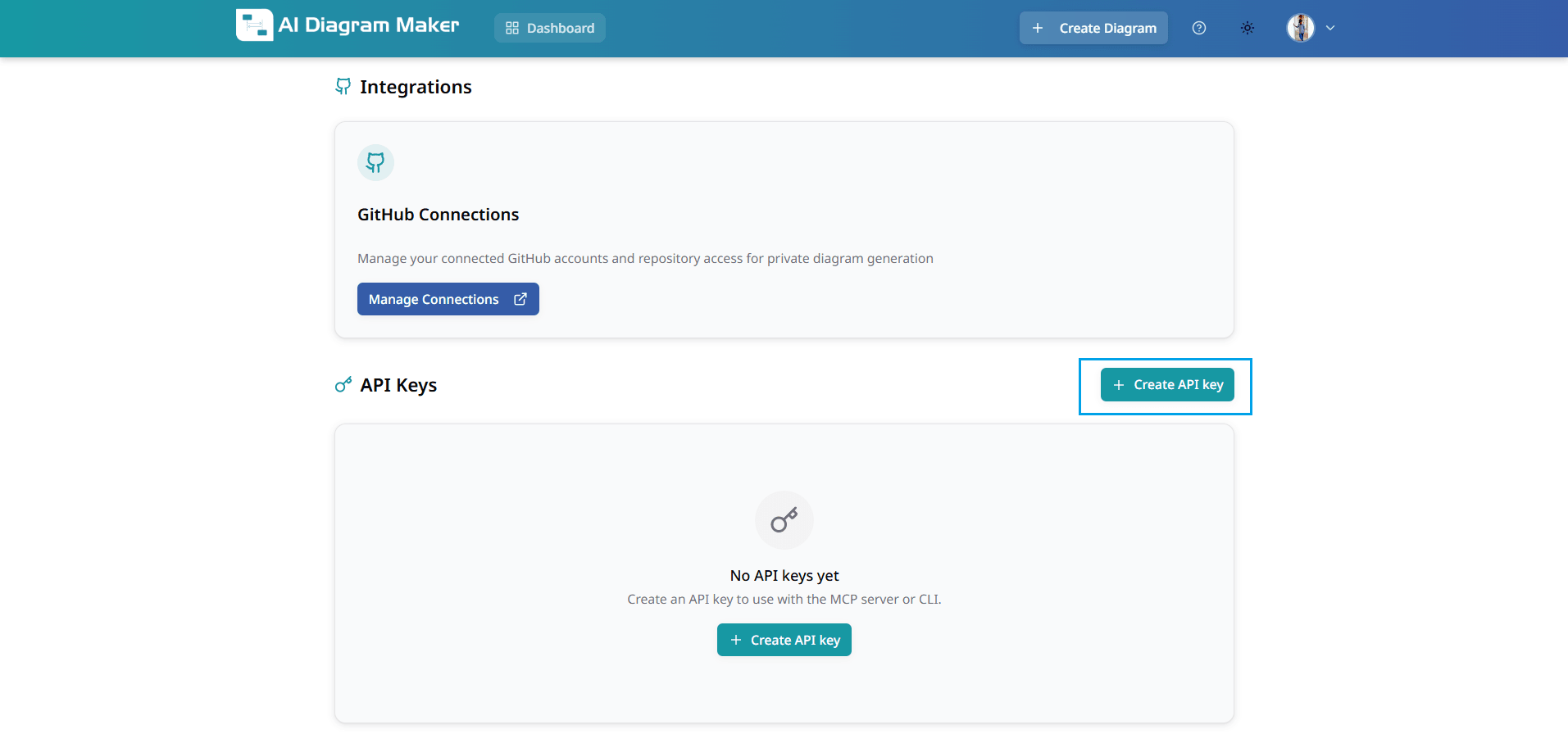
14.2 Create API key
On the Settings page, go and find API Keys. Click the Create API key button (green button with a plus icon) to start creating a new API key.
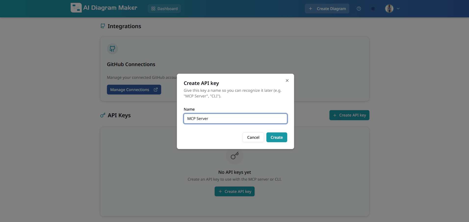
14.3 Name your key and create
In the Create API key modal, give your key a name so you can recognize it later (e.g. "MCP Server", "CLI"). Enter the name in the Name field and click the Create button.
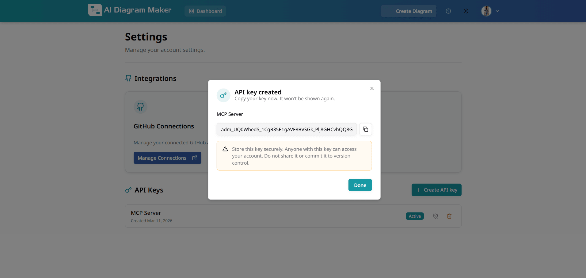
14.4 Copy your key immediately
After creation, the new API key is shown in a modal. Copy your key now — it will not be shown again. Store the key securely; anyone with this key can access your account. Do not share it or commit it to version control. Click Done when finished.
14.5 Manage API keys
The API Keys list shows all keys you have created. Each key displays its name, creation date, and is in Active state by default. You can Deactivate a key using the Deactivate API key icon, and Activate it again with the Activate API key icon. To remove a key you no longer need, click the delete (trash) icon. For deactivate, activate, and delete actions, a confirmation dialog will appear.
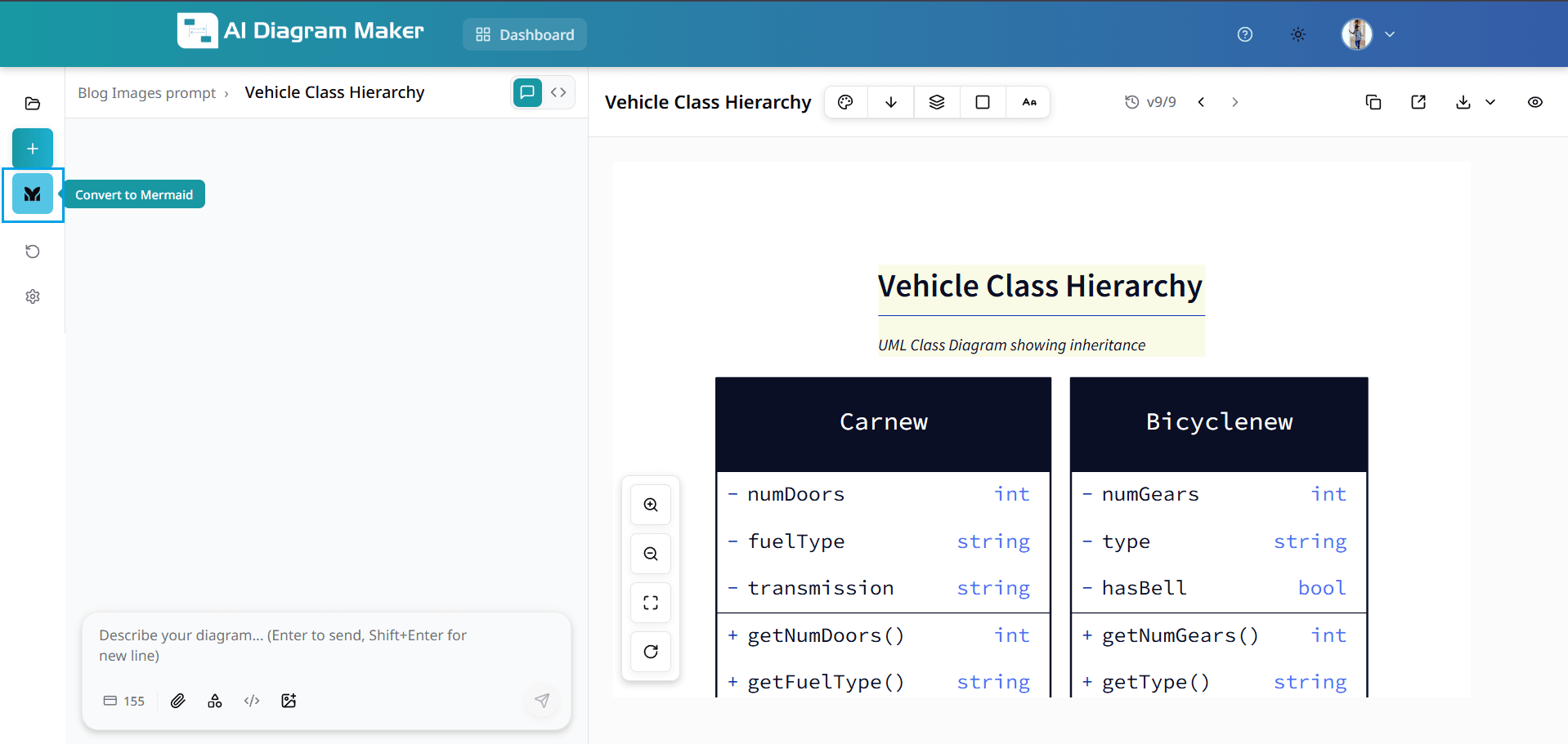
15. How to convert D2 code to Mermaid?
Convert your existing D2 diagram code into Mermaid syntax, then open it directly in Mermaid Live Editor or copy the Mermaid code for reuse.
15.1 Use Convert to Mermaid from the left sidebar
Open a diagram that has D2 code, then click the Convert to Mermaid button in the left sidebar. This action converts your current D2 code into Mermaid syntax.
15.2 Open Mermaid Live Editor or copy Mermaid code
After conversion, review the generated Mermaid code. You can click Open in Mermaid Live to continue editing in Mermaid Live Editor, or use Copy to paste the code anywhere you need.
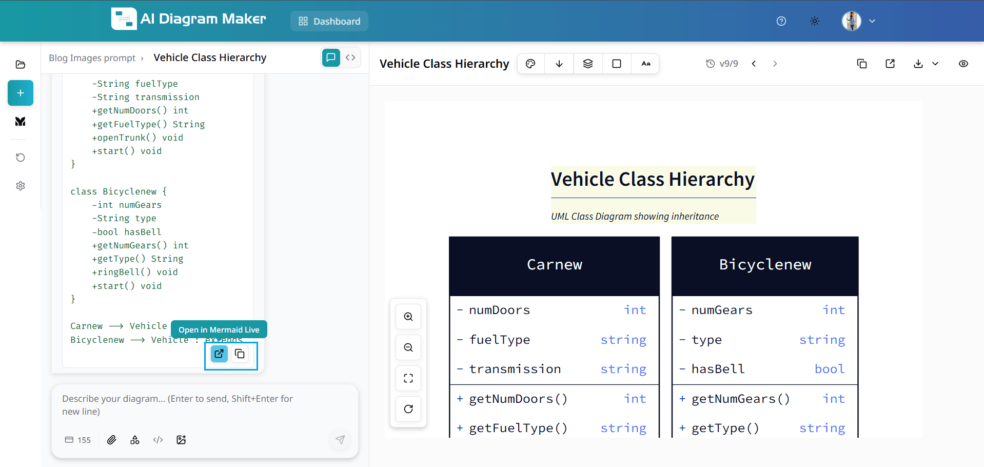
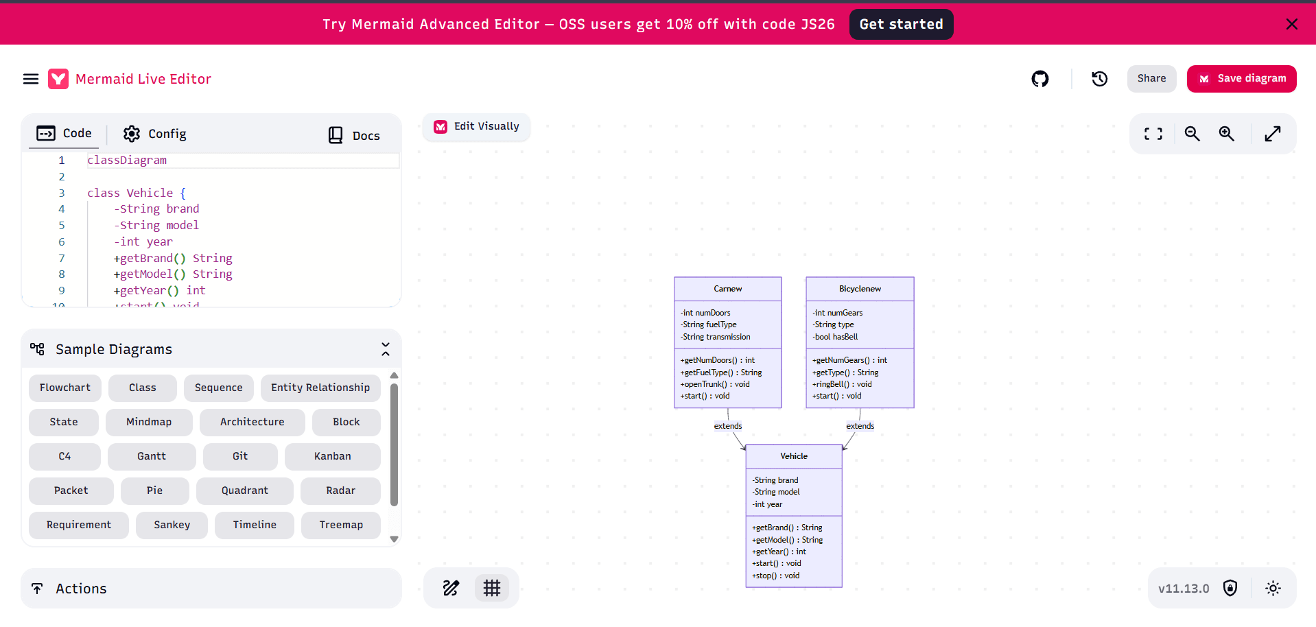
15.3 Mermaid diagram opened in Mermaid Live Editor
When you choose Open in Mermaid Live, your converted Mermaid code opens in Mermaid Live Editor, where you can visually inspect and further refine the diagram.