· Scenarios & Use Cases · 8 min read
Explaining Machine Learning Models Visually with AI
ML models are often "black boxes" to stakeholders. Learn how to use AI for machine learning visualization to generate clear pipeline flowcharts and neural network diagrams in seconds.

I remember one time trying to explain a fairly simple neural network architecture to a product manager. I was at the whiteboard, drawing layers of nodes and connecting them with a web of lines, trying to talk through concepts like activation functions and max pooling. After a few minutes, I looked at his face, and I could see I had completely lost him. My diagram looked like a mess, and my explanation probably wasn’t much better. The incredible logic of the model was trapped in my head, and I had failed to communicate it clearly. I think anyone who works in a data science or machine learning role has been in a similar situation.
Tl;dr
If you’re in a hurry, here’s the main idea. Explaining machine learning concepts is hard because they are so abstract. AI diagramming tools make it incredibly easy to create visuals for your work. You can describe your entire data pipeline in plain English and get a perfect flowchart in seconds. You can even describe the layers of a neural network and get a clean architecture diagram. This saves a ton of time, makes your documentation and presentations much clearer, and helps bridge the communication gap between ML experts and other stakeholders.
Introduction: The “Black Box” Communication Problem in Machine Learning
One of the biggest challenges for any machine learning professional isn’t building the model. It’s explaining the model to other people. To our teammates, to our managers, to the stakeholders who are funding the project. These incredibly powerful algorithms can often feel like a complete “black box” to anyone who doesn’t have a background in data science.
And that’s a real problem. If people don’t understand how a model works, at least at a high level, they won’t trust it. This can make it difficult to get buy in for new projects or to integrate our work into the broader business. The challenge has always been finding a way to make these abstract, mathematical concepts tangible and understandable without dumbing them down. A clear visual aid is the best tool we have, but creating them has always been a slow, manual process.
The Scenario: Visualizing a Classic Image Classification Pipeline
To show how this works in practice, let’s use a classic, widely understood example. We’ll imagine we are building a pipeline to train a model that can classify images of cats and dogs. The workflow, or pipeline, for a project like this has several distinct stages that we need to visualize.
Data Ingestion: First, we need to load our dataset of labeled images.
Preprocessing: Then, we have to clean and prepare the images by resizing, augmenting, and normalizing them.
Model Training: Next, we feed this prepared data into our model, in this case a Convolutional Neural Network (CNN).
Evaluation: After training, we need to check the model’s accuracy on a separate test set of images.
Deployment: Finally, if the model is good enough, we serve it via an API endpoint so the application can use it.
Building the ML Pipeline Flowchart with a Single Prompt
Mapping out this entire workflow is a perfect job for a flowchart. Learn more in our detailed guide to flowcharts. In the past, this would mean opening a tool and manually creating a dozen shapes and connectors. Now, you can do it with a single, descriptive prompt.
The Natural Language Prompt
You can simply describe the process, step by step, including any loops or decisions.
Prompt Example:“Create a flowchart for a machine learning pipeline. It starts with ‘Image Data Ingestion’. This flows into ‘Data Preprocessing’, which includes steps for ‘Image Resizing’ and ‘Data Augmentation’. The preprocessed data goes to ‘Model Training’ using a CNN. After training, the model goes to ‘Model Evaluation’. If the accuracy is good, it moves to ‘Model Deployment’ as an API. If not, it goes back to ‘Model Training’ for more epochs.”
The Instant Diagram
In just a few seconds, the AI will process that description and generate a complete flowchart. What’s amazing is how well it understands the logic. It will correctly create the sequential steps, but it will also create the diamond shaped decision box for “If accuracy is good?” and draw the two separate paths, one leading to deployment and the other looping back to the training step. It perfectly visualizes the iterative nature of model training.
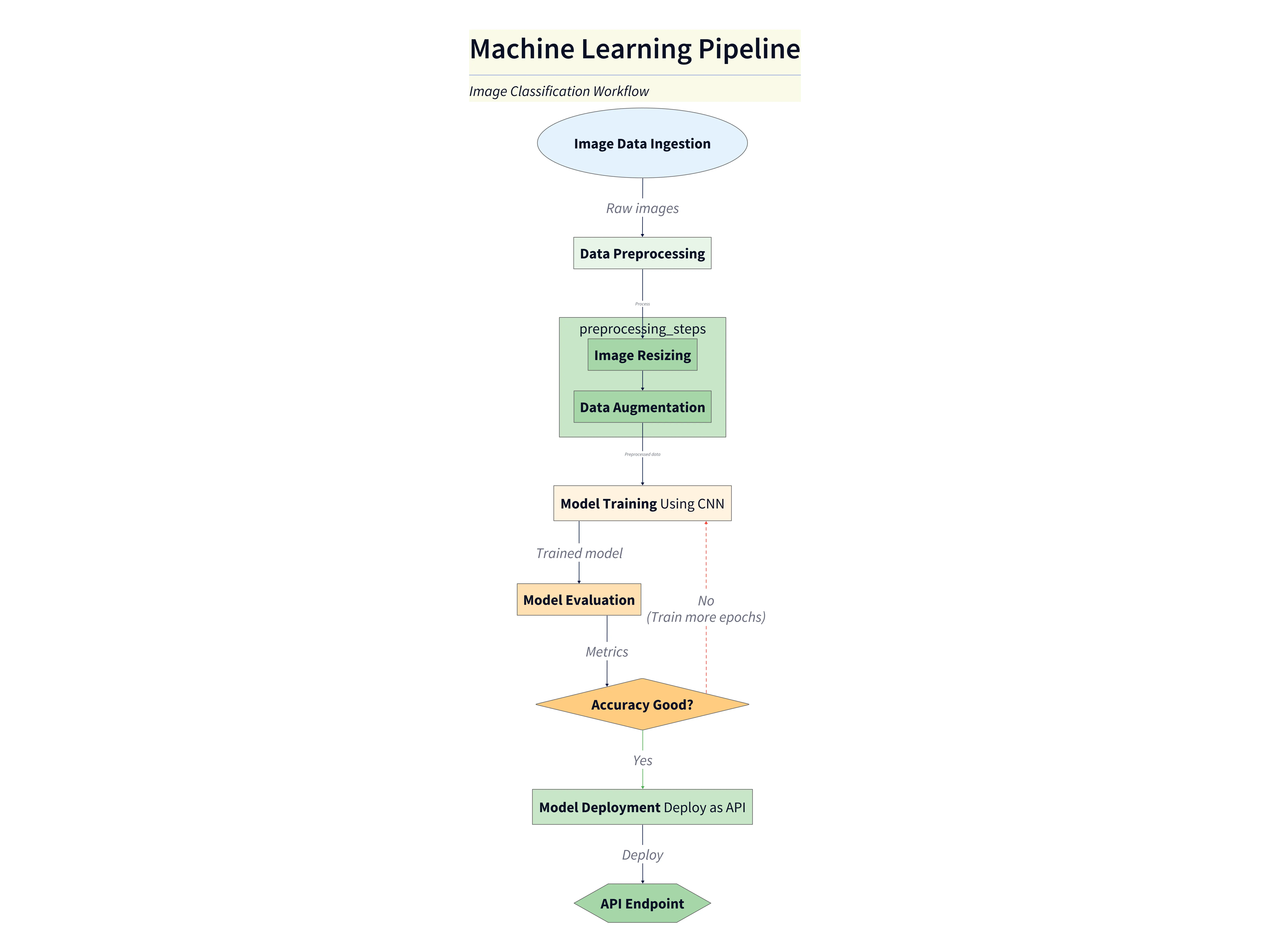
Diagram explanation
- Image Data Ingestion: Raw labeled images are loaded from storage (datasets, S3, etc.) as the pipeline entry point.
- Data Preprocessing: Images are normalized and prepared — the diagram highlights sub‑steps for Image Resizing and Data Augmentation (random crops, flips, color jitter) to increase robustness.
- Model Training (CNN): Preprocessed batches are fed to a Convolutional Neural Network for training. The diagram shows this as a central processing block where weights are updated across epochs.
- Model Evaluation: After a training run, the model is evaluated on a held‑out validation/test set to compute metrics like accuracy.
- Decision: Accuracy Good? A decision node branches the flow: if the metric meets the target, the model proceeds to deployment; otherwise the diagram shows a loop back to
Model Trainingfor additional epochs or hyperparameter tuning. - Model Deployment (API): When ready, the trained model is packaged and served behind an API endpoint so applications can call it for inference.
This short explanation mirrors the approach used in the SaaS architecture post: pair the visual with concise bullets that map each labeled element to real system responsibilities and data flow. Use the diagram to trace end‑to‑end flow and to identify where to add monitoring, data versioning, or validation checks.
Detailing a Neural Network Architecture
This approach is not just for high level workflows. You can also use it to get more specific and visualize the architecture of the model itself. This is something that is notoriously difficult to draw by hand.
The Prompt for a Simple CNN
Let’s say you wanted to show the layers of your image classification model. You could use a prompt like this.
Prompt Example: Show a diagram of a simple Convolutional Neural Network architecture. The input is an image. It goes through two ‘Convolutional Layers with ReLU activation’, each followed by a ‘Max Pooling Layer’. After that, the data is ‘Flattened’. This goes to a ‘Fully Connected Layer’ and finally to a ‘Softmax Output Layer’.
The Resulting Architecture Diagram
The output will be a clean, layered diagram that clearly shows the flow of data through the neural network. Each layer is distinct and labeled correctly. A diagram like this would be perfect for a research paper, a presentation to your team, or just for your own documentation.
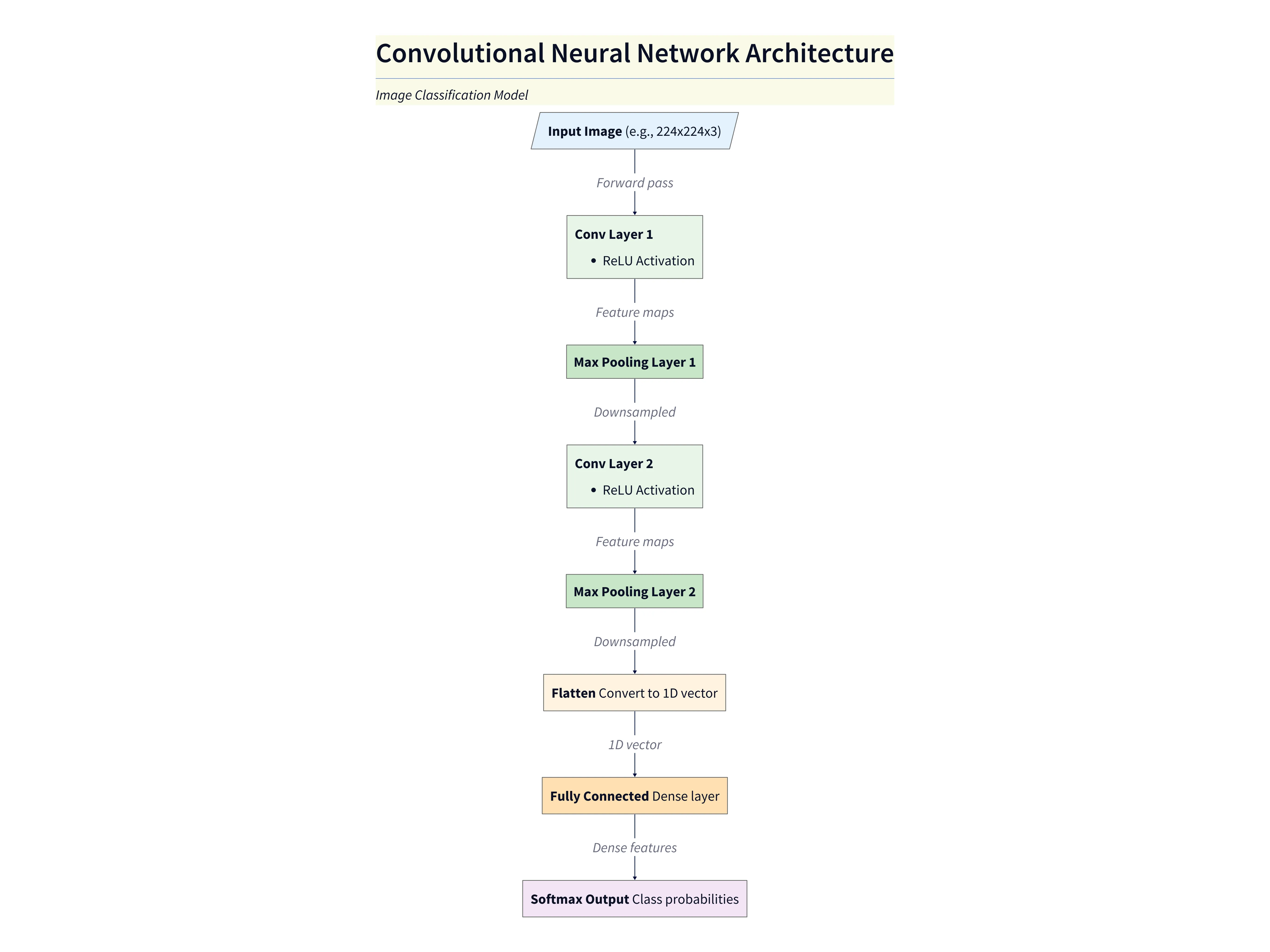
Diagram explanation
- Input Image: The model accepts an input image (e.g., 224×224 RGB) which is passed into the network.
- Convolutional + ReLU layers: Two convolutional layers extract hierarchical features (edges → textures → shapes). Each convolution is followed by a ReLU activation to introduce nonlinearity.
- Max Pooling layers: After each convolution block a max pooling layer reduces spatial resolution, controls overfitting, and reduces compute for subsequent layers.
- Flatten: The final feature maps are flattened into a 1‑D vector to prepare for dense classification layers.
- Fully Connected Layer: Dense layers learn higher‑level combinations of features and map them toward class scores.
- Softmax Output: The final layer uses a Softmax activation to produce class probabilities for the classification task.
This explanation mirrors the concise style used in the SaaS architecture post: pair the visual with short bullets that map each label to the component’s responsibility and data flow. Use this diagram when explaining model structure, expected input shapes, and where to add regularization or monitoring hooks.
Why AI Diagramming is a Superpower for ML Teams
This ability to create visuals so quickly is more than just a convenience. It’s a kind of superpower for ML teams.
It allows for rapid experimentation. You can quickly sketch out and compare different model architectures or pipeline designs without investing a lot of time.
It leads to much clearer documentation. Adding clean, professional diagrams to your model cards, internal wikis, or research papers makes your work far more accessible and understandable.
It dramatically improves collaboration. It helps bridge that communication gap between the ML engineers and the other stakeholders, like product managers or backend developers, who need to understand and integrate with the model.
And finally, it’s a fantastic educational tool. It’s perfect for teaching and explaining the fundamental concepts of machine learning in a visual and intuitive way.
Conclusion: From Abstract Algorithms to Actionable Insights
The core benefit here is communication. AI diagramming tools remove the friction from visualizing complex machine learning concepts. They make it easy to turn abstract algorithms into clear, understandable, and actionable diagrams. The Ultimate Guide to AI Diagram Generation
This allows teams to build, document, and share their work more effectively than ever before. Whether you’re designing a new data pipeline or explaining the architecture of a deep neural network, you can finally bring your model to life.