· DevOps · 3 min read
Scenario: The Post-Mortem Analysis (Incident Report)
This scenario illustrates how to use AI-generated sequence diagrams to visually explain complex production outages and cascading failures during post-mortem meetings.
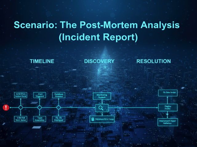
The fire is out. The site is back up. You finally got some sleep. Now comes the hard part. The Post-Mortem Meeting. You have to explain to the CTO, the VP of Engineering, and the Product Managers exactly what happened. Why did the checkout page crash for 45 minutes on Black Friday? You have a Google Doc full of timestamps and log snippets. “At 14:02 DB CPU spiked. At 14:03 Redis evicted keys.” But looking around the room you see glazed eyes. The non-technical stakeholders are lost. They hear “Redis eviction” and they zone out. You need to tell a story. You need a visual that shows the chain reaction.
The Situation: Production Outage (Checkout Failed)
The incident was complex. A third-party payment gateway slowed down. This caused the API threads to hang waiting for a response. Because the threads were hung the health check failed. Because the health check failed Kubernetes killed the pods. Because the pods died the load balancer returned 502 errors. It was a cascading failure caused by latency.
The Goal: Explain “Why” to Stakeholders
You need a diagram that shows time. A static architecture diagram isn’t enough because the architecture was fine. The timing was the problem. You need a Sequence Diagram. But drawing this manually in the middle of writing a report is a pain. You usually skip it.
The Workflow:
Here is how you use AI Diagram Maker to create the “smoking gun” visual.
Describing the Failure Log as a Sequence Diagram
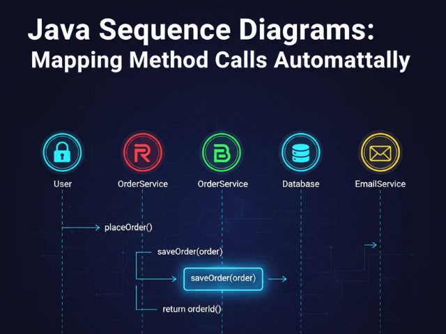
You don’t draw. You type the story into the tool. “User calls Checkout API. API calls Payment Gateway. Payment Gateway delays for 30 seconds. API Health Check times out. Kubernetes kills Pod. User receives 502 Error.”
Visualizing the Timeout Event
Diagram
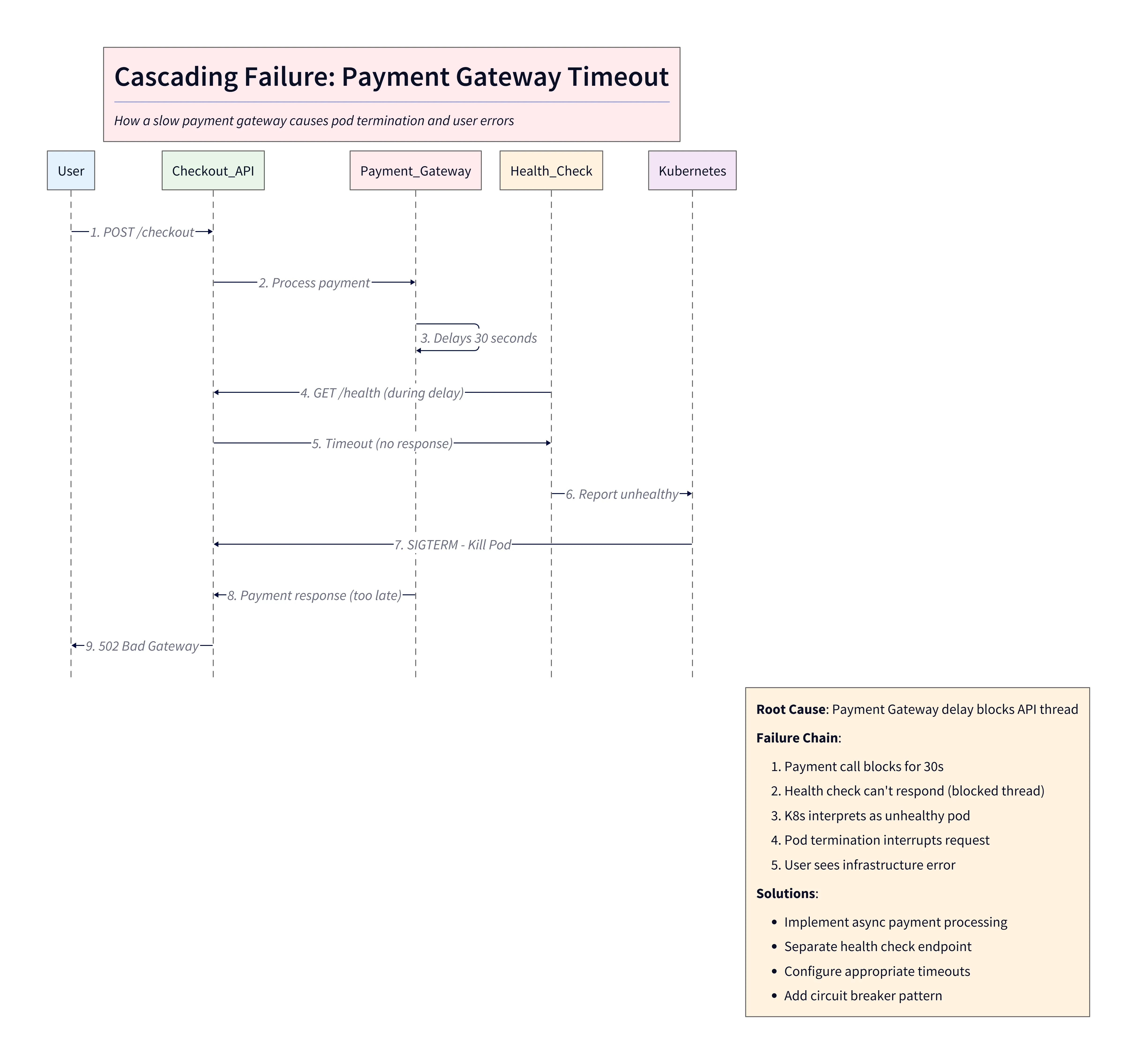
Diagram Explanation:
This sequence diagram illustrates a cascading failure during a payment gateway timeout. The user initiates a checkout, the API calls the payment gateway, which delays for 30 seconds. During this delay, the API health check times out, Kubernetes marks the pod as unhealthy and kills it, and the user ultimately receives a 502 error. The diagram visually highlights the root cause (latency), the propagation of failure, and the resulting user-facing error, making it clear for both technical and non-technical stakeholders.
The AI generates the Sequence Diagram. It draws a massive vertical gap on the Payment Gateway lifeline representing the delay. It draws an “X” on the API lifeline showing the crash. You can explicitly label the gap: ”30s Latency (Root Cause).” The visual is striking. You can physically see the delay pushing the system over the edge.
The Result: Clarity on the Root Cause
You paste this image into your incident report. In the meeting you project it on the screen. “Look at this gap,” you say. “This is where the money stopped moving.” The VP nods. “I get it. We need to add a shorter timeout.” The diagram bridged the gap between code and business impact. It turned a technical excuse into an understandable narrative.
Visualize your logs. Make your next Post-Mortem impactful. Use AI Diagram Maker to turn your incident logs into a clear visual story. It helps everyone learn from the failure.
The Programmable Diagram: A Developer’s Guide to D2 and Text-Based Visuals
Learn more about how text-based diagrams can streamline your documentation and reporting in our guide: The Programmable Diagram: A Developer’s Guide to D2 and Text-Based Visuals.