· Technical · 5 min read
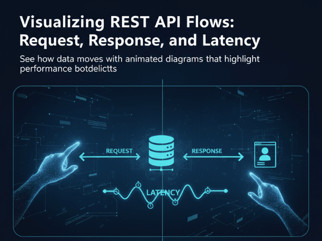
Visualizing REST API Flows: Request, Response, and Latency
This guide explores how to use Sequence Diagrams to map out the request and response cycle, creating a clear contract that everyone can see between frontend and backend.
The most dangerous part of software development is the gap between the Frontend and the Backend.
The Backend developer writes an API. They say “Just hit /users and I will send you the data.” The Frontend developer hits /users and gets a 500 error. Or they get a JSON object that looks completely different from what they expected. They get on a Zoom call. They argue. “I thought you were sending an array!” “No I am sending an object with a list inside it!” This friction is expensive. It slows down development. It ruins morale.
The problem is that we communicate API contracts using invisible assumptions. We need to make those assumptions visible. We need to visualize API flow.
This guide explores how to use Sequence Diagrams to map out the request and response cycle, creating a clear contract that everyone can see.
The Communication Gap Between Frontend and Backend
APIs are invisible contracts. Unlike a UI, which you can see, an API is just text flying over a wire.
Misunderstanding Payload Structures
The biggest source of confusion is the data shape. “What fields are in the response? Are they nullable? Is user_id a string or a number?”
Swagger (OpenAPI) docs help, but they are static. They do not show the sequence of events. They do not show that you have to call /login before you can call /profile.
The “Black Box” of API Latency
The second biggest issue is performance. The frontend makes a request and the spinner spins for five seconds.
“Why is it so slow?” asks the frontend dev.
“It should not be,” says the backend dev.
Without a diagram showing what happens during those five seconds, the API is a black box. You do not know if the delay is the network, the database, or a third-party service.
Using Sequence Diagrams for API Contracts
A Sequence Diagram is the perfect tool for demystifying APIs.
Visualizing the Request (GET/POST)
It shows the “Ask.” You see an arrow going from the Client to the Server labeled POST /checkout. This confirms exactly which endpoint is being hit.
Visualizing the Processing Time (Latency)
The vertical space on the diagram represents time. If the latency is high, you can draw a long activation bar. You can show that the Server calls the Database, then calls the Payment Gateway, then calls the Email Service. Seeing this stack explains why the request takes five seconds.
Visualizing the Response (Status 200 vs 500)
It shows the “Reply.” You draw a dashed arrow coming back. You can label it 200 OK (JSON). Or you can show an alternative path where it returns 401 Unauthorized. This forces the frontend developer to handle the error state because they can see it right there on the chart.
Mapping the Flow with AI Diagram Maker
Creating these diagrams for every endpoint used to be too much work. But with AI, you can generate them from your specs.
Describing the Endpoint Logic
You simply type the logic into our tool. “Client sends POST /login. Server validates password. If valid, Server returns 200 with Token. If invalid, Server returns 403.” The AI draws the diagram. It handles the alt block for the conditional logic.
Including the API Gateway and Auth Layers
Real APIs are rarely direct. You usually hit an API Gateway first. You can include this. “Client calls Gateway. Gateway calls Auth Service. If Auth passes, Gateway calls User Service.” This visualizes the hidden infrastructure that often trips up developers.
Abstracting JSON Payloads into Visual Notes
You do not want to clutter the diagram with 50 lines of JSON. Instead, you can add a note to the response arrow. “Returns User Object (id, name, email).” This gives enough context without overwhelming the visual flow.
Scenario: Designing a /checkout Endpoint
Let us look at a concrete example. You are designing the checkout API.
Mapping the Happy Path
You generate a diagram showing the success flow.
Client -> API: Send Cart API -> Stripe: Charge Card Stripe -> API: Success API -> DB: Save Order API -> Client: 200 OK
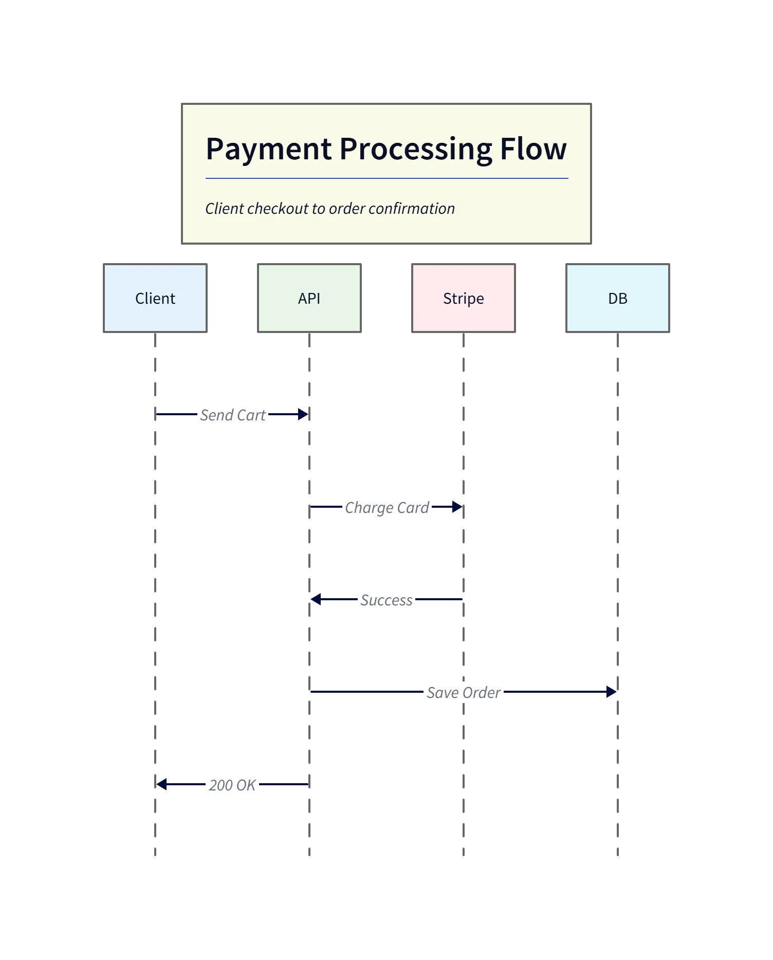
This generated sequence diagram shows the happy path for a /checkout request: the client sends the cart, the API charges the card via the payment gateway, the gateway responds with success, and the API persists the order before returning 200 OK to the client. Use this visual to confirm required frontend states (loading, success screen) and backend invariants (persist after payment success).
Visualizing Error States (Payment Failed)
Then you generate the failure flow.
Client -> API: Send Cart API -> Stripe: Charge Card Stripe -> API: Declined API -> Client: 402 Payment Required
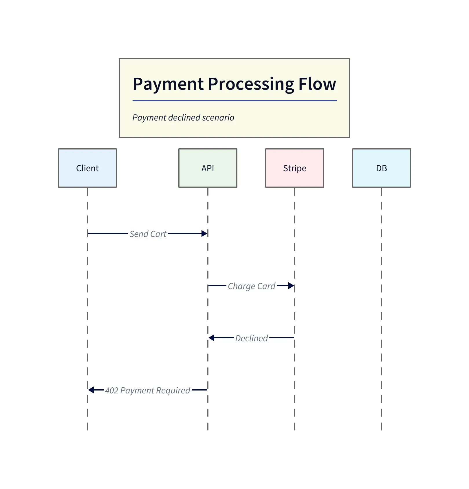
This failure diagram highlights the error path when the payment gateway declines the charge. The API surfaces the 402 Payment Required status back to the client so the frontend can render an appropriate error message (for example: “Card declined — please try another payment method”). Including this alternate path ensures error handling is designed up-front.
Now you hand both diagrams to the frontend team. They know exactly what to build. They know they need a success screen and a “Card Declined” error message.
Enhancing Swagger/OpenAPI with Visuals
Text-based documentation like Swagger is great for details. But adding a sequence diagram to the top of your Readme gives the “Big Picture.”
Adding Sequence Diagrams to your API Docs
You can export the SVG from our tool and embed it right next to your API definition. “Here is the schema. And here is the flow diagram.” This combination creates a bulletproof API contract. It eliminates the “I thought you meant X” conversations. It turns the invisible API into a visible, understandable product.
The Programmable Diagram: A Developer’s Guide to D2 and Text-Based Visuals
You can learn more about how text-based diagramming tools like D2 are transforming documentation and communication in our main guide, The Programmable Diagram: A Developer’s Guide to D2 and Text-Based Visuals.