· Glossary · 5 min read
What is a Sequence Diagram
What is a Sequence Diagram? A complete definition of this essential UML chart, detailing how it visualizes API calls, time, and system interactions.
I think the hardest part of software engineering isn’t writing the code itself. It is keeping the mental model of who is talking to whom inside your head.
You know the feeling. You are debugging an issue where a user cannot log in. You know the frontend sends a request. You know the backend receives it. But then the backend talks to the identity provider, and maybe it checks a cache first, or perhaps it writes to an audit log.
It gets messy fast.
Most diagrams show you the structure of a system. They show you “The API is connected to the Database.” That is useful, but it does not tell you the story of what actually happens during a request.
That is where the Sequence Diagram comes in. It is probably the most useful tool we have for visualizing time. It does not just show you the players involved. It shows you the script of the play, line by line, from top to bottom. It turns a chaotic mess of network calls into a straight, readable timeline.
TL;DR
- The Definition: A Sequence Diagram is a type of UML diagram that shows how objects or services interact with each other and in what order.
- The Key Feature: Unlike other diagrams, it has a specific dimension for “Time,” which flows vertically from the top to the bottom.
- The Use Case: Developers use them to map out API flows, understand complex logic, and debug distributed systems where many things happen at once.
- The Modern Approach: You can now generate these automatically by describing the conversation between services using AI tools.
Definition
Technically speaking, a Sequence Diagram is an “interaction diagram” within the Unified Modeling Language (UML) standard. But I prefer to think of it as a screenplay.
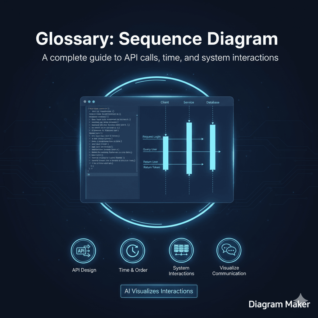
Imagine you have three actors on a stage. Let’s call them the Client, the Server, and the Database. In a sequence diagram, you list these actors across the top of the page. Then, you read down.
First, the Client says something to the Server. Then the Server thinks for a moment. Then the Server says something to the Database. The Database replies.
The diagram visualizes this conversation using vertical lines and horizontal arrows. It is arguably the best way to represent the dynamic behavior of a system. Static architecture diagrams show you how the car is built, but sequence diagrams show you how the engine fires.
Key Components of a Sequence Diagram
If you look at one of these diagrams, it might look a bit like a musical score. There are a few standard symbols you need to know to read them properly.
Lifelines (Participants)
These are the vertical dashed lines that drop down from each component. They represent the “life” of that object during the interaction. As long as the line keeps going down, that object is involved in the process.
Messages
These are the arrows that go back and forth between the lifelines.
A solid arrow usually means a request, like calling a function or hitting an API endpoint. A dashed arrow usually means a return message, like the API sending back a “200 OK” or the function returning a value.
Activation Boxes
You will often see tall, thin rectangles sitting on top of the dashed lifelines. These are called activation bars. They indicate that the object is actually doing work right now.
For example, if the Server is waiting for the Database to reply, the Server is technically active, so its box would stretch down until it gets the answer. It is a subtle detail, but it helps you see which part of the system is the bottleneck.
Why Developers Use Sequence Diagrams
I find myself reaching for these more than any other diagram type.
Visualizing API Calls
This is the classic use case. If you are building a REST or GraphQL API, you need to know exactly what data is moving where. A sequence diagram forces you to be honest about the complexity. You cannot hide a circular dependency when you have to draw the arrow for it.
Understanding Legacy Code
When you join a new team, you often inherit a codebase that is… let’s call it “creative.” Tracing the code execution in your IDE is hard. Generating a sequence diagram allows you to see the flow of a single transaction from start to finish without getting lost in the implementation details.
Designing Before Coding
It is much cheaper to fix a logic error in a diagram than in production code. If you map out the sequence and realize you are making three database calls when you only need one, you can fix the design before you write a single line of code.
How to Generate a Sequence Diagram with AI
I used to hate drawing these manually.
The problem is the spacing. You draw a perfect diagram with ten steps. Then you realize you missed a step in the beginning. In a manual tool, you have to select everything below that step and drag it down to make room. It is annoying.
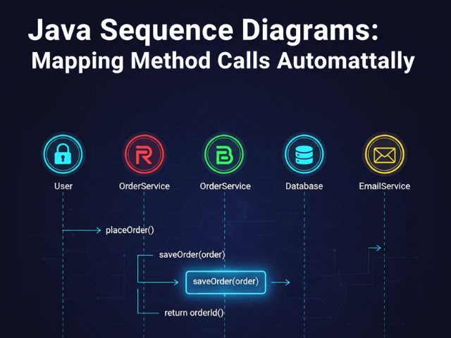
With AI tools like AIDiagramMaker, this pain goes away. You simply describe the interaction in text. You might say “The User calls the Login Service. The Login Service calls the Database. The Database returns the User. The Login Service returns a Token.”
The AI understands the “sequence” part of your description. It handles the layout. It draws the lifelines. It creates the activation boxes. If you need to add a step later, you just insert a sentence in the middle of your text prompt, and the AI redraws the whole thing instantly.
See a Practical Example
We have a specific guide that shows you exactly how to do this for a real project.
Visualizing Your API Flow Using AI Diagrams
Check out this tutorial to see how to turn a standard authentication flow into a sequence diagram in seconds.
The Ultimate Guide to AI Diagram Generation
Return to the main guide to explore other ways AI can visualize your code.