· Developer Productivity · 13 min read
How AI Diagram Generators Improve Developer Productivity by 10x
Manual diagramming is a hidden tax on engineering teams, costing up to 20% of developer time. Learn how AI diagram automation eliminates this bottleneck, speeds up onboarding, and creates living documentation.

For any tech lead or engineering manager, there’s a constant, nagging question that runs in the background of every decision: are we as fast as we could be? We invest in new frameworks, streamline our CI/CD pipelines, and optimize our cloud spend, all in the pursuit of greater efficiency. Yet, a massive productivity killer often lurks in plain sight, dismissed as just “the cost of doing business.” It’s the endless, soul-crushing task of making little boxes and arrows.
Tl;Dr:
Manual diagramming is a huge, hidden tax on your team’s time and focus. Developers are losing hours every week to the tedious work of creating and, more importantly, updating documentation in tools not built for their workflow. AI diagram generators solve this by instantly turning text prompts or entire codebases into clean, accurate diagrams. This eliminates context switching, creates “living documentation” that never gets stale, and dramatically speeds up everything from onboarding to code reviews. By automating this low value work, you give your team back a significant chunk of their time to focus on what they were hired to do: build great software.
Introduction: The Hidden Productivity Killer in Every Sprint
Let’s paint a picture that is probably all too familiar. The sprint is finally over. The big feature, the one that caused all those late nights and heated debates, is finally shipped.
There’s a brief moment of relief, a collective exhale. But then, the project manager gently nudges someone on the team. “Hey, can we make sure the documentation is updated for this?”
Suddenly, the energy drains from the room. The task falls to a developer who now has to stop thinking about the next challenge and instead fire up a tool like Lucidchart or Draw.io. They have to spend the next few hours meticulously recreating the new architecture, remembering every new service call, and hoping they don’t miss anything. This isn’t a small task. In fact, some industry watchers estimate that developers can spend up to 20% of their time on documentation related tasks. Think about that. That’s a full day out of every single week, not spent writing code, but spent drawing.
This is the reality for so many engineering teams, and frankly, it’s a massive productivity drain. It’s a tax on innovation. This article is here to break down exactly how a new breed of AI powered tools, specifically AI diagram generators, can eliminate this bottleneck. We are going to explore how you can reclaim those valuable engineering hours, leading to faster development cycles, happier developers, and documentation that people actually trust.
Quantifying the “Manual Diagramming Tax”

Before we dive into the solution, it’s important to appreciate the real cost of the problem. This “manual diagramming tax” isn’t a single line item; it’s a series of costs that compound over time and silently eat away at your team’s potential. Let’s break it down.
First, there’s The Setup Cost. This is the initial friction. The developer has to find the right tool, maybe argue with a teammate about which one is better, find the correct template, and then hunt for the right shape libraries. Are we using the latest AWS icons? Does this thing even have a symbol for a message queue? It seems trivial, but it’s a series of small paper cuts that happens before a single box is even drawn on the canvas.
Next comes The Creation Cost. This is the most visible part of the tax. The dragging, the dropping, the connecting, the labeling. Then comes the most frustrating part of all: the endless nudging. Pushing a box one pixel to the left, then back to the right. Trying to get three different arrows to align perfectly. It’s low value, mind numbing work that requires the dexterity of a graphic designer but provides none of the creative satisfaction. For a diagram of even moderate complexity, you’re easily looking at an hour or two of a developer’s time. That’s an expensive hour.
But the biggest and most insidious cost, the one that truly drains productivity, is The Maintenance Cost. This is the killer. Code changes every single day. A diagram created three months ago is, for all intents and purposes, a historical artifact. It’s a fossil. When a developer needs to update it, they first have to go on an archaeological dig to even find the right file. Then they have to reverse engineer the old logic, figure out what the original author was even thinking, and carefully perform surgery on the diagram to reflect the new reality. This is so painful and time consuming that, more often than not, it just doesn’t get done. The documentation becomes stale, developers stop trusting it, and the whole purpose of having it in the first place is lost.
Let’s look at a simple comparison.
| Task | Time Spent (Manual Diagramming) | Time Spent (AI Diagram Generation) |
|---|---|---|
| Initial Creation | 1 to 2 hours | 2 to 5 minutes |
| Minor Update | 30 to 45 minutes | 1 minute |
| Major Refactor Update | 2 to 4 hours (or just abandoned) | 5 minutes (regenerate from code) |
When you look at it laid out like that, the difference is almost comical. It becomes incredibly clear that we are asking our highly paid, highly skilled engineers to spend their time on something a machine can now do better and faster.
Five Ways AI Diagram Automation Directly Boosts Productivity
So, how exactly does an AI diagram generator like AIDiagramMaker create this 10x improvement? It’s not just about being a little bit faster. It’s about fundamentally changing the workflow and removing entire categories of unproductive work.
1. Instant Generation: From Hours to Seconds
The most obvious benefit is the raw speed of creation. The core idea here is to shift from drawing to describing. Imagine a developer is in a planning meeting, and they need to explain a proposed API flow for a new feature. The old way involves them awkwardly trying to draw on a whiteboard, or saying “just imagine a box here that talks to another box over there.” It’s clunky and imprecise.
The new way is completely different. The developer can share their screen, open the AI diagram tool, and type a single sentence. Something like: “Create a sequence diagram where a user client sends a POST request to our API gateway, which then calls the auth service to validate the user before forwarding the request to the new checkout service.”
And just like that, a clean, perfectly formatted sequence diagram appears on the screen. The entire conversation changes. It’s no longer about imagining the flow; everyone can see it. This ability to instantly visualize an idea removes all the friction from the creative process. It turns a concept into a tangible artifact in seconds, not hours. For a tangible example of this, you can see how it works for visualizing an API flow in practice.
2. Eliminating Context Switching
Developers often talk about being in a “flow state.” It’s that magical period of deep concentration where the code just seems to write itself. The biggest enemy of the flow state is context switching, which is the act of having to jump between completely different types of tasks.
Going from writing Python code in a dark mode IDE to fighting with a bright, colorful, mouse-driven user interface in a diagramming tool is a brutal context switch. It shatters concentration and makes it difficult to get back into the flow of problem solving.
An AI diagram generator, especially one that is designed to integrate into the developer’s world, keeps them in their element. They can stay in a text based environment. In the near future, with tools like VSCode integrations, they won’t even have to leave their editor. They can simply open a new panel, type a description of the logic they just wrote, and get a diagram back. This is more than a convenience; it’s a way to protect the most valuable resource a developer has: their uninterrupted focus.
3. “Living Diagrams”: The End of Stale Documentation
This is probably the most critical point for long term productivity. Speed is great, but accuracy is everything. A diagram that is fast to create but wrong is worse than no diagram at all.
This is where the concept of generating diagrams directly from a codebase comes into play. By connecting a tool like AIDiagramMaker to a GitHub repository, you create what we call “Living Diagrams.” The diagram is no longer a separate, manually maintained artifact. It becomes a direct reflection of the source of truth, which is the code itself.
Imagine this workflow: a developer merges a pull request that refactors a major service. As part of the CI/CD pipeline, a process kicks off that regenerates the architecture diagram for that service from the newly merged code. The documentation is therefore guaranteed to be in sync with the production environment at all times. This completely eliminates the maintenance cost we talked about earlier. Developers no longer have to remember to update the docs; it just happens. This creates a culture of trust. When a developer looks at a diagram, they know it’s accurate, which makes it an incredibly powerful tool for understanding the system. This is truly the future of software documentation. Read More: future of software documentation
4. Faster Onboarding and Knowledge Transfer
How much time is lost getting a new team member up to speed? In many organizations, it can take weeks or even months for a new hire to become fully productive. They spend their first few weeks reading outdated wikis, trying to piece together a mental model of the architecture, and constantly having to bother senior developers with questions. 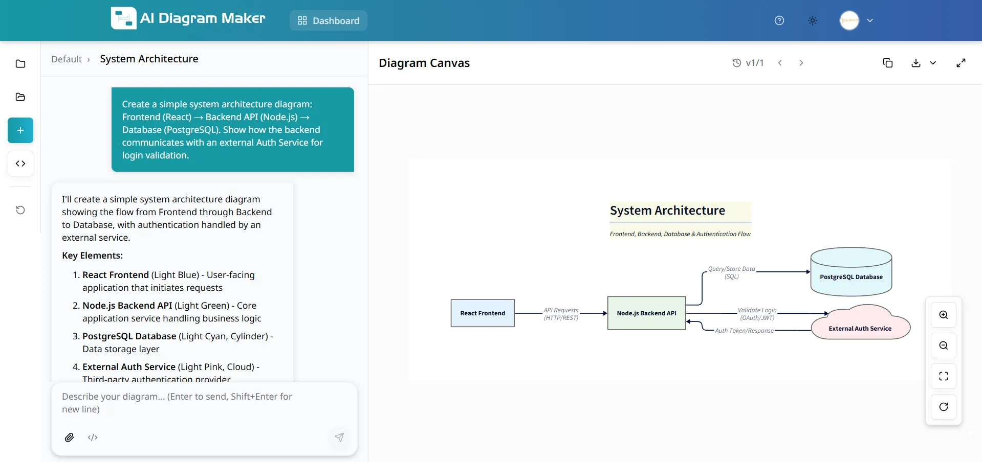
Now, picture a different onboarding experience. On day one, the new developer is asked to work on a specific microservice. Their first task is to connect the AI diagram tool to that service’s repository and generate a complete architecture diagram. Within minutes, they have a detailed, accurate, and interactive map of the component they will be working on. They can see its dependencies, its key modules, and how it interacts with the rest of the system. Read More: SaaS Architecture
This single step can shave weeks off the onboarding process. It empowers the new hire to learn independently and gives them the confidence to start contributing much sooner. It also frees up your senior developers from having to be full time tour guides. When you consider the cost of engineering salaries, accelerating this onboarding process provides a massive and immediate return on investment. The ability to document a complex SaaS architecture this way is a game-changer.
5. Streamlined Code Reviews and PRs
Code reviews are one of the most important processes for maintaining code quality, but they can also be a significant bottleneck. A large, complex pull request can present a reviewer with a wall of text and code changes that is difficult to parse. The reviewer has to spend a huge amount of mental energy just to understand the “before and after” state of the logic.
Now, imagine a developer submits a complex PR, and in the description, they include an AI generated sequence diagram that visually explains the new logic flow. Instantly, the reviewer’s job becomes ten times easier. They can see the proposed changes at a high level before they even read a single line of code. This allows them to focus their feedback on the architectural soundness of the solution rather than just on syntax or style. It leads to faster, higher quality reviews and, ultimately, better code being merged into the main branch.
Read More: Ultimate Guide to AI Diagram Generation
Beyond Individual Productivity: The Team-Wide “Flywheel Effect”
The benefits we’ve discussed so far are powerful on their own, but their true impact comes from how they combine to create a “flywheel effect” across the entire engineering organization. It’s not just about one developer saving time; it’s about the entire team operating on a higher level.
When diagrams are easy to create and always accurate, they get used more often. When they are used more often, they create a shared understanding among all team members. This shared understanding reduces miscommunication, which in turn reduces bugs and the need for rework. This frees up more time for innovation.
Furthermore, when your diagrams are treated like code, you can bring the same best practices to them. A system with a proper diagram revision history allows you to track architectural decisions over time. You can see why a change was made and who made it, which provides invaluable context. This prevents the “why on earth did we build it this way?” problem that plagues so many long running projects. It creates a collaborative environment where everyone is, quite literally, on the same page.
Read More: diagram revision history
How AI DiagramMaker Is Built for Peak Developer Efficiency
These productivity benefits are not just theoretical; they are the direct result of building a tool designed specifically for the way developers work.
Code-to-Diagram Engine: This is the core of the “living documentation” concept. It ensures that your diagrams are always accurate with zero manual effort required from your team.
Natural Language Prompts: This feature is all about speed and eliminating context switching. It allows for the instant visualization of ideas without ever having to touch a mouse.
D2 Backend: This ensures that every diagram generated is clean, readable, and consistent. You get professional looking results every single time without needing a graphic designer.
GitHub Integration: This is what ties everything together, enabling the ultimate “living diagram” workflow and making documentation an automated part of your development process.
As one lead engineer at a fast growing startup put it, “With AIDiagramMaker, our team spends less time drawing and more time building. It’s that simple. We’ve removed a whole category of work that nobody enjoyed and wasn’t a good use of our time.”
Conclusion: Reinvesting Your Reclaimed Hours
The shift from manual diagramming to AI powered generation is not just an incremental improvement. It is a fundamental change in the software development workflow. By eliminating the manual diagramming tax, you are not just making your developers faster at drawing. You are giving them back their most valuable asset: their time and focus.
We’ve seen how this automation leads to massive gains in speed, ensures the accuracy of your documentation, dramatically accelerates onboarding, and fosters better collaboration. The question for you, as a technology leader, is this: what could your team achieve with the 10 to 20 percent of their time they get back? Could they ship that next big feature sooner? Could they finally pay down some of that technical debt? Could they spend more time innovating and less time on tedious chores?
Stop paying the manual diagramming tax. It’s time to supercharge your team’s productivity.
Stop dragging boxes and start describing. Try AIDiagramMaker for free today and visualize your ideas instantly.