· Technology Deep Dive · 7 min read
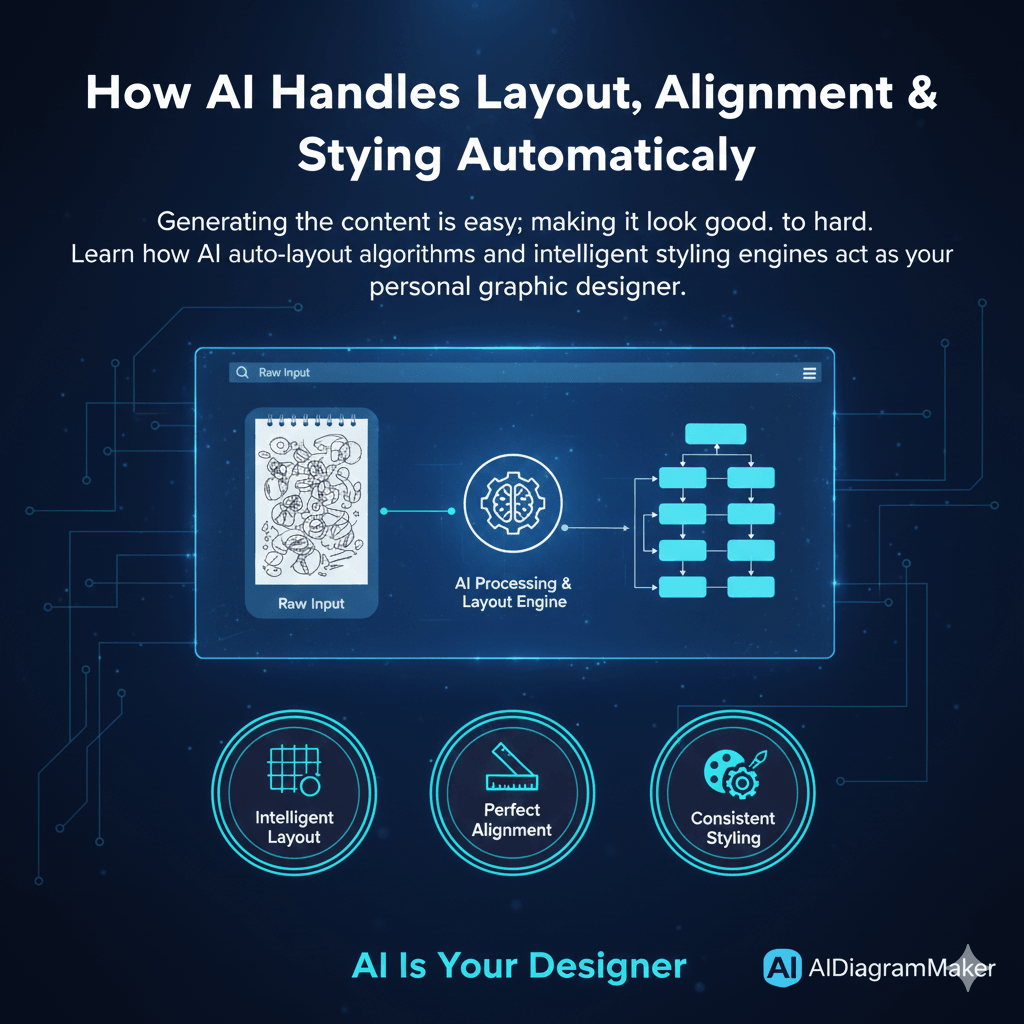
How AI Handles Layout, Alignment & Styling Automatically
Generating the content is easy; making it look good is hard. Learn how AI auto-layout algorithms and intelligent styling engines act as your personal graphic designer.
I’m sure you’ve seen the diagram. Maybe you even made it. It’s a flowchart that’s technically correct, but it’s a mess. A jumble of overlapping lines, boxes that are not quite aligned, and colors that seem to have been chosen at random. It gives you a mild headache just looking at it. The information is all there, somewhere, but the diagram fails at its one true job: to communicate clearly.
Generating the parts of a diagram, the boxes and the text, is actually the easy bit. The real challenge, the part that consumes all our time and energy, is arranging those parts beautifully. This article is about the unsung hero of AI diagramming, the intelligent designer built right into the system that handles all of that for you.
Read More: Ultimate Guide to generating the parts of a diagram
Tl;Dr
In a hurry? Here’s the main point. A great AI diagramming tool is also an expert graphic designer. It doesn’t just generate content; it makes it readable. It does this by using sophisticated layout algorithms to logically group related items, applying mathematical precision to ensure every box is perfectly aligned, and enforcing a consistent style guide for colors and shapes. This isn’t just about looks; it saves a huge amount of time and mental energy, letting you focus on your ideas instead of playing with pixels.
Introduction: Beyond Generation The Quest for Readability
We’ve all been in that situation. You’ve just spent an hour in a drawing tool, carefully placing every element. You lean back, look at your creation, and realize it’s just… chaotic. It might have all the right components, but it’s hard to follow. It’s unprofessional.
This is the hidden challenge of all visual communication. Generating the content is only half the battle. The other, and I would argue much harder, half is arranging that content in a way that is clean, logical, and instantly understandable.
This article explains how the “intelligent designer” inside AIDiagramMaker takes on that burden. It’s the part of the system that worries about the aesthetics so that you don’t have to.
The Three Pillars of Automated Aesthetics
The problem of making a diagram look good can be broken down into three core areas. The AI has to solve all three of these to produce a genuinely useful result.
1. Intelligent Layout: More Than Just Spacing
First, let’s talk about layout. Good layout is not just about distributing things evenly on the page. It’s about logical grouping and visual hierarchy. The AI needs to understand the relationships between the nodes to decide on the optimal structure.
For example, when diagramming a software architecture, the AI understands that a load balancer is an entry point and naturally belongs at the top layer. It knows that a database is often a terminal node, the final destination for data, and should be placed at the bottom. It can see which microservices are closely related and should be grouped together visually.
Under the hood, this is handled by very clever graph layout algorithms. These are the same kinds of algorithms used to render complex networks, and their entire purpose is to minimize line crossings and create a clear, top to bottom or left to right flow. The D2 engine we use is particularly good at this.
Read More: Understanding D2 engine
2. Perfect Alignment: The End of “Nudging” Pixels
This one is personal for me. I can’t tell you how many hours of my life I have probably wasted nudging a box one pixel to the left, then one pixel to the right, trying to get it perfectly aligned with the one above it. It’s a tedious, soul-destroying process.
An AI engine completely eliminates this. It treats the diagram elements not as drawings, but as objects on a virtual grid with defined relationships. It solves for perfect alignment mathematically. Every element is snapped into place with absolute precision, relative to everything else on the canvas. Every box in a row will have its center perfectly aligned. Every gap between columns will be identical. You get a level of polish in seconds that would take ages to achieve by hand.
3. Consistent Styling: Your Built In Style Guide
And finally, there’s styling. When different team members create diagrams, you often end up with a visual mess. Different colors, shapes, and font sizes make the documentation look disjointed.
A good AI tool acts as an automated style guide. It applies a consistent and professional visual language to everything it generates.
It knows, for example, that in a standard flowchart, a user process should be a rectangle, while a point where a decision must be made should be a diamond. It uses professional, pre defined color palettes to create a clear visual hierarchy. Perhaps primary services are all one color, while external third party APIs are another. It manages the typography, ensuring font sizes and weights are used to communicate importance and improve readability.
How It Works: A Peek Inside the AI’s “Design Brain”
So how does it all come together? It’s a process of steps, really.
First, the AI performs a semantic analysis. When you give it a prompt, it doesn’t just see words; it understands meaning. It tags “User Database” as a database entity and “Check Credentials” as a process step.
Second, it does logical grouping. Based on the relationships, the AI identifies natural clusters and hierarchies in your system. It knows that a group of services all related to authentication belong together.
Third, and this is the key, it translates these logical relationships into declarative code. It’s not thinking in terms of pixels. It’s writing a set of instructions like “A connects to B.” We’ve talked about this before, but this is where the power of the D2 language really shines.
Finally, that D2 code is sent to the rendering engine. The D2 engine takes over, applies its powerful layout algorithms and styling rules, and renders the final, polished image or SVG.
The Practical Benefit: Saving Time and Cognitive Load
I want to be clear that this is not just a feature for people who are obsessed with design. This is a massive productivity feature.
Every minute a developer doesn’t have to spend fiddling with alignment and colors is a minute they can spend thinking about complex engineering problems. It reduces what psychologists call “decision fatigue.” When you’re designing a system, you have a finite amount of mental energy. You shouldn’t have to waste any of it deciding if a box should be light blue or dark blue. You can trust the AI to make good, consistent choices for you. This is a huge advantage over manual tools like Lucidchart, where you are the designer for every single element.
Read More: Manual tools like Lucidchart
Conclusion: Focus on Your Ideas, Not on Your Lines
The core message here is pretty simple. A great AI diagramming tool is also a great design tool, operating quietly in the background. It automates the tedious but essential principles of good graphic design.
This automation frees you up to focus purely on the substance of your work, the structure and logic of your system. The end result is not just that you create diagrams faster. You create diagrams that are better. They are more readable, more professional, and far more effective at communicating your ideas.
Experience the difference of fully automated layout and styling. Create a diagram with AIDiagramMaker and see the polish for yourself.