· Architecture · 9 min read
Mastering System Design with AI: From Interviews to Architecture Reviews
System design is the art of trade-offs. This guide explores how system design with ai changes the way we prototype, document, and explain complex software architectures.
System design is the art of trade-offs. It is about choosing between consistency and availability. It is about deciding whether to use a SQL database or a NoSQL store. It is about balancing latency against throughput.
But for most of us communicating these trade-offs is a nightmare.
You have the perfect architecture in your head. You know exactly how the load balancer should distribute traffic to the web servers. You know where the Redis cache sits. But when you try to explain it to a stakeholder or an interviewer you end up waving your hands in the air or drawing scribbles on a whiteboard that look more like spaghetti than software.
This guide is about fixing that communication gap. We are going to explore how system design with ai changes the way we prototype, document, and explain complex software architectures. We will look at how you can use AI Diagram Maker to turn your architectural requirements into clear visual maps instantly allowing you to focus on the engineering rather than the drawing.
TL;DR:
System design is hard enough without having to fight with drawing tools. Traditional drag-and-drop software slows you down and distracts you with pixel alignment. AI Diagram Maker allows you to describe your system using natural language or code concepts. It generates professional topology diagrams using abstract nodes allowing you to visualize concepts like sharding, caching, and microservices in seconds. Whether you are prepping for a FAANG interview or documenting a legacy monolith for compliance this text-first approach gives you speed and precision.
The Evolution of System Design: From Whiteboards to AI Prompts
For decades the whiteboard was the only tool that mattered. It was fast. It was messy. It was collaborative. But the whiteboard has a major flaw. It is analog. You cannot version control a whiteboard. You cannot copy-paste a whiteboard into a design document.
The bottleneck of manual prototyping
When we moved to digital tools we lost that speed. Tools like Visio or Lucidchart forced us to become drafters. If you wanted to show a cluster of servers you had to drag an icon. Then duplicate it. Then align it. Then draw a box around it.
This manual effort acts as a brake on your thinking. You hesitate to explore a new architectural idea because you don’t want to spend twenty minutes redrawing the diagram. You stick to the first draft because editing is too painful.
Why “Low-Fidelity” visuals are better for initial design
In the early stages of system design specific icons don’t matter. It doesn’t matter if it is an AWS EC2 instance or a Google Compute Engine instance. What matters is that it is a Compute Node.
We believe in the power of abstract nodes. By using simple labeled boxes for “Service,” “Database,” and “Queue,” you strip away the vendor-specific noise. You focus on the topology. You focus on the data flow. This “Low-Fidelity” approach allows you to iterate on the logic without getting bogged down in which shade of blue the Azure cloud icon should be.
Using AI as a collaborative architect
Think of AI Diagram Maker not as a drawing tool but as a junior architect. You tell it the requirements. “I need a highly available web app with a read-heavy database layer.”
The AI interprets this. It knows that “highly available” implies a Load Balancer. It knows that “read-heavy” implies a primary database with read replicas. It draws this structure for you. You can then look at it and refine it. It turns design into a conversation rather than a drawing project.
Core Concepts of System Design (and how to visualize them)
To master system design you need to understand the building blocks. And you need to know how to represent them visually so your team understands them too.
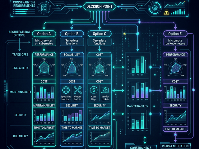
Scalability: Horizontal vs. Vertical
Scalability is the ability of your system to handle growth. If you are scaling vertically (buying a bigger server) your diagram is static. You just have one big box.
But if you are scaling horizontally (adding more servers) your diagram needs to show that. In AI Diagram Maker you can define a group of nodes. You can label a box “Web Server Fleet (Auto-scaling).” This visual shorthand communicates to the viewer that this single component is actually dynamic and elastic.
Reliability: Mapping Redundancy and Failover
Reliability means your system stays up even when things break. To visualize this you need to show redundancy. You don’t just draw one database. You draw a “Primary” and a “Secondary.” You draw an arrow labeled “Replication” between them.
You can use our tool to prototype failure scenarios. “What happens if the Primary fails?” You can generate a diagram showing the “Failover” path where the application connects to the Secondary.
Availability: Visualizing Load Balancers and Zones
Availability is about uptime. It is often achieved by spreading your system across multiple physical locations.
You can map this by grouping your components into boxes labeled “Zone A” and “Zone B.” You can place a Load Balancer at the top that directs traffic to both boxes. This makes it visually obvious that if “Zone A” disappears the system survives.
Using AI Diagram Maker for System Design Interviews
If you are a software engineer applying for a Senior or Staff role you know the terror of the System Design Interview. “Design Twitter.” “Design Uber.” “Design a URL Shortener.”
You have 45 minutes. You have to gather requirements estimate capacity and design the architecture. Most candidates fail because they waste time drawing boxes instead of explaining their decisions.
We have a dedicated guide on this Cracking the System Design Interview but here is how the core workflow helps you win the interview.
The “URL Shortener” Problem (Step-by-Step Visualization)
Imagine the interviewer asks you to design Bit.ly.
Phase 1: High Level You type: “Client talks to Web Server. Web Server talks to Database.” The AI generates the basic flow. You have a visual anchor to start the discussion.
Phase 2: The Bottleneck You say: “This won’t scale for millions of users. We need a cache.” You update the prompt: “Add a Cache between Web Server and Database.” The diagram updates. You explain that the cache stores the popular redirects.
Phase 3: The Key Generation You add: “We need a separate Key Generation Service (KGS) to pre-generate unique URLs.” You add the KGS node. The interviewer sees that you understand how to decouple write-heavy logic from read-heavy logic.
The “Chat App” Problem (WebSockets & Pub/Sub)
For a chat app like WhatsApp the challenge is real-time communication.
You can describe the flow: “User A connects to Chat Server via WebSocket. Chat Server pushes message to Message Queue. Message Queue fans out to User B’s Chat Server.”
Visualizing this Event Driven Architecture helps you explain how you handle eventual consistency and message delivery guarantees.
Speed is Key: Generating diagrams while you talk
The killer feature here is speed. You can type while you talk. “I’m going to add a load balancer here.” Type type type. “And I’m going to shard the database based on User ID.” Type type type. The visual appears instantly. It shows the interviewer that you are fluent in architectural concepts. It keeps the interview moving forward.
Framework-Specific Architecture Visualization
System design isn’t just about abstract cloud boxes. It is also about the code structure itself. Different frameworks impose different architectural patterns.
React: Component Trees & State Flow
Frontend architecture is complex. In React you have a tree of components. State flows down via props. Events bubble up.
You can use our tool to visualize this hierarchy. You can paste your App.tsx or your router configuration. We generate a tree diagram showing which components are parents and which are children. This is crucial for onboarding new frontend hires who need to understand where the global state lives.
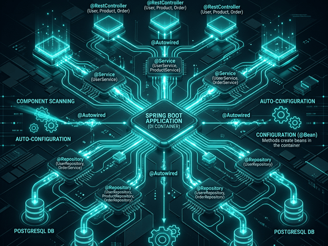
Spring Boot: Service Layer & Dependency Injection
In the Java world Spring Boot is king. It relies heavily on Dependency Injection.
Your Controller calls a Service. Your Service calls a Repository. Your Repository calls the Database. This layered architecture is strict. You can visualize it to ensure no one is breaking the rules. If you see an arrow going directly from the Controller to the Database you know you have a code smell.
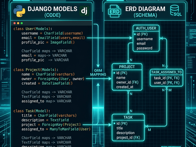
Django: MVT (Model-View-Template) & ORM Mapping
Python’s Django framework has its own “batteries included” philosophy.
You define your data models in models.py. These models define your database schema. You can paste your model code to generate an ERD. This allows you to see the “Many-to-Many” relationships that Django hides behind helper functions.
Security & Compliance in Architecture
Security cannot be an afterthought. It has to be designed into the topology.
Defining Trust Boundaries in Data Flow Diagrams
Security architects use Data Flow Diagrams (DFD) to identify risks. They look for “Trust Boundaries.” This is the line between the wild internet and your secure internal network.
You can use AI Diagram Maker to draw these boundaries. You can draw a box representing your “Secure VPC” and show exactly which ports are open to the outside world.
Visualizing Auth flows (JWT/OAuth)
Authentication flows like OAuth2 are notoriously confusing. There are redirects tokens and callbacks flying everywhere.
Mapping this out visually helps you audit the security. “Wait why are we sending the access token in the URL query parameter? That is visible in the logs.” A sequence diagram makes this vulnerability obvious.
The Architect’s Workflow: Prototype, Iterate, Document
So how do you fit this into your day job?
Step 1: Define Requirements in Text Start with a blank text editor. Write down what you are building. “We need a notification service that handles email and SMS.”
Step 2: Generate Initial Topology Paste that description into AI Diagram Maker. Get the first draft. It will probably have a generic “Notification Service” box.
Step 3: Refine Components (Database choices, Caching) Now put on your architect hat. “We need a queue for this so we don’t block the API.” Update the diagram. “Add a RabbitMQ node between the API and the Notification Service.” “We need to store logs.” “Add a MongoDB instance connected to the Notification Service.”
Step 4: Export to Design Doc (ADR) Once the diagram represents your plan export it. We recommend putting it in an Architecture Decision Record (ADR). This is a document that explains why you made these choices. The diagram shows the what. Together they form the complete history of your system.
FAQ: AI in System Architecture
Can AI suggest the right database for me? Currently the AI visualizes what you tell it. If you ask for a database it draws a database. It does not yet analyze your traffic patterns to tell you “Use Cassandra instead of Postgres.” You are still the architect. The AI is your draftsman.
Is this useful for high-level vs low-level design? It excels at High-Level Design (HLD). Abstract boxes and arrows are perfect for system topology. For Low-Level Design (LLD) like class structures it is also powerful provided you input the code snippets.