· Architecture · 5 min read
Microservices vs. Monolith: Visualizing the Migration
This guide explains how to create microservices architecture diagrams that clarify the boundaries between your services, focusing on high-level topology diagrams to map the "Before" and "After" states of migration.

Migrating from a monolith to microservices is one of the most complex projects an engineering team can undertake.
It is like doing heart surgery while running a marathon. You have to take a single massive application and slice it into tiny, independent pieces without crashing the site. The hardest part is not the code. The hardest part is the mental model. When everything is in one codebase, you know where things are. When you split it up into twenty services communicating over a network, you lose visibility. You create a “distributed ball of mud.”
You need a map. You need to visualize the migration.
This guide explains how to create microservices architecture diagrams that clarify the boundaries between your services. We will focus on using high-level topology diagrams to map the “Before” and “After” states.
The Complexity of Breaking Down a Monolith
A monolith is simple to deploy but hard to scale. A microservice architecture is easy to scale but hard to deploy and monitor.
Defining Service Boundaries
The first step in migration is deciding where to cut. Do you split by business domain? Do you split by team structure? Visualizing these boundaries is essential. You need to draw a circle around the “User Logic” and see how many lines cross that circle. If there are too many lines (dependencies), you know that splitting that service will be painful.
Visualizing Network Traffic vs. Internal Function Calls
In a monolith, Module A calls Module B via a function call. It is fast. It never fails. In microservices, Service A calls Service B via HTTP. It is slow. It can timeout. Your diagram needs to show this difference. You need to distinguish between internal logic and network boundaries. Seeing the network hops visually helps you identify latency risks before you build them.
Creating High-Level Topology Diagrams
We recommend starting with abstract topology diagrams. Do not worry about the details of the servers yet. Focus on the flow of data.
Using Abstract Nodes (Boxes) for Services
In AI Diagram Maker, you can define abstract nodes. “User Service.” “Order Service.” “Inventory Service.” These boxes represent the logical grouping of code.
Defining Relationships (Arrows) for Data Flow
Draw arrows to show dependency. “Order Service -> User Service.” This tells you that the Order Service cannot function if the User Service is down. This dependency graph is the most critical artifact of your migration plan.
Enhanced Clarity with Automatic Icon Integration
Now, our tool automatically adds relevant icons to your diagrams to provide clear visual cues for each service or component. This enhancement helps you quickly identify cloud services and architectural roles at a glance, while still keeping the focus on how systems interact. The use of icons improves clarity and communication without distracting from the core logic of your architecture.
Mapping the “Before” and “After” States
To get buy-in for the migration, you need to show the transformation.
The Monolith: A Single Box with Internal Complexity
Generate a diagram of the current state. It is usually one giant box labeled “The App” connected to one giant database. Inside “The App,” you might show clusters of modules. But the visual weight of that single box communicates the risk. “If this box crashes, everything dies.”
The Microservices: Distributed Boxes with Network Complexity
Then generate the future state. Show the exploded view. Show the “Auth Service” and the “Billing Service” standing alone. Show that they have their own databases. This visual contrast highlights the benefits of scalability. You can point to the “Billing Service” and say “We can scale this one independently on Black Friday.”
Visualizing Scalability and Bottlenecks
Distributed systems introduce new failure modes.
Identifying Single Points of Failure
Look at your microservices diagram. Is there one service that everyone points to? Maybe it is the “Shared Config Service.” If every arrow points there, you have identified a Single Point of Failure (SPOF). Visualizing the fan-in helps you spot these bottlenecks.
Representing Load Balancers (Abstractly)
You can add abstract nodes for traffic control. “Client -> Load Balancer -> Service Instances.” This shows how you plan to handle traffic spikes.
Diagram
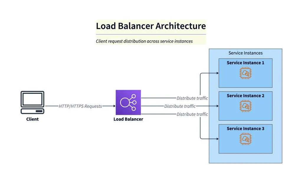
Diagram Explanation
This diagram illustrates a typical load balanced architecture. Client HTTP requests are routed to a load balancer, which distributes the traffic across multiple service instances. This setup improves scalability and reliability by ensuring no single instance is overwhelmed, and requests are handled efficiently.
How AI Diagram Maker Accelerates the Design Process
Designing this system manually takes weeks of whiteboard sessions.
Rapid Prototyping of Service Meshes via Text
With our tool, you can prototype in real time. “Show me what happens if we merge the Order and Inventory services.” You update the text prompt. The two boxes merge. You re-evaluate the connections. This rapid iteration allows you to explore different architectural patterns “Strangler Fig” vs “Big Bang” instantly. You are not just drawing a diagram. You are testing your architectural hypothesis.
The Programmable Diagram: A Developer’s Guide to D2 and Text-Based Visuals
For a deeper dive into how text-based tools like D2 can revolutionize your approach to architectural design and documentation, check out our comprehensive guide: The Programmable Diagram: A Developer’s Guide to D2 and Text-Based Visuals.